Estimated reading time: | Select text to share via Facebook, Twitter or Email
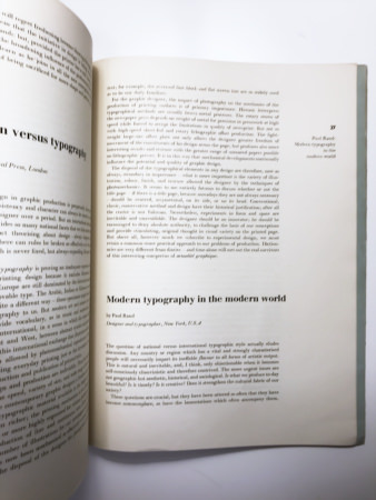
The question of national versus international typographic style actually eludes discussion. Any country or region which has a vital and strongly characterized people will necessarily impart its ineffable flavour to all forms of artistic output. This is natural and inevitable, and, I think, only objectionable when it becomes self-consciously chauvinistic and therefore contrived. The more urgent issues are not geographic but aesthetic, historical, and sociological. ls what we produce to-day beautiful? Is it timely? Is it creative? Does it strengthen the cultural fabric of our society?
These questions are crucial, but they have been uttered so often that they have become commonplace, as have the lamentations which often accompany them. Nevertheless, we cannot evade them. I should like to borrow a device from the popular Press, and suggest something similar to the personality test as perhaps a useful and somewhat different way of answering these questions. Just as the newspaper examination impertinently demands Do you like parties? and then refers you to page x to check whether your answer reveals you to be an introvert or extrovert, I should like to ask the following but leave you to evaluate the answers:
(1) Do you understand the theory and philosophy of modern painting, typography and architecture as well as their traditional backgrounds?
(2) Do you agree that each of these forms of expression has principles in common as well as limitations and potentialities exclusively its own?
(3) Do you understand the art of the East and its influence on all forms of modern visual expression?
(4) Do you believe that modern typography and its sister arts are a way of living and not merely expedients or temporary diversions?
(5) Do you seek the essential meanings of space, symmetry, asymmetry, function, texture, form, etc?
(6) Do you accept that traditional type faces are absolutely modern in the sense that they are established norms?
More specifically:
(1) Do you try to be ‘original’ for originality’s sake?
(2) Do you use lower-case letters because they look modern?
(3) Do you use white space indiscriminately?
(4) Do you always ‘bleed’ pictures?
(5) Do you use sansserif faces because they look ‘up to date?’
(6) Do you employ abstract shapes foolishly?
(7) Do you use new materials because of their newness?
The implications of these questions are doubtless clear. They will surely not startle the reader, but I have offered them in the hope he might find them provocative and that they will suggest other questions.
We have inherited from the great aesthetic revolution of the twentieth century the task of bringing to fruition the new ideas and forms which it introduced. This task is not only arduous, but less rewardingly glamorous than was participation in the original dramatic and dynamic insurgence. Consequently, many designers and typographers have shirked this task. Some who originally accepted this task have since abandoned it. Some have contracted the ‘revolutionary habit’ of novelty-making — neglecting other aspects of design and indulging in a sort of perpetual juvenilism. Other designers, unable to escape the ‘academic habit,’ have too soon crystallized the theories of the aesthetic revolution into a set of rules and dogma.
These pitfalls threaten all contemporary designers, and I should like to suggest that honest, frequent and searching self-examination with respect to his work is perhaps the best way for the designer to avoid them.
As far as the role of modern typography in history is concerned, I believe that a vital epoch will make, and bring to successful maturity, original contributions which derive from the needs and fulfill the desires of the period.
A neglected but important subject which must also be considered is the relationship of the designer with the business world and its problems, its foibles, its blind conviction that poll-taking will reveal ‘what the public wants’, and its inherent conservatism. It is all very well to speak of aesthetic or sociological questions in connection with modern design, but we must at the same time remember that such questions are too often irrelevant or even nonsensical so far as the world of commerce is concerned; yet the designer is generally almost entirely dependent on its patronage. The modern designer has a threefold task: to educate and satisfy himself, the public at large, and then induce the business world to go along with him in this endeavour.

