Ideas About Ideas

This version of the article was originally published in “Industrial Design Magazine”, August, 1955.
It was revised and reprinted in “A Designer’s Art”, 1985.

Estimated reading time: | Select text to share via Facebook, Twitter or Email

Ideas About IdeasZoom
Portrait
Ideas About IdeasZoom
Etruscan eye painting
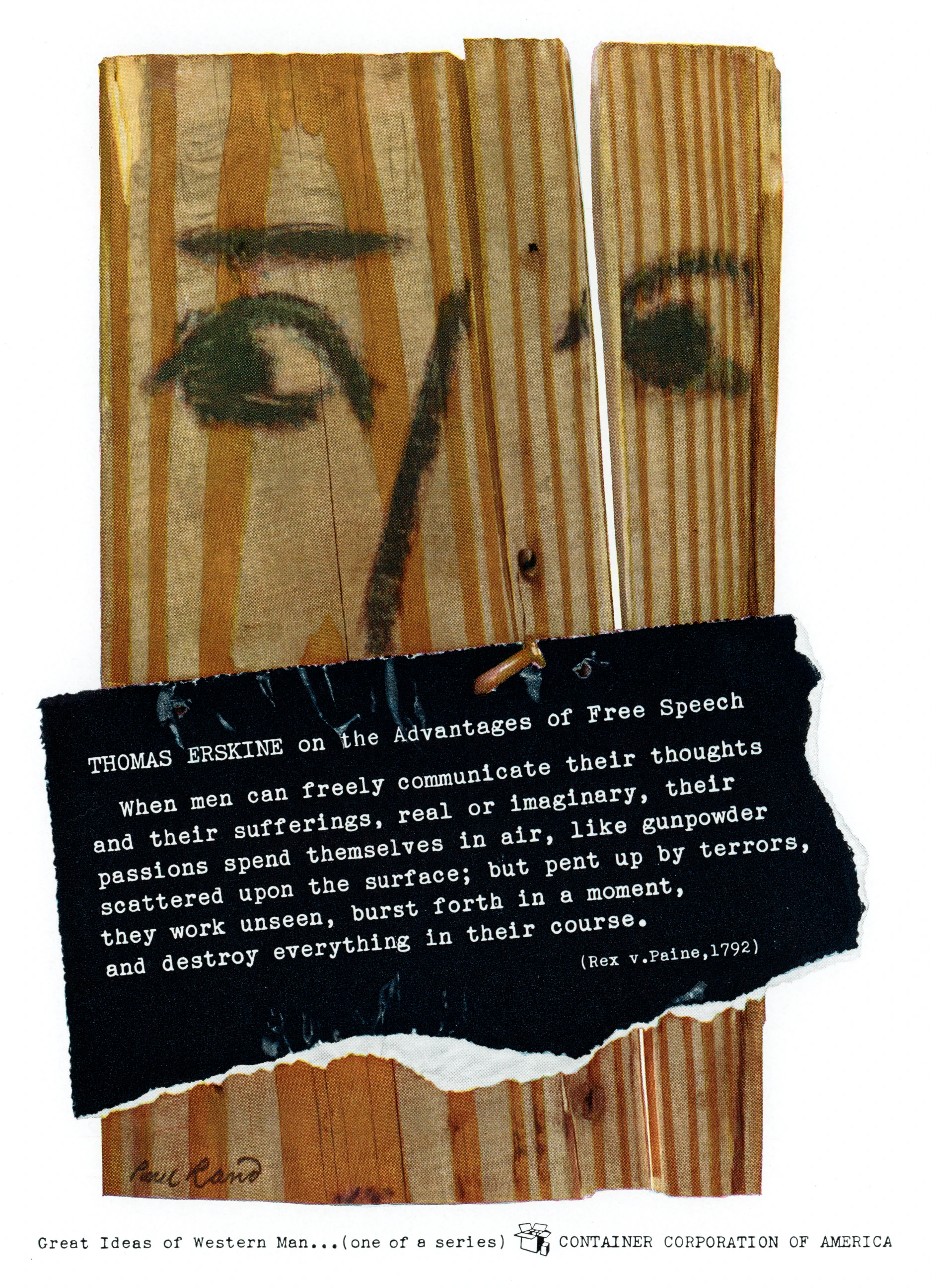
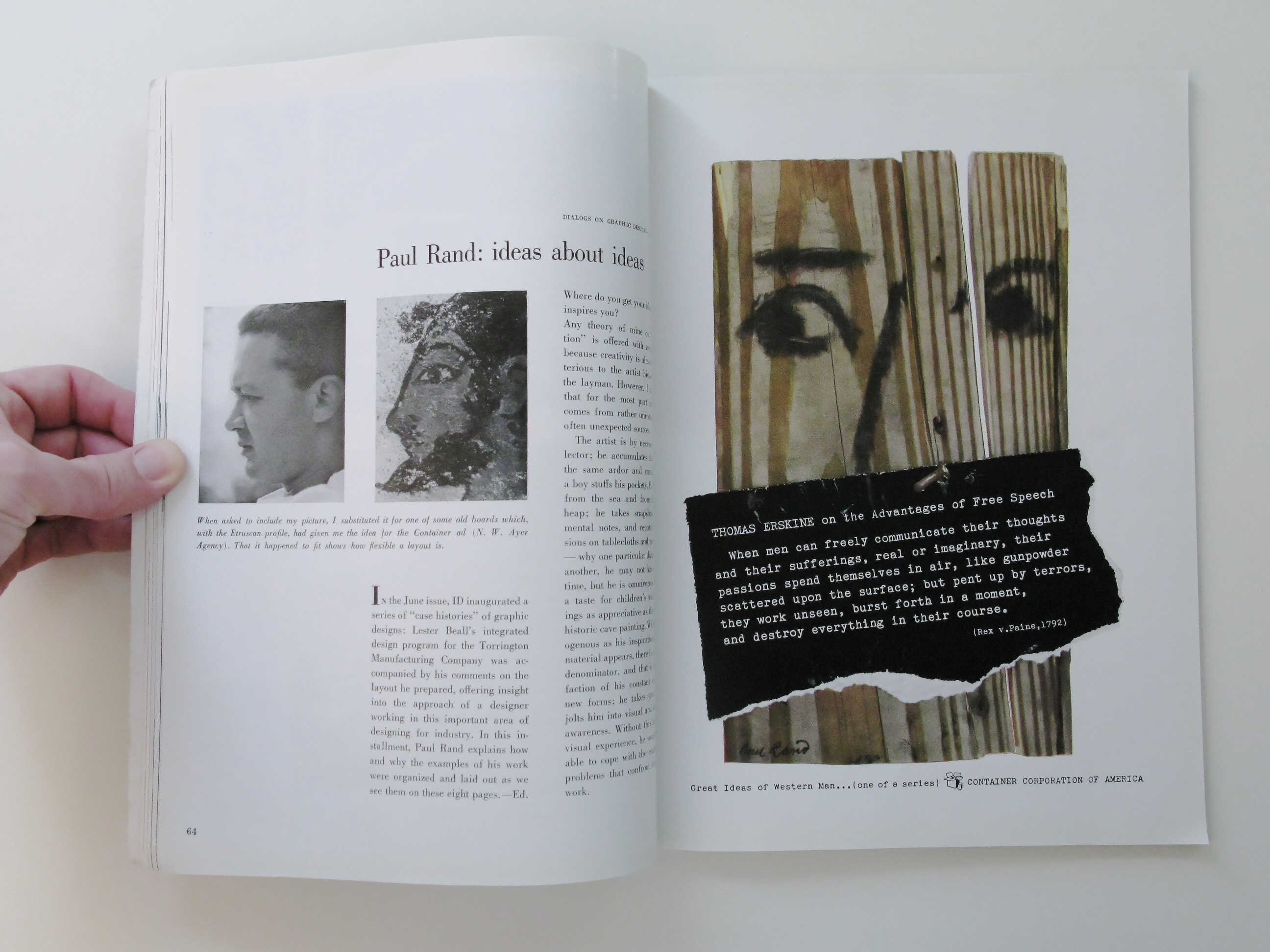
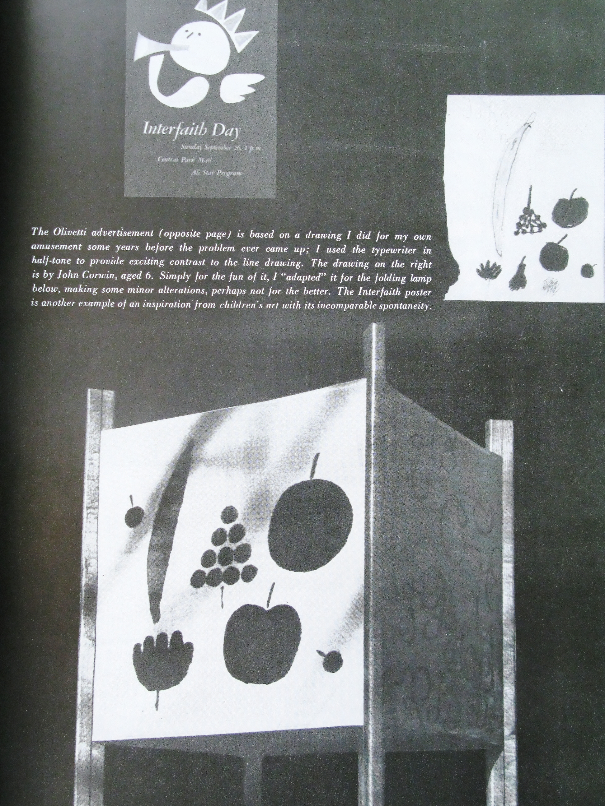
When asked to include my picture, I substituted it for one of some old boards which, with the Etruscan profile, had given me the idea for the Container ad (N. W. Ayer Agency). That it happened to fit shows how flexible a layout is.

In the June issue, ID inaugurated a series of “case histories” of graphic designs: Lester Beall’s integrated design program for the Torrington Manufacturing Company was accompanied by his comments on the layout he prepared, offering insight into the approach of a designer working in this important area of designing for industry. In this installment, Paul Rand explains how and why the examples of his work were organized and laid out as we see them on these eight pages.—Ed.

Where do you get your ideas? What inspires you?

Any theory of mine on “inspiration” is offered with reservations, because creativity is almost as mysterious to the artist himself as to the layman. However, I do believe that for the most part inspiration comes from rather unromantic and often unexpected sources.

The artist is by necessity a collector; he accumulates things with the same ardor and curiosity that a boy stuffs his pockets. He borrows from the sea and from the scrap heap; he takes snapshots, makes mental notes, and records impressions on tablecloths and newspaper — why one particular thing and not another, he may not know at the time, but he is omniverous. He has a taste for children’s wall scrawlings as appreciative as that for pre-historic cave painting. Wildly heterogenous as his inspirational source material appears, there is a common denominator, and that is the satisfaction of his constant search for new forms; he takes note of what jolts him into visual and emotional awareness. Without this harvest of visual experience, he would be unable to cope with the multitude of problems that confront him in his work.

Ideas About IdeasZoom

The Olivetti advertisement (opposite page) is based on a drawing I did for my own amusement some years before the problem ever came up; I used the typewriter in half-tone to provide exciting contrast to the line drawing. The drawing on the right is by John Corwin, aged 6. Simply for the fun of it, I “adapted” it for the folding lamp below, making some minor alterations, perhaps not for the better. The Interfaith poster is another example of an inspiration from children’s art with its incomparable spontaneity.

Ideas About IdeasZoom
Folding Lamp adapted from child's drawing
Ideas About IdeasZoom

How do you approach a given problem, a product or a layout?

Like any designer, when I have extracted from a mass of complex material the how, the why, the when and the where, I may find there (or in the unconscious storehouse) one or more symbols to convey the significant idea. These must be used suggestively, to engage the imagination. Contrast is one of the guiding principles — not only a contrast of symbols, as in the Olivetti ad (previous page), but the contrast in size, color, technique, in a photograph juxtaposed with a line drawing. The effect of startling simultaneity, with two unrelated objects integrated in space, creates a kind of visual test, inviting the spectator to observe and decipher it for himself. Besides the strong contrast in the Disney ad at the left, there is an attracting, rhythmic repetition in the squares and rectangles. This sense of continuity underlies the layout of the whole spread, with the black square from the Disney hat repeated to unite a group of small, unrelated pictures. Four squares in turn make a larger one, clearly organizing the page.

An old Parisian fashion plate from 1896 was the incentive for a series of advertisements, one of which is shown at the left. As a matter of fact, the layout of this double spread was in turn inspired by the Disney advertisement; the heterogeneous assortment of pictures is tied together by the repetition of the black square. The Inter-faith poster and the Japanese magazine cover are both based on paintings I did some years previously. In the case of the poster, only the essence of the idea was used; in the magazine cover, however, the painting was adapted almost literally.

There is a definite emotional force generated by the repetition of words or pictures, and there are endless graphic possibilities here. Rhythmic repetition is apparent in all the examples on this spread: in the stencil, in the book jacket where the same typography is used more freely, for “El Producto” to suggest that cigars come from abroad; and it supplies the basic forms for the fabric design.

Bleed pages (right) should be used only when they contribute to the total visual effect, when they help to clarify the message, and when they convey the provocative quality of something partly seen. The full page single ads in this article use the bleed simply as an extension of a white or black background ; in the fabric, the bleed gives the feeling of the continuity of a bolt of cloth. A rhythm is also created by the alternating bleed pages in the total layout. Since we are in the habit of reading from the left, I started this article with text on the left rather than on the conventional right side. This, I feel, helps the article begin as a spread and not as a single page. I used a full-page photograph to create a visual conclusion to the story.

A type stencil caught my eye in Paris, and it turned out to he the inspiration for all sorts of interpretations, from the book jacket for Alfred A. Knopf to the “Animalphabet” fabric for L. Anton Maix. I decided to animate the cigars with masculine symbols; the ad adapts to any size layout up to full newspaper page, showing any number of figures. (Agency: W. H .Weintraub)

Ideas About IdeasZoom
“Animalphabet” fabric for Anton Maix

The Original Article

Ideas About Ideas
Ideas About Ideas
Ideas About Ideas
Ideas About Ideas
Ideas About Ideas
Ideas About Ideas
Ideas About Ideas
Ideas About Ideas
Ideas About Ideas
Ideas About Ideas

(Use ← → keys to navigate. Click for larger view.)

Zoom

Published In

Industrial Design

August, 1955
Find in a local library

Next Article

Advertisement: Ad Vivum or Ad Hominem?

1960

Originally published in a special issue of Daedalus: The Visual Arts Today

View Now