Beaux Arts magazine is a French magazine founded in 1983 and dedicated to the arts in all their forms and periods. It is published monthly.
The Original Text
By Pierre Ponant
Commercial artist
Inventor of the concept of global visual identity, Paul Rand revolutionized the graphic identity of companies and created some of the most famous logos in the world. A retrospective exhibition in Chaumont.
Pierre Ponant
In 1953, readers of The New York Times and the New York Tribune were probably surprised by this ad: “Wanted: Art Director modern, creative and trendy. There is not asked to be a Rand but necessary to inspire art department. “This provides for a recruitment advertising agency resumes, through reference to the personality of the designer Paul Rand, the passionate debate, since the 1930s, opposes or combines art and advertising.
A debate was born in France, within the modernist movement and its artists: some think when recovery by market society, others see it as a utopia in the service of modern man. Advertising has its apologists (Fernand Leger, Sonia Delaunay, Jean Carlu ….) and its detractors, including Le Corbusier. And some disappointed. Like the poster Cassandra stops working in advertising, returning from a trip to the United Urus, disgusted to see the art used in staging and vulgar mercenary. The art of the 1930 U.S. advertising is, in fact, poor and very aggressive editorially. His imagery, essentially realistic, reinforces and accentuates these guidelines. In addition to discussing the picture, another sticking point emerges in the advertising community that sees some art directors refute the notion of art for him to prefer that of engineering. There is an engineer or visual graphic designer (translated from English by designer).
AN ARTIST TOTAL
In the late 1940s, a young graphic designer to its growing reputation in the world of visual communication, invites himself into the debate. Author of a theoretical work, Thoughts on Design (thoughts on design), published in 1947, Paul Rand combines analysis inherited from the Bauhaus experience a more personal question, as expressed in a more poetic, facing dominant discourse on advertising. Paul Rand says that design is indeed related to the concept art and more than just design. The topic has a strong impact. Paul Rand is a “total artist” within the meaning of avant-garde. Illustrator, graphic designer, textile designer, poster artist, author of books for children, it will dominate the design of the 1940 American and 1950. Rand is one of the few American designers - he was born in Brooklyn in 1914 - to claim, with generation of designers who had emigrated from Eastern Europe in the 1930s (Will Burtin, Ladislav Sutnar, Alexander Liberman …) provision Cubism, Constructivism, Bauhaus and the “new typography” movement driven by Jan Tschichold in Switzerland. In 1938, spotted by the art magazine chart, PM, it is considered an essential personality in young American designers. The article presents it as a vector of the philosophy of Le Corbusier … by its rejection of ornament and the report he makes between the masses, proportions and characters to solve a communication problem. These references to the European avant-garde of the 1920s made him a functionalist convinced that believes in the relationship between visual objects and strong dynamic typography to convey messages. Theorist, but from his practice where he uses all the “modern” techniques, collages and montages of photographs or drawings, he was influenced by painters like Matisse, Miro, Jean Arp or the linearity of the drawings of Paul Klee. Rand defines as the designer who must find a means of communication between himself and the viewer. The humor also involved these communication tools. Thus, its elegant typographical choices often precludes handwritten text. And a signature, his signature affixed to the display to confirm the idea that this is the designer, not the client that communicates with the viewer. Utopian, Paul Rand, the rest in the sense of ethical research. But all of his work is marked by pragmatism and a genuine match the economic reality of America of the fifties. The designer knows the company and understands the world. His early career in various advertising agencies on Madison Avenue in New York was trainer. And for the company, Paul Rand is going to invent the concept of visual identity overall. In 1956 he created at the request of Thomas J. Watson, chairman of IBM, identity, logo and visual chart of the firm, which is still valid and a model of unparalleled corporate identity. Other logos follow as Westinghouse (1961), United Parcel Service (1961), ABC (1962) and Cummins Engine (1979). Visuals still in use today, except for UPS. In 1986, Steve Jobs, Apple’s founder, Paul Rand consults for its brand image, NeXt. Logic and eloquence of the old graphic designer - Paul Rand is then aged 72 - seduce the young businessman who agrees the only proposal made to him. For Rand, the combination of words and images is fundamental to convey a single idea. His research led him, in the early 1960s to become one of the pioneers of “new advertising.” This concept places the reader / viewer into a more active role. Her curiosity stimulated, the viewer must complete the self-defined message. This technique plays the apparent isolation of the text, often written as in spoken language and image. Everything seems to be based on the unique aesthetic of the typography, drawing and photography. To see more closely, the assembly can conceptually take one without the other. Photomontages and layouts for cultural journals Apparel Arts and Management, from its beginnings, the cover illustrations for book publishers or Pantheon, A Vintage Book, press ads for Coronet to those for Olivetti and IBM, books for children written and illustrated with his wife Ann to the posters for the meetings of Aspen or against the war in Vietnam, the art of Paul Rand is based on this notion of balance between the protection of copyright and design response to the command. A balance between improvisation and invention, between instinct and intuition as symbolic images which reflect the designer eliminates unnecessary to achieve clarity and interest. Sensitive to public reactions, feelings and tastes, education of his gaze, Paul Rand invented a form of advertising, now undermined by financial pressures, advertising citizen.
Sides 1
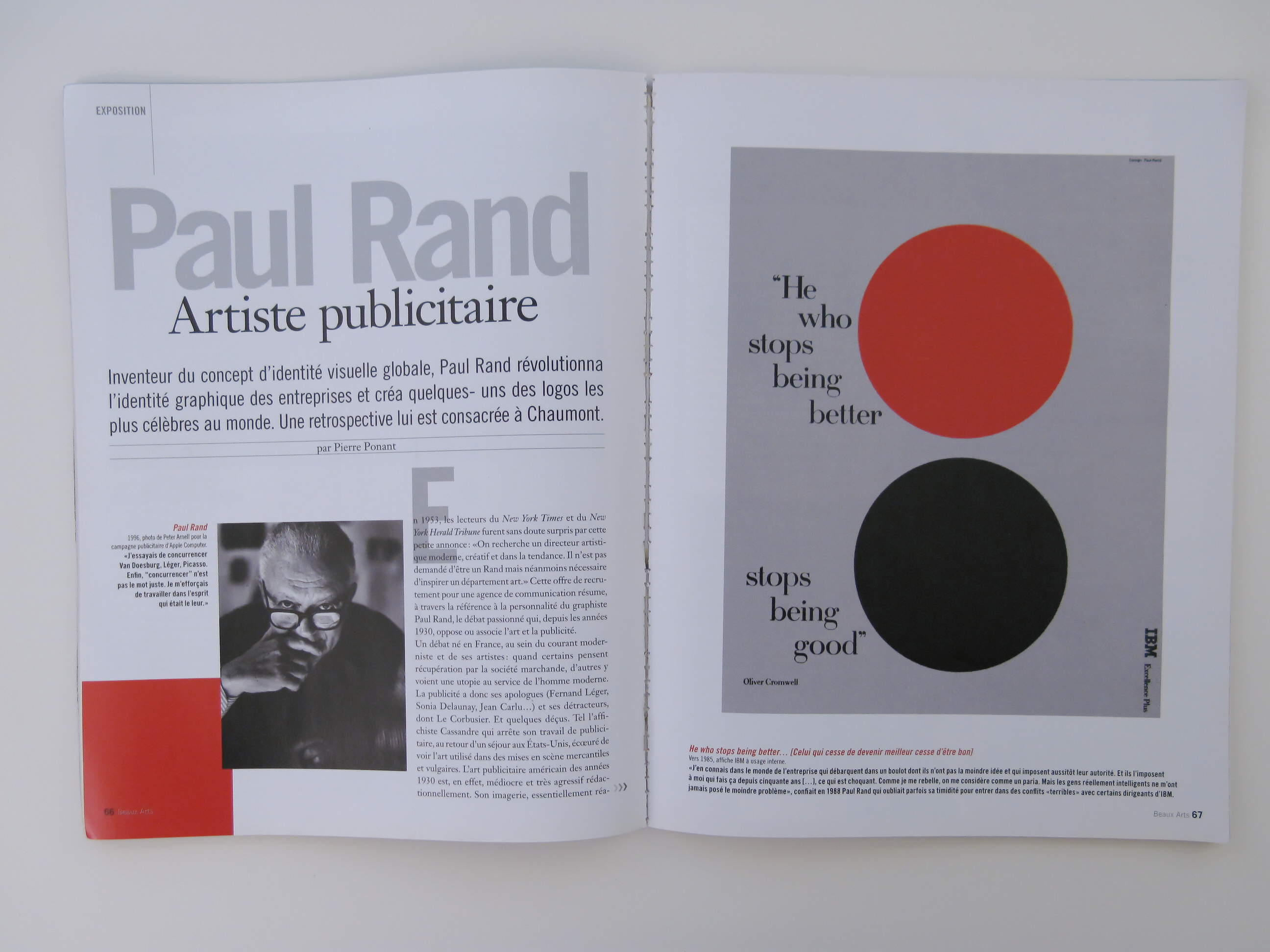
Paul Rand
1996, photo by Peter Arnell’s ad campaign for Apple Computer. “I was trying to compete with Van Doesburg, Leger, Picasso.“ Finally, “compete” is not the right word. I tried to work in the spirit that was theirs. ”
2 Sides
He Who Stop Being better… [One who stops getting better stops being good]
Around 1985, shows IBM internal use.
“I know in the business world who land a job in which they have no idea who immediately imposed their authority. And they dictate to me who’ve been doing this fifty years …, which is shocking. As I rebel, I am regarded as a pariah. But the really smart people I was never posed the slightest problem, “Paul Rand confided in 1988 that sometimes forgot his shyness to enter into conflict “terrible” with some executives from IBM.
3 Sides
Milestones
Born 1914 in New York.
1936-1945 Artistic Director of Apparel Arts magazines, and Management.
1944 First illustration for the book cover the Cubist Painters, by Guillaume Apollinaire, ed. Wittenborn & Co.
1954 First solo exhibition at the Contemporary Art Museum, Boston.
1956 Designs the corporate identity of IBM.
1974-1993 Taught at Yale University.
1996 Publishes From Lascaux to Brooklyn, ed. Yale University Press. Died in Norwalk, Connecticut.
Eye Bee M
1981, shows for IBM.
This puzzle, which was to serve as poster at an internal event IBM will initially banned by the group’s leaders, fearing that it encourages designers to allow himself home eccentricities. Rand finally managed to convince them and the poster will become one of the most famous brand.
The man of change
In 1955, Thomas J. Watson, chairman of IBM, received an officer of the firm in the Netherlands where a note that tells him that at the dawn of the electronic age, image, design and architecture of IBM are too poor. This thinking reinforces the belief of the CEO as what good design is good business, and it is time to change identity from the 1920s. Thomas Watson says while a consultant mission to Paul Rand. This creates a new logo, which the acronym is designed as a ribbed like those three letters that appear on bank checks, used to prevent counterfeiting. In 1962, Paul Rand realizes the IBM Design Guide, the first textbook of its kind to impose a discipline to the company vision for all versions of the logo, the header of a letter to its inclusion in the architecture the buildings of the company.
4 Sides
The Art Club Directors
1988, poster.
This announcement discusses some paintings of his youth.
Quality
1990, poster.
This poster is a plea on the intrinsic quality of the IBM logo design, which takes just as much to control the employees of the brand consumers.
Westinghouse
1962-1971, advertising.
What counts for Rand, is “good typography, no matter how old or new. […] The bottom line is the staging, construction, the play of contrasts.”
Tokyo Communication Arts
1991, poster.
Not as free as when he works for an organization, graphics, Rand tries in this poster to a transcript of geometric flowers.
Sides 5
SOS Children’s Village SOS Kinderdorf
1996, poster.
This poster, last by Paul Rand. was designed for soution the first private organization in the world in the service of children in distress.
Tri Arts Press
1980, poster.
Paul Rand’s oeuvre stands out so much that, conventionally, of his contemporaries that led to his being regarded as the “Picasso” of the graphic.
6 Sides
Exposure
As part of its 18th edition, the Festival International Poster and Graphic Arts in Chaumont presents the first retrospective of the work of French designer Paul Rand and advertising. The exhibition features a collection of posters and covers for coverage of novels in print or original artwork. The presentation of the book Thoughts on Design allows the visitor a review of key concepts associated with its graphic images. The graphic IBM is also presented, together with all the associated elements (in letterhead, packaging …) with funds from the Centre Pompidou. Despite the loan and the exceptional nature of this retrospective, we can only be distressed that no resumption of the exhibition is planned in Paris. Is it lack of places? Or is it rather a lack of political will to develop a real programming around the graphic, still considered a minor art?
Paul Rand in the Festival International Poster and Graphic Arts in Chaumont, May 12 to June 24 Silos - House Book and Poster - 52000 Chaumont - www.city-chaumont.frlfestival-Placard
Read: Paul Rand by Steven Heller, ed. Phaidon, 256 pages, € 59.95.
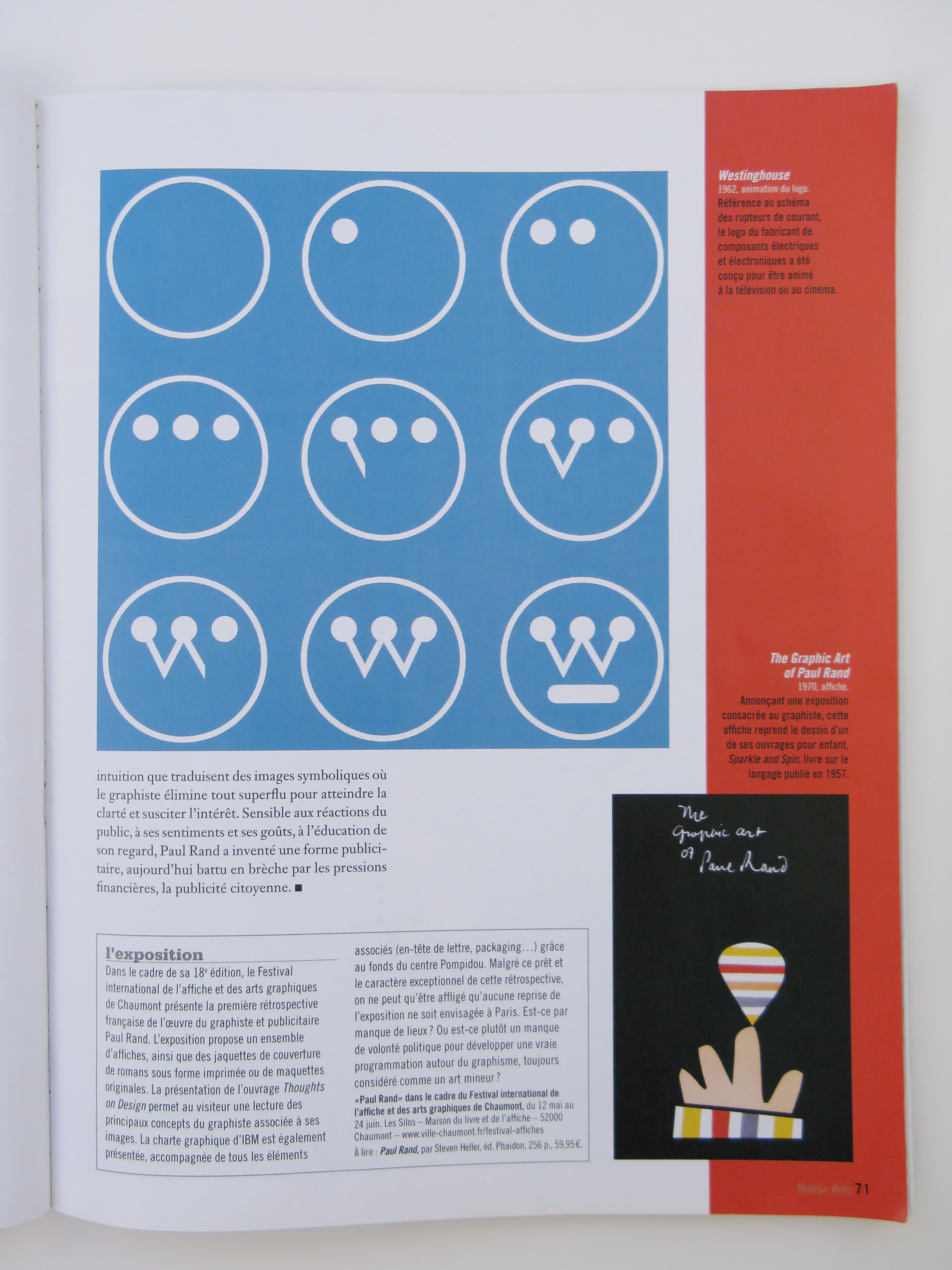
Westinghouse
1962, animated logo.
Reference to the pattern of current switches, the logo of the manufacturer of electrical and electronic components has been designed to be animated on television or cinema.
The Graphic Art of Paul Rand
1970, poster.
Announce an exhibition devoted to the designer, this poster includes a drawing of one of his books for children, Sparkle and Spin, on language book published in 1957.


