The New Republic is a liberal American magazine of commentary on politics and the arts published since 1914, with major influence on American political and cultural thinking.
The Original Text
By Jessica Helfand
Graphic design is easily the most ubiquitous of all tile arts. It is everywhere, touching everything we do, everything we see, everything we buy; on billboards and in Bibles, on taxi receipts and on web sites, on birth certificates and on gift certificates, on the folded circulars tucked inside jars of aspirin and on the thick pages of children’s chubby board books, It is the boldly directional arrows on street signs and the blurred, frenetic typography on the title sequence to E.R. his the bright green logo for the New York Giants and the staid front page of The New York Times. It is hang-tags in clothing stores, playbills in theaters, timetables in train stations, postage stamps and cereal box packaging, fascist propaganda posters and junk mail. It is complex combinations of words and pictures, numbers and charts, photographs and illustrations that, in order to succeed, demand the clear thinking of a thoughtful individual who can orchestrate these elements so that they all add up to something distinctive, or useful, or beautiful, or playful, or subversive, or in some way truly memorable. It is a popular art, a practical art, an applied art, an ancient art. It is informed by numerous disciplines, including art and architecture, philosophy and literature, politics and performance.
Simply put, graphic design is the art of visualizing ideas. Until World War II, it was better known in the United States as commercial art. Practiced by printers and typesetters, it was more a vocation than a profession, more a reflection of the economic realities of a newly industrialized culture than an opportunity to engage the creative expression of an individual or an idea. Unlike the experimentation that characterized design as it was being practiced and taught in Europe in the early years of this century—led by Cubism and Constructivism, pioneers of DeStijl and disciples of the Bauhaus—what we now think of as graphic design was, in this country, driven by the demands of commerce, and fueled by the prospect of eliminating the economic hardships that had plagued the nation during the Depression.
Commercial art was a service industry motivated by the same honorable objectives that characterized the average consumer: it sought to encourage stability, to promote prosperity, and to maintain a generally happy, don’t-rock-the-boat sort of aesthetic status quo. So it is perhaps not surprising that a good deal of the design of printed matter dating from the years between the wars was dry, unimaginative, and predictable. It was also cluttered and decorative: the use of ornament became a kind of aesthetic panacea, masking the greater cultural complexities of this awkward, transitional age. This ornamentation was at odds with the streamlined simplicity that otherwise characterized so much of the artistic expression—the painting, the music, the literature—of the same fertile period.
And if we consider “commercial art” not a fine but a popular art, it Jails also as an adequate mirror of social history. With the great exception of World War II propaganda—which suggests an altogether different aesthetic, evoking the urgency of a highly politicized and mobilized nation—the typical outlets for what would eventually become “graphic design” were met, in the 1920s and 1930s, with little in the way of truly noteworthy activity. It was a curious time, from the standpoint of design history: a period marked by great social upheaval and negligible creative advance.
By the early 1930s, however, a small but accomplished group of American and European expatriate designers began to experiment with new ways to approach the design of commercial printed matter. Combining the experimental formal vocabularies of their European colleagues with the material demands of American commerce, they helped to inaugurate a new visual language that would revolutionize the role of design as both a service and an art. Of this group—which included Lester Beall, Bradbury Thompson, and Alexey Brodovich, among others—none was so accomplished, or would produce as many lasting contributions to the field, as Patti Rand, arguably America’s most accomplished graphic designer, who died last year at the age of 82.
More than any other designer of this century, Rand is credited with bringing the modernist design aesthetic to postwar America. Highly influenced by the European modernists—Klee and Picasso, Calder and Miro—Rand’s formal vocabulary signaled the advent of a new era. Using photography and montage, cut paper and what would later become known as “The New Typography”—asymmetrical typography that engaged the eye and activated the page—Rand rallied against the sentimentality of stolid, commercial layouts and introduced a new, sharper, cleaner, and forward-looking vocabulary of the kind that he had observed in such European design magazines as the German Gebrauchsgraphik and the English Commercial Art. To look at Rand’s work today—work that dates from half a century ago—is to see how an idea can be distilled to its most concentrated and salient form. The style is playful, the message immediate, the communication undeniably direct.
Born in 1914 in Brooklyn, the son of Viennese immigrants who were Orthodox Jews, Rand began drawing as a child and went on to attend the Pratt Institute, the Parsons School of Design, and the New York Art Students League, where he studied with George Grosz. He opened his own studio in New York in 1935; two years later he was named art director of Esquire. In his twenties, he suffered a terrible loss when his identical twin brother, a jazz musician, died in an automobile accident; his divorce and subsequent remarriage followed not long after. During these turbulent years, he remained busy designing layouts for Apparel Arts magazine, as well as covers for the antifascist magazine Direction, where, between 1938 and 1941, he developed his skills in connection with complicated political issues: the Nazi seizure of the Sudetenland, for example.
In 1941, at the age of 27, Rand left to join the William H. Weintraub advertising agency, where he would spend the next 13 wars producing advertisements for, among others, El Producto, Dubonnet, Orbach’s, and Revlon. He was hired as the graphic design consultant for IBM in 1956 (the same year he was hired by Josef Albers to teach in the graduate design program at Yale), where be collaborated with Thomas Watson Jr. and Eliot Noyes on the famous striped letterforms that are still in use today.
Rand was also one of the few distinguished practitioners of graphic design who saw fit (or found time) to publish on the subject. A contributing writer to numerous design publications here and abroad, he went on to publish four important books: Thoughts on Design (1946); Paul Rand: A Designer’s Art (1985); Design, Form and Chaos (1994); and, most recently, From Lascaux to Brooklyn (1996). Consequently, he was perhaps the only designer of his generation to articulate a sustained theoretical position about graphic design.
Rand was a modernist not only in the reductive vocabularies of his design, but also in the intellectual curiosity of his writing. His books typically consist of short, staccato-like essays in which he considers the fundamental factors that shape our understanding of visual communication. In each of his books, he scrutinizes the relationship between art and design, between design and aesthetics, between aesthetics and experience.
At length, he examines the role of intuition and ideas, the balance between form and function, and the universal language of geometry. He believed these topics to be timeless. “My interest has always been in restating the validity of those ideas which, by and large, have guided artists since the time of Polyclitus,” he wrote. “It is the continuing relevance of these ideals that I mean to emphasize, especially to those who have grown up in a world of punk and graffiti.” There is a personal, almost spiritual quality to Rand’s work. The promises of modernism, in which the harmony of formal relationships gesture to a higher order, and seek to embrace a purist ideal, must have held, for Rand, a kind of divine appeal.
And while it is true that Rand’s celebration of pure form gestured to an economy of means that might be characterized as quintessentially modern, it is also true that his resistance to new, more abstract forms of expression revealed itself repeatedly in his writings, in public lectures and interviews, thus branding him, in his final years, as outmoded and conservative. Throughout his professional life, the words most frequently associated with Rand were “irascible,” “ornery,” and “curmudgeon”—characteristics which led to such statements as “the development of new typefaces is a barometer of the stupidity of our profession.” True to form, his last book was dedicated “to my friends and enemies.”
A lifelong advocate of the axiom “less is more,” he was often criticized for his rejection of a more contemporary design idiom. Rand scorned what he saw in his later years as a postmodern free-for-all, in which sentiment and subjectivity supplanted logic and clarity. The teacher in him saw an opportunity to redefine and to restate the great lessons of the modernist legacy; his writing is tireless in this regard. And the artist in him saw the necessity of promoting the same exacting standards that he used not only to evaluate his own work, but to assess the quality of any great work of art. “The quality of the work always precedes everything else,” he explained in an interview not long before his death. “And the quality, of course, is my standard.”
Throughout his books, Rand sustained his arguments through repetition that sometimes verged on dogma. He wrote in the rhetoric of the manifesto. Written primer-style on such topics as “The Beautiful and the Useful,” “Design and the Play Instinct,” and “Intuition and Ideas,” his essays were extensively illustrated by visual examples from his own portfolio, and footnoted with citations from his equally extensive library. In Rand’s writings, design became a humanist discipline; and his insistence was amplified not only by references to, say, Leger and Albers, but also to Kant, Hegel, Dewey, Whitehead, Bergson, James, and others.
“To design,” Rand writes in Design, Form and Chaos, “is much more than simply to assemble, to order or even to edit: it is to add value and meaning, to illuminate, to simplify, to clarify, to modify, to dignify, to dramatize, to persuade, and perhaps even to amuse. To design is to transform prose into poetry.” For Rand, design was an orchestration of rhythm, contrast, balance, proportion, repetition, harmony, and scale—a philosophically sophisticated vocabulary of simple form, specific function, and symbolic content. In his vision, a circle could be a globe, an apple, a face, a stop sign; a square became a gift-wrapped box (the UPS trademark), an Egyptian frieze (the IDEO trademark), or a child’s toy (the Colorforms trademark). Over the course of a career that spanned more than six decades, Rand produced a prolific body of work that included advertising and posters, books and magazines, illustration and—perhaps most important—a host of extraordinary trademarks for such corporations as ABC, IBM, UPS, and Westinghouse. It is for these ubiquitous icons that he is best remembered.
A trademark is a company’s signature, an emblematic stamp that establishes its name, and firmly communicates the qualities with which it seeks to identify itself publicly. Its ends, of course, are very concrete: it must furnish a company—and its public—with a visual, material presence in a culture. It is the principal task of the designer to mediate the relationship between the practical demands of the corporation and the formal requirements of its trademark. For Rand, it was an ideal task, which showcased his greatest strengths. It demanded a serious faith in intuition (visualizing the logo that must be recognized instantly by millions of people) and an equal faith in analysis (isolating the idea that must be distilled into its most salient, germane form).
The success of many (though not all) of Rand’s logos may be attributed to a number of factors. To begin with, he spent over a decade in advertising, where he developed an acute appreciation for the value of design in the interest of commerce. Working on short deadlines, collaborating with clients and copywriters (it is said that while working for the Weintraub Agency, he personally pioneered the art-and-copy collaborative teams that are widely practiced in most agencies today), Rand quickly learned that design could function as a powerful strategic tool. This experience did little to lessen his commitment to the importance of art: if anything, it reinforced his aesthetic and increasingly modernist leanings. But it also forced him to become ruthlessly pragmatic, even skeptical—qualities that gave him a particular ability to grasp the design needs of the corporations who came to him for what he called “the relevant idea and its formal interpretation.”
Rand was blessed with good clients. The corporate America into which Rand was introduced in the 1950s and 1960s was eager to define itself within the context of a relatively new and rapidly growing consumer culture. Rand’s purism gave visual form to the exalted ideals of corporate leaders whose great ambition was to embrace new and vast and diverse audiences: this process involved rethinking traditional methods of corporate communication which, in the years directly following World War II, had been largely characterized by unimaginative marketing efforts and unnecessarily decorative design. Given a climate ripe for change, the idea that visual communication could be both powerful and simple was a radical—and a very pragmatic—idea.
Rand himself never claimed to be particularly good at business (he credited this skill to his wife Marion), but he made a point of approaching his projects with laser-beam focus. In the corporate universe, he became an aesthetic evangelist, and he persuaded his clients that they had a vested interest in the importance of good design. Rand had an unusual verbal gift, and prepared long and eloquent reports for his clients, in which he presented a new trademark as a carefully documented process, illustrating the evolution of his ideas over time and articulating his argument with clarity and purpose. What was most striking about the reports, however, was Rand’s decision to expose the process of his aesthetic and analytical thinking. Here, Rand celebrated the integration of reasoning with the presentation of graphic design. He called these reports the “musical accompaniment” to design.
“A company’s reputation is very much affected by how it looks and how its products work,” he wrote in “Good Design Is Good Will.” “A beautiful object that doesn’t work is a reflection on the company’s integrity. In the long run, it may not lose only its customers but its good will. Good design will no longer function as the harbinger of good business but as the herald of hypocrisy.” He set a high standard, and his clients agreed to accept it (and to pay him six-figure fees for the design of a single trademark). Or most of them did. Steve Jobs reportedly once asked Rand to “design a few logos” for his then-start-up company, NeXT. “If you want a few logos then ask a few designers,” Rand barked back. “But if you want me to solve your problem for you, I’ll solve your problem for you.”
Rand also had the good fortune to work with clients who stayed in their jobs long enough to ensure the longevity of his creations. This may explain why the more enduring logos commissioned over 30 years ago—IBM (1956); Colorforms (1959); Westinghouse (1960); UPS (1961); ABC Television (1962)—have remained virtually unchanged since their creation. Today, of course, the peripatetic and promiscuous nature of business makes such sustained activity more difficult to achieve. The role of trademarks has changed in keeping with new products, activities, and services; the very nature of corporate identity itself has evolved in keeping with technological, social, commercial, and bureaucratic changes. Indeed, the contradiction between Rand’s purist view of the logo as a timeless emblem and these complex metamorphoses in business culture may explain why some of Rand’s later logotypes—The Limited (1988), or Morningstar (1991)—were received less favorably.
There have been, and there are, other designers and design firms who have made enormous contributions to the practice of corporate identity. Pentagram, Landor Associates, and Chermayeff and Geismar are among many such firms in the United States whose efforts have been widely recognized and whose role, in addition to the design of the mark itself, has grown to include market research, product positioning, and consumer branding. These firms typically work in teams and in collaboration with clients to determine the applications of an identity across a wide range of uses and forms. But Rand worked solo, and only with the person responsible for making the decisions. He was opposed to such things as focus groups, to what he called “design by committee.” In this way, he streamlined the nature of the designer’s process much as he streamlined the work itself.
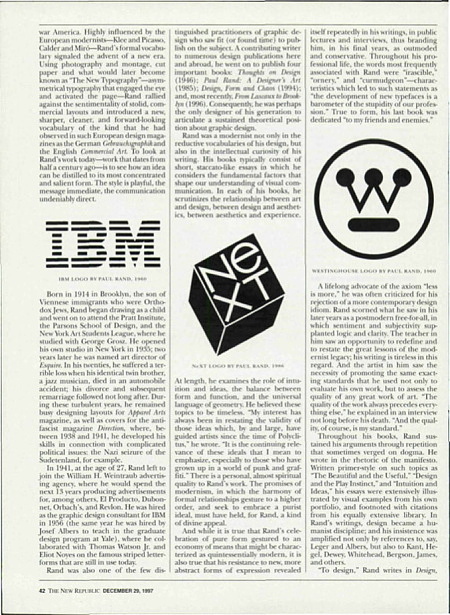
In the mid-’50s, Rand produced his most successful logo, the trademark for IBM. Working closely with Eliot Noyes, IBM’s consulting director for design, he understood that what mattered was a flexible logo that could be interpreted in different ways by different designers to suit different needs within the corporation. For Rand, this translated into a kind of modular thinking: taking his philosophical cues from architecture (and in particular from the writings of Le Corbusier on similar principles in architecture), he experimented with proportion, scale, color, and humor. For the IBM logo, this translated into a basic equation in which the fundamental mark might be duplicated, rotated, colorized, or mutated in such a way as to play the variable against the constant, In 1970, he extended the boundaries of this notion to include an “eye-bee-m” pictogram which has been widely used in posters and promotional materials ever since.
The trademark itself (commissioned by the conservative Thomas Watson Jr. largely in response to his great competitor Olivetti) was based on City Medium, an obscure typeface designed by George Trump in 1930. Rand designed the initial logo in 1956. Four years later he added the stripes, in an effort to minimize the discrepancy in character widths between the narrow “I” and the wider “B” and “M.” His inspiration in striping the letterforms came from observing the multi-lined striations on legal documents designed to discourage counterfeiting. By weighing up the stripes, Rand modernized the font, simplified the mark, and gestured to a kind of visual speed one might tightly associate with a technology company. (He also believed that stripes had a universal appeal, evoking images including Romanesque architecture and Parisian fashion.) Rand went on to design a 13-line variation and later an 8-line variation, which remains the corporate standard today.
IBM is perhaps more the exception than the rule. Rand typically designed trademarks, not corporate identity programs. His marks were simple, modern, geometric abstractions of letterforms, recognizable shapes, and symbols. He designed them to work at any scale or at an angle, on the side of a truck or emblazoned on an annual report cover—but they were rarely conceived of as part of larger, more complex communications programs, designed to embrace evolution and permutation over time or across disparate media. For Rand, a modern mark was a simple mark, and the secret to making things last lay in keeping them simple. In keeping them simple, he was indeed able to lay claim to the greatest endurance record of any trademark designer to date: while the Westinghouse logo was retooled five times between 1900 and 1953, Rand’s 1960 redesign has remained intact for 37 years. His 1961 logo for UPS has lasted almost as long. (It is now reportedly being redesigned by Pentagram.)
Do these logos succeed where others fail merely because they are simple? Are they better because they are ubiquitous, making us recognize them more quickly and behave more efficiently as a result? Or do we tire of their inertia, demanding more from our emblems than predictability and sameness? Many classic marks that previously achieved success through widespread recognition—the bell in Bell Telephone, for instance—have been given face-lifts in recent years. These upgraded marks may remain simple in theory, though in practice they reflect more complex uses and are of a more idiosyncratic nature. It is interesting, too, to note the degree to which stripes, particularly in the mid-1980s, started to take on a kind of visual identity of their own, gracing marks for such corporate giants as AT&T (Saul Bass, 1984), Nynex (Lippincott and Margulies, 1984), and the traditionally depicted, though striped. Prudential rock (Lee and Young, 1984).
Today’s marks face even greater performance expectations as they compete for attention in a media landscape dominated by increasingly kinetic media. Modernism notwithstanding, a timeless logo is, for some, little more than a tired logo. Consider the UPS logo: fixed and predictable, a beige package trapped inside a heraldic shield on a flat, brown field. Once an emblem of the solid reliability of the United Parcel Service, it is now little more than a gloomy graphic portrait of snail-mail—a fact somewhat exacerbated by the clean look and nononsense efficiency of its greatest competitor, Federal Express, reborn not long ago as “FedEx” in a cheery orange-and-purple identity program redesigned by Landor Associates. Or think of the ABC logo: compared to NBC’s fluttering peacock, or CBS’s blinking eye, Rand’s 1962 logo is surprisingly static fare for television—a modernist bubble sporting Bauhaus typography, but static nonetheless.
Looking back on his prolific career, it is paradoxical to think that the man who gave graphic life to such technological giants as IBM, IDEO* (the international technology think tank based in Northern California), and Steve Jobs’s NeXT should himself have been so averse to the computer. How could Rand, the devout modernist, be so openly resistant to the progressive changes brought about by the machine, the symbolic child of modern industry? It is as though the mine geometric forms that embodied the logic of mechanical reproduction, the same formal vocabulary that inspired his mentors and defined the very spirit of modernism, were available to Rand only in theory.
Such contradictions underscored his entire career. The darling of corporate America for decades, Rand rejected the lure of city life, choosing to work alone in his home studio in Connecticut for the better part of his career. He claimed to despise academia, but he remained a devoted member of the Yale faculty for over 35 years, it is likely that the orthodoxy that characterized both his relationship to design and his relationship to God was an attempt to resolve these contradictions, to right the balances, to establish order in the studio and in the spirit. But the contradictory impulses remained: “Five is better than four, three is better than two,” he often announced to his students, claiming that the mind worked harder and received a greater sense of reward when resolving asymmetrical relationships on the page.
As Rand grew older, such lessons were taught with even greater passion and emphasis. At the same time, in his own work, the pioneering spirit that led him to push the boundaries of expression in the early years grew decidedly less ambitious. With each successive book, the editorial organization is looser, the type is larger, and the writing is weaker. Rand’s last book, From Lascaux to Brooklyn, is in many ways his weakest book. The precision that qualified the earlier essays is missing, the ideas follow a less logical path, and the marginalia from philosophy, aesthetics, and literature combine somewhat randomly with Rand’s brazen, ex cathedra statements. And yet it is a passionate and exuberant book. ‘The impulse to creation knows no exception—fashionable or practical,” he writes. “Cosmetics or jewelry, flatware or footwear, hammers or nails—it is the urge to invent, to solve problems, visual or mechanical, that really matters.” There is Rand’s testament, there is Rand going out in a blaze of brains and glory.

