
The Original Text
By Jon Bowermaster. Photography by Michael O’Brien
Creator of the best-known corporate logos in existence, the legendary Weston designer still draws accolades, and clients, from around the world.
PAUL RAND WAITS FOR A VISITOR IN THE doorway of his Weston home, shielded from an icy winter rain that has turned his winding drive into a sheet of black ice. As he leads the way through the halls of the house he designed and built 38 years ago, he passes a painting by Picasso, a chair by Le Corbusier, a Bang & Olufsen stereo, and a collection of ceramic whistles from Portugal.
The 74-year-old graphic designer—known as the father of the modern corporate icon and famous for the logos he created for IBM, Westinghouse, UPS, and ABC—wears a stylish yellow-and-red-checked shirt with a brown knit tie, a green-and-red watchband, and a green-and-red stretch belt. His keys hang deep in his right-hand pants pocket from a silver chain hooked to his belt. Obviously this small, fragile-looking fellow, who “has contributed more to graphic design than anybody in the last few decades,” according to a recent international jury of his peers, leads a well-designed life. This is evident in his home, in his dress, and in the six decades of design work that have garnered him riches and countless accolades.
But when asked if he designed his career with as much calculation and precision as he obviously has his surroundings, Rand is evasive. “That’s like asking a racehorse how he wins the race. He doesn’t know, and if he did he wouldn’t tell you” is as direct an answer as he’ll give.
That same feistiness (what the designer’s book publicist at Yale refers to as his “volatile nature”) propelled Rand up and out of the Brooklyn neighborhood where he was born in 1914. Today millions of people see his unsigned artwork every day—on street corners, television sets, and billboards, in cities and on back roads around the globe. “His logos are the most copied in the world,” says Alan Fern, the director of the National Portrait Gallery and a graphic arts historian. “Any number of young designers view him as a model. It’s easy to be inspired by his work.”
Despite his years, Rand shows no hint of slowing down. An animated conversationalist, he continually bounds from his chair to fetch a poster or book to illustrate a point. He calls frequently to his wife of 13 years, Marion, whom he affectionately calls Swan. “Hey, Swanee, have you seen that Baruch job?” or “When did Steven Jobs first call?” She shouts back authoritatively with details Rand himself can’t quite put a finger on. “She’s a real doll,” he says of his spouse, publicist, and in-house critic.
Rand’s celebrated logos—IBM’s striped icon, ABC’s lowercase letters, UPS’s wrapped package—have become American institutions in their own right, and he continues to create more. Most recently he designed the logo of Apple Computer co-founder Steven Jobs’s new company, Next Inc., which rolled out its first personal computers last October. And Rand’s nearby workroom contains sketches for yet another corporate logo. He cryptically describes the project as “an enormous job for a company much bigger than Next but smaller than IBM.” He won’t name the firm.
A SELF-STARTER, RAND TOOK CLASSES at the Pratt Art Institute in Brooklyn while still a high school student. He was initially intent on becoming an illustrator, even submitting a drawing of himself, instead of a photograph, to the high school yearbook. His illustrations were influenced by books and paintings from Europe, and his style was more reminiscent of Picasso than Norman Rockwell.
But he gave up on the idea of making a living as an illustrator when, in 1932, he won a scholarship to the Parsons School of Design in Manhattan. Two years later he opened his own studio as a freelance designer, working out of a cramped office on 31st Street in Manhattan. “The room was the width of the door and as big as a table—I literally had to crawl over the desk to sit at it. It was just big enough to get a girl into if she wasn’t too fat, and it cost 15 bucks a month,” he says with a laugh. “And I shared it with another designer.”
He began talking on a variety of projects. “I did everything a kid does starting out—lettering, layouts, drawings, you name it,” he proclaims, leaping out of his chair to grab some examples. “Agencies would call, and I’d do rush jobs—chalk renderings for Young & Rubicam of salads for their Nabisco account, for example. I’d do anything for a client, even shovel snow. I was making $10 a week,” he remembers, “and I thought I was hot stuff.”
He was hot, and his reputation among ad agencies and magazines took off. In 1937, when he was 23, the four-year-old Esquire magazine named him art director. “Most of the people there were twice my age,” he remembers, “and the magazine was already filled with famous writers, like Hemingway and Fitzgerald. It was a great job.
“But I never put all my eggs in one basket—by design,” he goes on “I always wanted to feel independent, so if I didn’t like a job I could say goodbye. I never worked exclusively for anyone.” Fulfilling that need for independence, Rand left Esquire in 1941 and joined an ad agency, though he continued to freelance. His newspaper ads for Ohrbach’s department store in New York, movie posters for 20th Century Fox, and magazine covers for influential art publications like PM set the design standards of the day and were distinguished by their use of abstract images, unusual typography, and backgrounds of bold, flat color. Rand employed the same techniques in designing jackets for books by John Hersey and H. L. Mencken, posters for the Museum of Modern Art, and labels and boxes for EI Producto cigars.
In 1946, at the urging of a New York publisher, he published his first book, Thoughts on Design—a collection of 107 of those advertisements, book jackets, and posters, now in its fourth printing. In a book review, Time declared that his ads were “sometimes as pristine as good abstract painting, sometimes as jumbled as Dadaism on an off-day. But unlike many frustrated ad artists, who like to paint ‘the real thing’ on Sundays, Rand believes he can put his art in ads.” By the age of 32, the designer was earning a remarkable $75,000 a year as a freelancer and challenging the traditions of advertising. “He was producing advertisements as sensitive as paintings by Miro and Matisse,” says historian Fern.
Rand’s successes, and his rates, mounted, earning him enough to buy eight acres of land in rural Connecticut (for $17,000) and to build himself a house—a low-slung, stone-and-glass one-story on the eastern border of Weston. But his lasting success and fame weren’t assured until 1956, when IBM design consultant Eliot Noyes hired him to redesign the burgeoning company’s staid logo, which Rand describes as plain and forgettable.
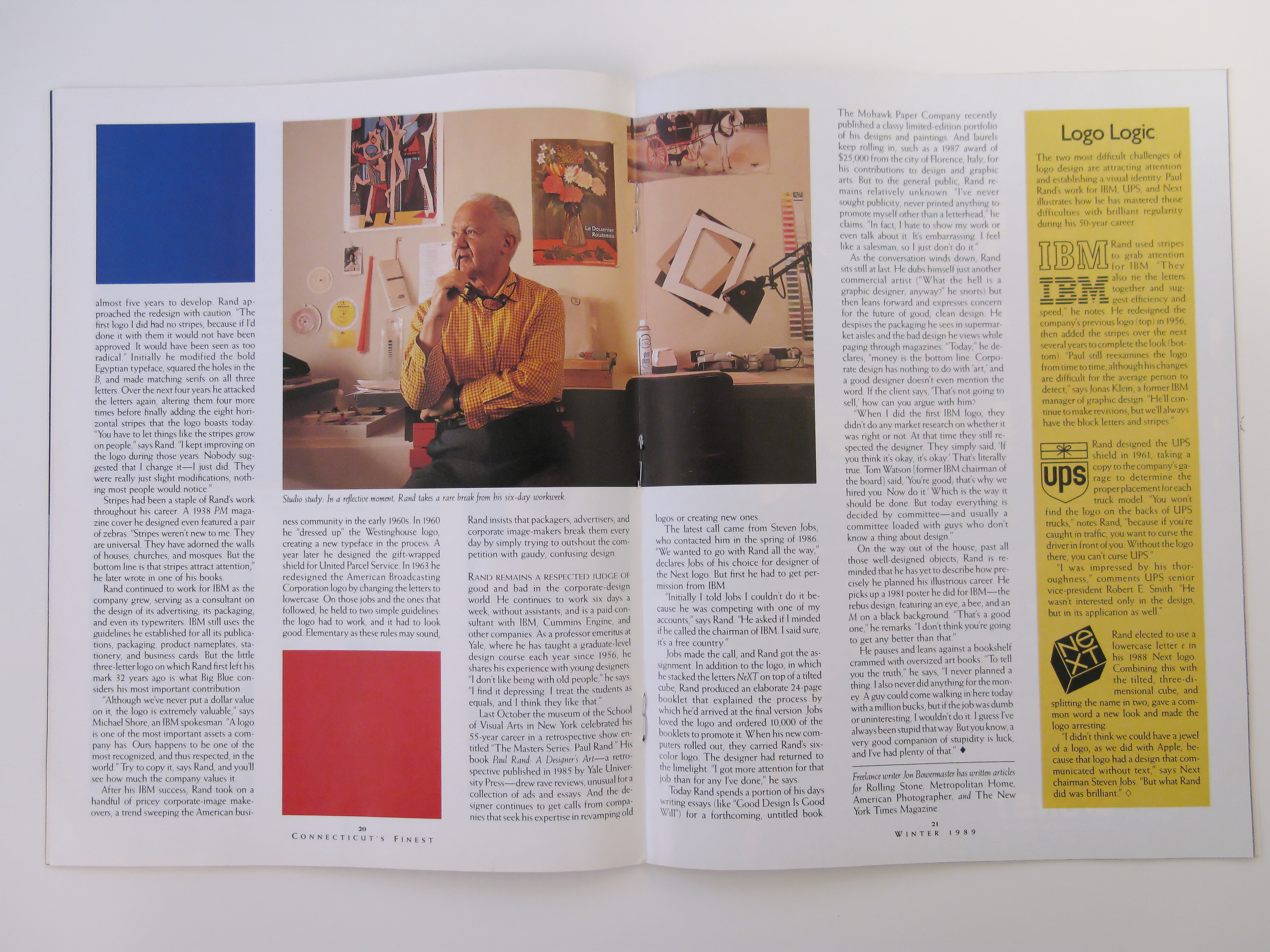
The IBM logo as it appears today took almost five years to develop. Rand approached the redesign with caution. “The first logo I did had not stripes, because if I’d done it with them it would not have been approved. It would have been seen as too radical.” Initially he modified the bold Egyptian typeface, squared the holes in the B, and made matching serifs on all three letters. Over the next four years he attacked the letters again, altering them four more times before finally adding the eight horizontal stripes that the logo boasts today. “You have to let things like the stripes grow on people,” says Rand. “I kept improving on the logo during those years. Nobody suggested that I change it—l just did. They were really just slight modifications, nothing most people would notice.”
Stripes had been a staple of Rand’s work throughout his career. A 1938 PM magazine cover he designed even featured a pair of zebras. “Stripes weren’t new to me. They are universal. They have adorned the walls of houses, churches, and mosques. But the bottom line is that stripes attract attention,” he later wrote in one of his books.
Rand continued to work for IBM as the company grew, serving as a consultant on the design of its advertising, its packaging, and even its typewriters. IBM still uses the guidelines he established for all its publications, packaging, product nameplates, stationery, and business cards. But the little three-letter logo on which Rand first left his mark 32 years ago is what Big Blue considers his most important contribution.
“Although we’ve never put a dollar value on it, the logo is extremely valuable,” says Michael Shore, an IBM spokesman. “A logo is one of the most important assets a company has. Ours happens to be one of the most recognized, and thus respected, in the world.” Try to copy it, says Rand, and you’ll see how much the company values it.
After his IBM success, Rand took on a handful of pricey corporate-image make-overs, a trend sweeping the American business community in the early 1960s. In 1960 he “dressed up” the Westinghouse logo, creating a new typeface in the process. A year later he designed the gift-wrapped shield for United Parcel Service. In 1963 he redesigned the American Broadcasting Corporation logo by changing the letters to lowercase. On those jobs and the ones that followed, he held to two simple guidelines: the logo had to work, and it had to look good. Elementary as these rules may sound, Rand insists that packagers, advertisers, and corporate image-makers break them every day by simply trying to outshout the competition with gaudy, confusing design.
RAND REMAINS A RESPECTED JUDGE of good and bad in the corporate-design world. He continues to work six days a week, without assistants, and is a paid consultant with IBM, Cummins Engine, and other companies. As a professor emeritus at Yale, where he has taught a graduate-level design course each year since 1956, he shares his experience with young designers. “I don’t like being with old people,” he says. “I find it depressing. I treat the students as equals, and I think they like that.”
Last October the museum of the School of Visual Arts in New York celebrated his 55-year career in a retrospective show entitled “The Masters Series: Paul Rand.” His book Paul Rand: A Designer’s Art—a retrospective published in 1985 by Yale University Press—drew rave reviews, unusual for a collection of ads and essays. And the designer continues to get calls from companies that seek his expertise in revamping old logos or creating new ones.
The latest call came from Steven Jobs, who contacted him in the spring of 1986. “We wanted to go with Rand all the way,” declares Jobs of his choice for designer of the Next logo. But first he had to get permission from IBM.
“Initially I told Jobs I couldn’t do it because he was competing with one of my accounts,” says Rand. “He asked if I minded if he called the chairmnan of IBM. I said sure, it’s a free country.”
Jobs made the call, and Rand got the assignment. In addition to the logo, in which he stacked the letters NeXT on top of a tilted cube, Rand produced an elaborate 24-page booklet that explained the process by which he’d arrived at the final version. Jobs loved the logo and ordered 10,000 of the booklets to promote it. When his new computers rolled out, they carried Rand’s six-color logo. The designer had returned to the limelight. “I got more attention for that job than for any I’ve done” he says.
Today Rand spends a portion of his days writing essays (like “Good Design Is Good Will”) for a forthcoming, untitled book. The Mohawk Paper Company recently published a classy limited-edition portfolio of his designs and paintings. And laurels keep rolling in, such as a 1987 award of $25,000 from the city of Florence, Italy, for his contributions to design and graphic arts. But to the general public, Rand remains relatively unknown. “I’ve never sought publicity, never printed anything to promote myself other than a letterhead,” he claims. “In fact, I hate to show my work or even talk about it. It’s embarrassing. I feel like a salesman, so I just don’t do it.”
As the conversation winds down, Rand sits still at last. He dubs himself just another commercial artist (“What the hell is a graphic designer, anyway?” he snorts) but then leans forward and expresses concern for the future of good, clean design. He despises the packaging he sees in supermarket aisles and the bad design he views while paging through magazines. “Today,” he declares, “money is the bottom line. Corporate design has nothing to do with ‘art,’ and a good designer doesn’t even mention the word. If the client says, ‘That’s not going to sell,’ how can you argue with him?
“When I did the first IBM logo, they didn’t do any market research on whether it was right or not. At that time they still respected the designer. They simply said, ‘If you think it’s okay, it’s okay.’ That’s literally true. Tom Watson [former IBM chairman of the board] said, ‘You’re good, that’s why we hired you. Now do it.’ Which is the way it should be done. But today everything is decided by committee—and usually a committee loaded with guys who don’t know a thing about design.”
On the way out of the house, past all those well-designed objects, Rand is reminded that he has yet to describe how precisely he planned his illustrious career. He picks up a 1981 poster he did for IBM—the rebus design, featuring an eye, a bee, and an M on a black background. “That’s a good one,” he remarks. “I don’t think you’re going to get any better than that.” He pauses and leans against a bookshelf crammed with oversized art books. “To tell you the truth,” he says, “I never planned a thing. I also never did anything for the money. A guy could come walking in here today with a million bucks, but if the job was dumb or uninteresting, I wouldn’t do it. I guess I’ve always been stupid that way. But you know, a very good companion of stupidity is luck, and I’ve had plenty of that”.
Logo Logic
The two most difficult challenges of logo design are attracting attention and establishing a visual identity. Paul Rand’s work for IBM, UPS, and Next illustrates how he has mastered those difficulties with brilliant regularity during his 50-year career.
Rand used stripes to grab attention for IBM. “They also tie the letters together and suggest efficiency and speed,” he notes. He redesigned the company’s previous logo (top) in 1956, then added the stripes over the next several years to complete the look (bottom). “Paul still reexamines the logo from time to time, although his changes are difficult for the average person to detect,” says Jonas Klein, a former IBM manager of graphic design. “He’ll continue to make revisions, but we’ll always have the block letters and stripes.”
Rand designed the UPS shield in 1961, taking a UPS copy to the company’s garage to determine the proper placement for each truck model. “You won’t find the logo on the backs of UPS trucks,” notes Rand, “because if you’re caught in traffic, you want to curse the driver in front of you. Without the logo there, you can’t curse UPS.”
“I was impressed by his thoroughness,” comments UPS senior vice-president Robert E. Smith. “He wasn’t interested only in the design, but in its application as well.”
Rand elected to use a lowercase letter e in his 1988 Next logo. Combining this with the tilted, three-dimensional cube, and splitting the name in two, gave a common word a new look and made the logo arresting.
“I didn’t think we could have a jewel of a logo, as we did with Apple, because that logo had a design that communicated without text,” says Next chairman Steven Jobs. “But what Rand did was brilliant.”


