
Estimated reading time: | Select text to share via Facebook, Twitter or Email
12.25 x 9.25 hardcover book with approximately 200 pages and 158 black and white photographs and illustrations pointing towards the future of Sales Displays, circa 1952. Sutnar said “With the world becoming even smaller,a new sense of world inter-dependence comes sharply into focus. And with it,a new need for visual information capable of worldwide comprehension becomes evident. This will require many new types of visual information,simplified information systems,and improved forms and techniques. It will also make urgent the development of mechanical devices for information processing,integration and transmission.These advances will also influence the design of visual information for domestic consumption.”
Sutnar said “If a graphic design is to elicit greater intensity of perception and comprehension of contents,the designer should be aware of the following principles: 1) optical interest,which arouses attention and forces the eye to action; 2) visual simplicity of image and structure allowing quick reading and comprehension of the contents; and 3) visual continuity, which allows the clear understanding of the sequence of elements.”
DESIGN FOR POINT OF SALE beautifully carries these ideas forward. And the contributors’ list reads like a Rosetta Stone of the modern movement.
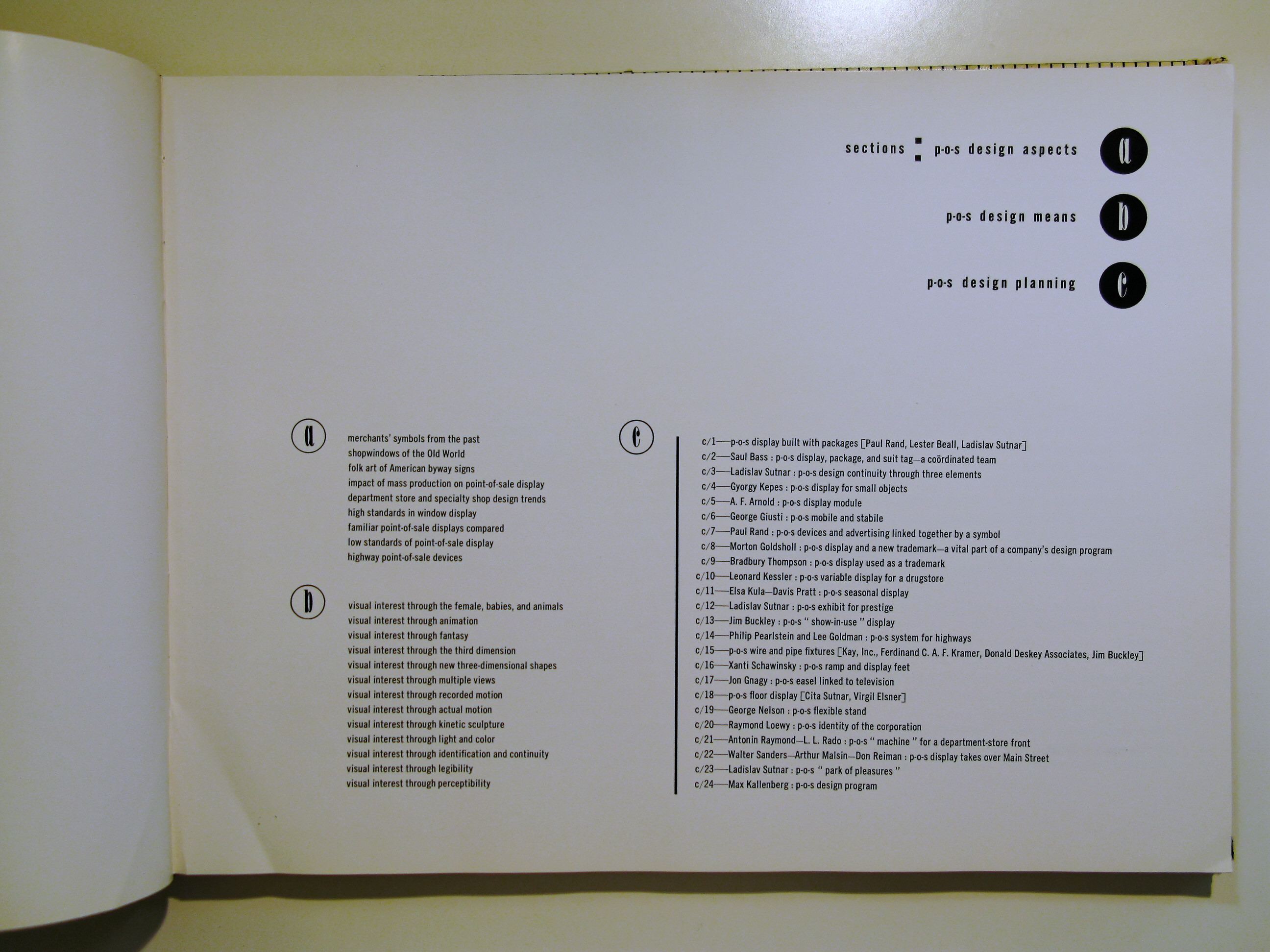
These artists, designers and architects contributed their ideas of P-O-S design planning to this book: Saul Bass, Lester Beall, George Giusti, Morton Goldscholl, Max Kallenberg, Gyorgy Kepes, Leonard Kessler, Raymond Loewy Associates, George Nelson, Paul Rand, Antonin Raymond and L. L. Rado, Xanti Schawinsky, Bradbury Thompson and others.
In addition, these artisans work is represented: Donald Deskey Associates, William Golden, Frederick Kiesler, Saul Steinberg, Alexander Archipenko, herbert Bayer, Joseph Binder, Alexey Brodovitch, Marcel Breuer, Alexander Calder, Werner Graff, Herbert Matter, Laszlo Moholy-Nagy, Ezra Stoller, and many others.
From the book: “This book is concerned with a subject close to all of us, for in some way it affects us each day - from our purchase of a newspaper in the morning to the evening’s last fulfillment of some buying need. Yet despite the familiarity of the subject and its increasing influence on contemporary merchandising, no study of sufficient scope has yet appeared to give precision to the basic definition and analysis which point of sale requires and merits. Therefore it seems timely to fill this gap and to examine those avenues of approach which might suggest new potentials and refreshing discoveries in the design means of merchandising today.”
Sutnar was one of the most ardent advocates of pure visual education in his designs and writings. Sutnar left Czechoslovakia after the Nazi occupation to design the Czechoslovak Pavilion in the World’s Fair in New York in 1939 . He never returned to his homeland. After one desperate year of looking for a job in New York,in 1941 Ladislav Sutnar met Knud Lönberg-Holm,the Danish-born architect who was director of Research at Sweet’s Catalog Service. Holm hired Sutnar as art director. Sweet’s Catalog Service was the producer of trade, construction,and hardware catalogs that were distributed to businesses and architects throughout the United States. Sutnar and Holm radically transformed the organization and presentation of technical and commercial information.
In short time, Sutnar made great progress in researching the effect of typography on the perception of information. He incorporated this experience into visual brochures entitled Controlled Visual Flow (1943) and Shape, Line and Color (1945), whose aim was to educate both designers and clients. Minimum means, maximum effect –that was Sutnar’s Czechoslovak principle. In the U.S. he was the first to use the horizontal area of a spread for organizing information with the idea of dynamic reading and continuous visual flow. He designed the double-page in such a manner that it would be immediately scanned then would quickly provide the details required.
Diagrams, widely used even prior to World War II as a means of visualization and rationalization,were effectively used by Sutnar and Holm in designing their catalogs. Continuous flow of hierarchically-structured information was effected by the laws of optics and psychology of perception.
Sutnar’s information design, based on factual scholarly research,was executed in a creative form.While seemingly simple,Sutnar’s information schemes are quite sophisticated,yet at the same time visually attractive and imaginative.They are fascinating because of their brilliant balance between the strict logic of hierarchical structure and playful imagination ,the rational and irrational, both science and art. Sweet’s catalogues are considered foundling work in the field of information design. Holm and Sutnar together wrote three educational books: Catalog Design (1944 ), Designing Information (1947),and Catalog Design Progress (1950 ) which have been recognized as a milestone of information design.
The Original Text
The symbol or trademark can be the link between advertising and point-of-sale display, and when it contains an element of humor, its effectiveness is often greatly heightened.
…[What we commonly understand as “originality” often depends on the successful integration of the symbol as a visual entity with all other elements, pointed to a particular problem, performing a specific function consistent with its form]…
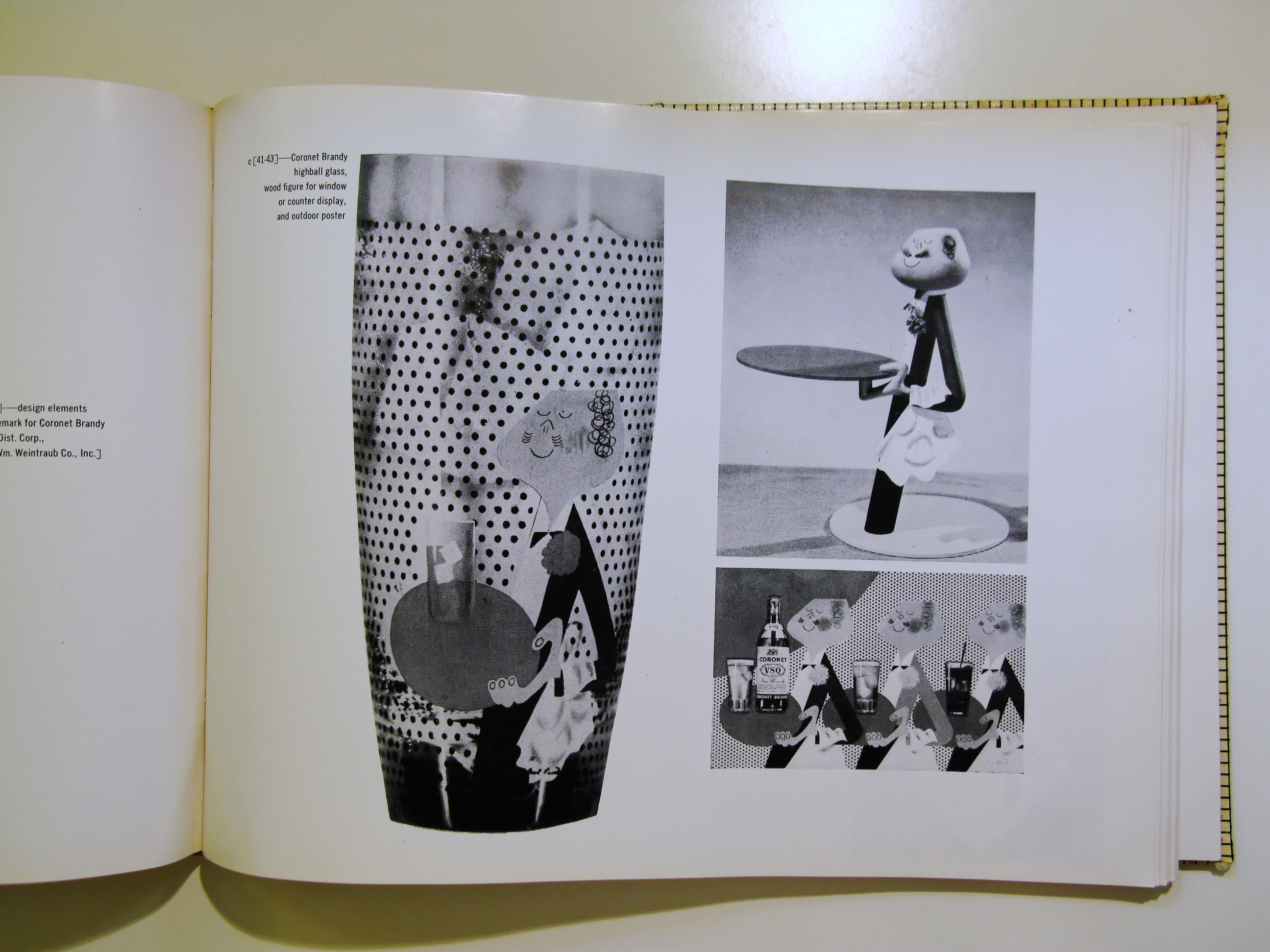
The familiar trademark for Coronet Brandy is built up as a composite of a number of elements, each an integral part of the whole-the waiter with his oval tray, the smiling napkin, and the dots. In addition to the magazine ads that have incorporated these features, these elements have been used at the point of sale in a number of variations.
The highball glass with the trademark silk-screened directly to the glass was applied to both three-dimensional and printed displays. The wood figure is for both window and counter displays, the tray accommodating a bottle and a glass. The twenty-four sheet poster uses the repetitive device of the waiter to point up the various drinks made with Coronet Brandy… On the following pages, in the Gibson Diamond 8 and 12 trademark, the same visual approach has been used and carried in variations for point of sale as well as for salesmen’s aids. The silk scarf shows the Diamond pattern in multi-color form… The DuBouchett trademark is self-explanatory. The figure is so designed that it will accommodate the many different products produced by one company. P.R.


