
NeXT Computers
1986
Logo

Logo Sketches


Branding spec sheets


Collateral


Logo Presentation Booklet

View More


(Use ← → keys to navigate. Click for larger view.)
NEXT
The Sign of the Next Generation of Computers for Education.
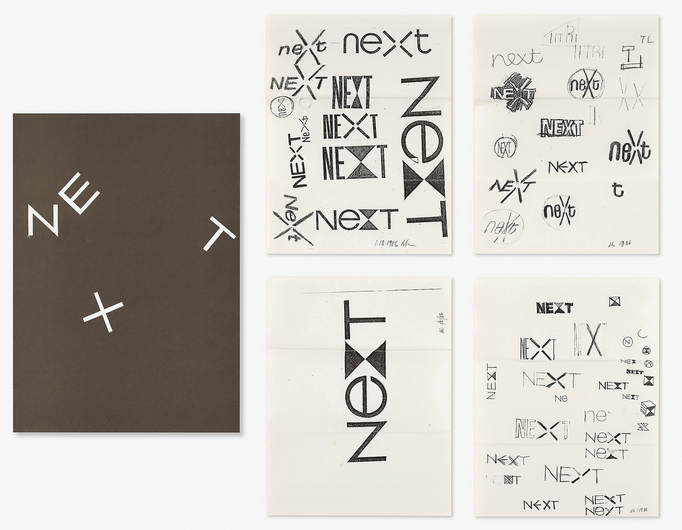
What should a logo for Next look like?
Choosing a typeface as the basis for the design of a logo is a convenient starting point. Here are two examples: Caslon and Bifur. Caslon is an alphabet designed as far back as 1725 by William Caslon. It appears to be a good choice because it is both elegant and bookish, qualities well suited for educational purposes.
Bifur, a novelty face by A. M. Cassandre, was designed as recently as 1929. An unconventional but ingenious design, it has the advantage, to some, of visually implying advanced technology. (Attributing certain magical qualities to particular typefaces is, however, largely a subjective matter.)
One reason for looking at a number of possible typefaces is to satisfy one’s curiosity. Another, and perhaps more meaningful one, is to study the relationship of different letter combinations, to look for visual analogies, and to try to elicit ideas that the design of a letter or group of letters might inspire.
Here are some further choices, but no matter how one may look at these different examples: sans serifs, hairline and slab serifs, condensed, expanded, bold, light, outline… they still say next… like next time, what’s next?, next in line, or even next of kin. The word is in such common usage that it is simply taken for granted.
Personal preferences, prejudices, and stereotypes often dictate what a logo looks like, but it is needs, not wants, ideas, not type styles which determine what its form should be. To defamiliarize it, to make it look different, to let it evoke more than the mere adjective or adverb it happens to be is, it seems, the nub of the problem.
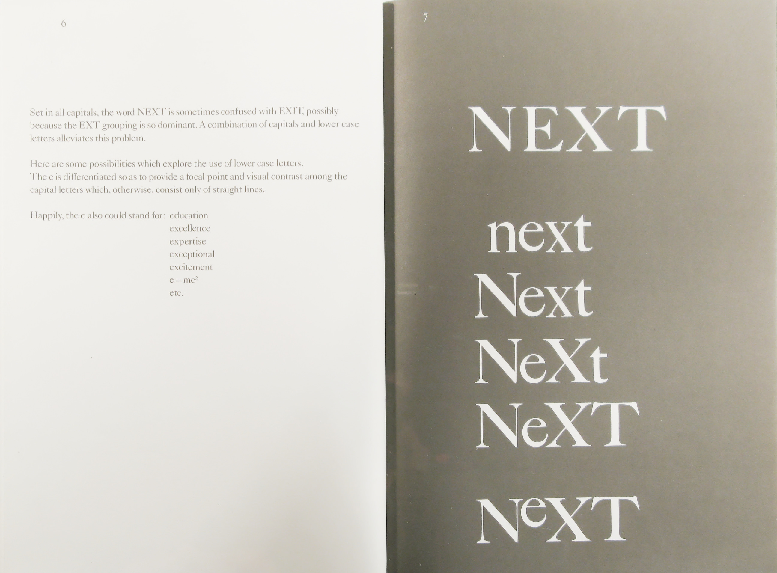
Set in all capitals, the word NEXT is sometimes confused with EXIT possibly because the EXT grouping is so dominant. A combination of capitals and lower case letters alleviates this problem.
Here are some possibilities which explore the use of lower case letters.
The e is differentiated so as to provide a focal point and visual contrast among the capital letters which, otherwise, consist only of straight lines.
Happily, the e also could stand for:
education
excellence
expertise
exceptional
excitement
e=mc2
etc.
Note the difference that the lower case e makes when compared with the capital E. By means of contrast both interest and readability are achieved. This is particularly noticeable in the illustration at the bottom.
These simple, geometric letters make it easier to exploit and manipulate possible visual ideas than do more complex serifed letters.
Ideally, a logo should explain or suggest the business it symbolizes, but this is rarely possible or even necessarv.There is nothing about the IBM symbol, for example, that suggests computers, except what the viewer reads into it. Stripes are now associated with computers because the initials of a great computer company happen to be striped.This is equally true of the ABC symbol which does not suggest TV. The mnemonic factors in both logps are graphic devices: stripes and circles.
In this example the e is the mnemonic factor.
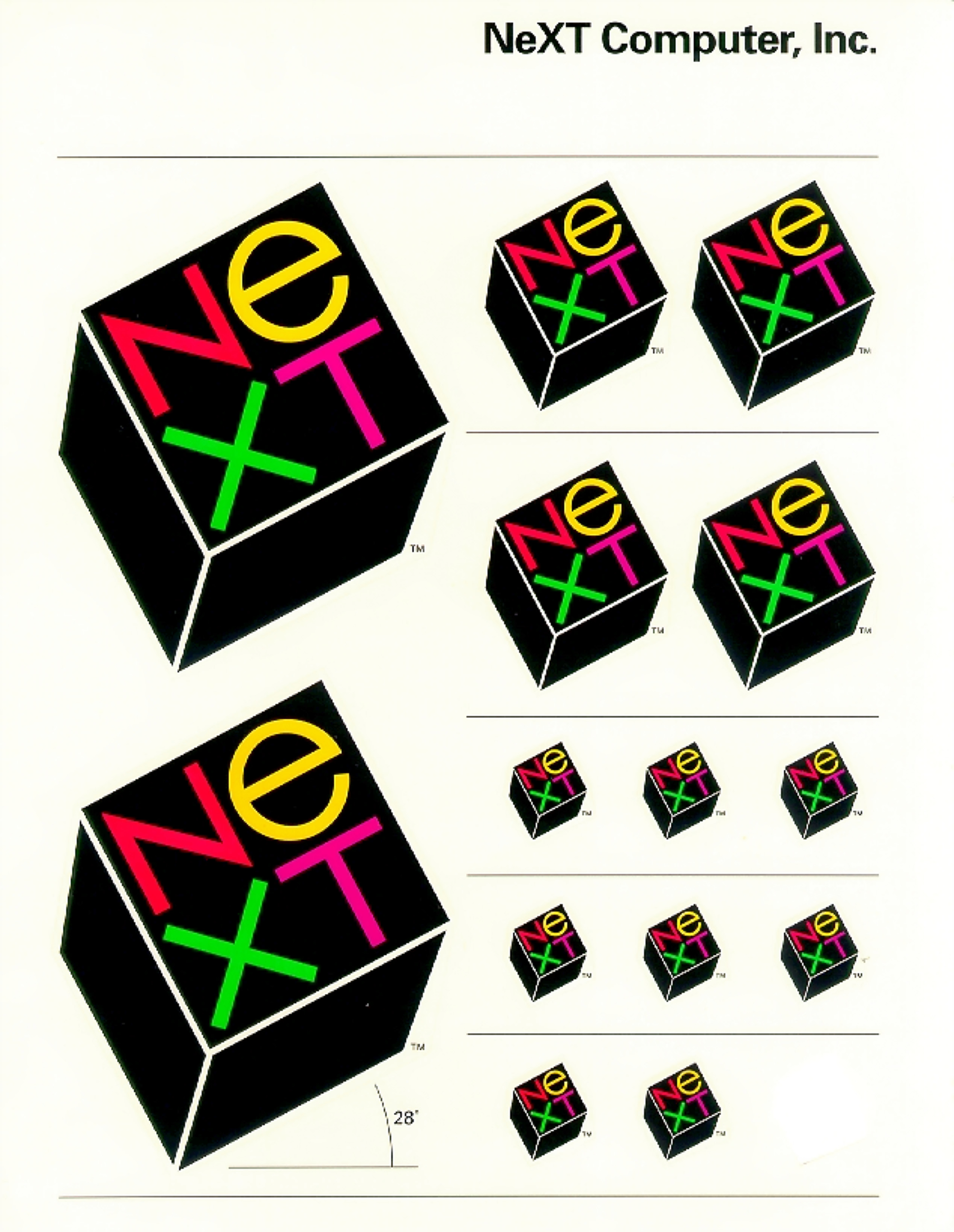
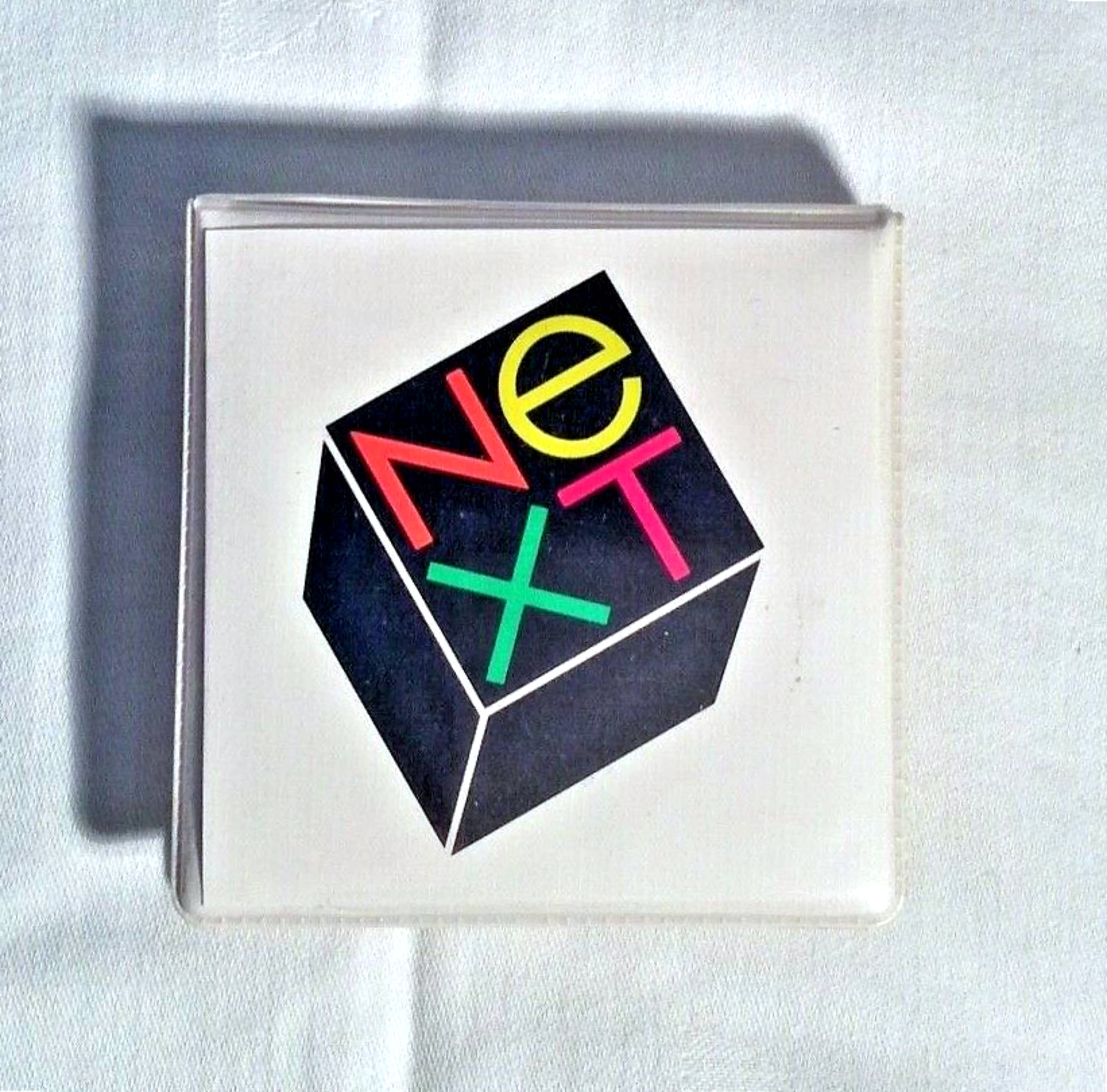
A logo takes on meaning, only if over a period of time it is linked to some product or service of a particular organization. What is needed is finding a meaningful device, some idea that reinforces the memorability of the company name. A black cube can be such a device because it has visual impact, and is easy to remember. Unlike the word Next, it is depictable, possesses the promise of meaning, and the pleasure of recognition.
This idea in no way restricts its application to any one product or concept.
The three dimensional effect functions as an underscore to attract the viewer s attention.
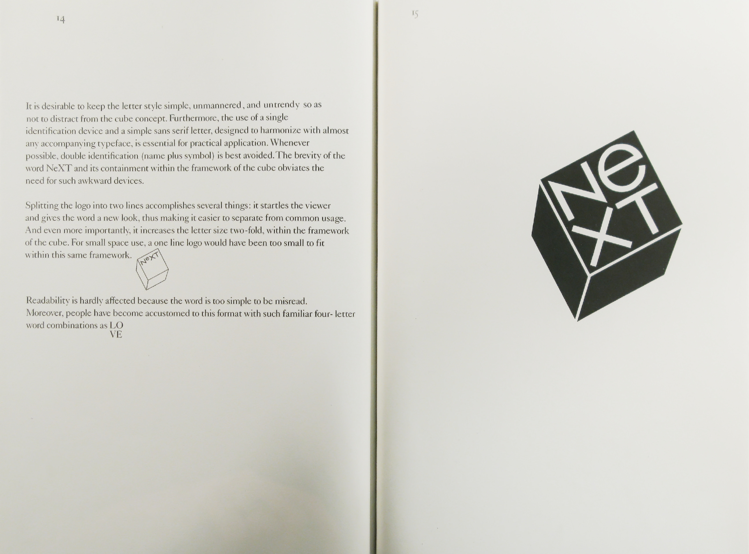
It is desirable to keep the letter style simple, unmannered, and untrendy so as not to distract from the cube concept. Furthermore, the use of a single identification device and a simple sans serif letter, designed to harmonize with almost any accompanying typeface, is essential for practical application. Whenever possible, double identification (name plus symbol) is best avoided.The brevity of the word NeXT and its containment within the framework of the cube obviates the need for such awkward devices.
Splitting the logo into two lines accomplishes several things: it startles the viewer and gives the word a new look, thus making it easier to separate from common usage. And even more importantly, it increases the letter size two-fold, within the framework of the cube. For small space use, a one line logo would have been too small to fit within this same framework.
Readability is hardly affected because the word is too simple to be misread.
Moreover, people have become accustomed to this format with such familiar four- letter word combinations as
LO
VE
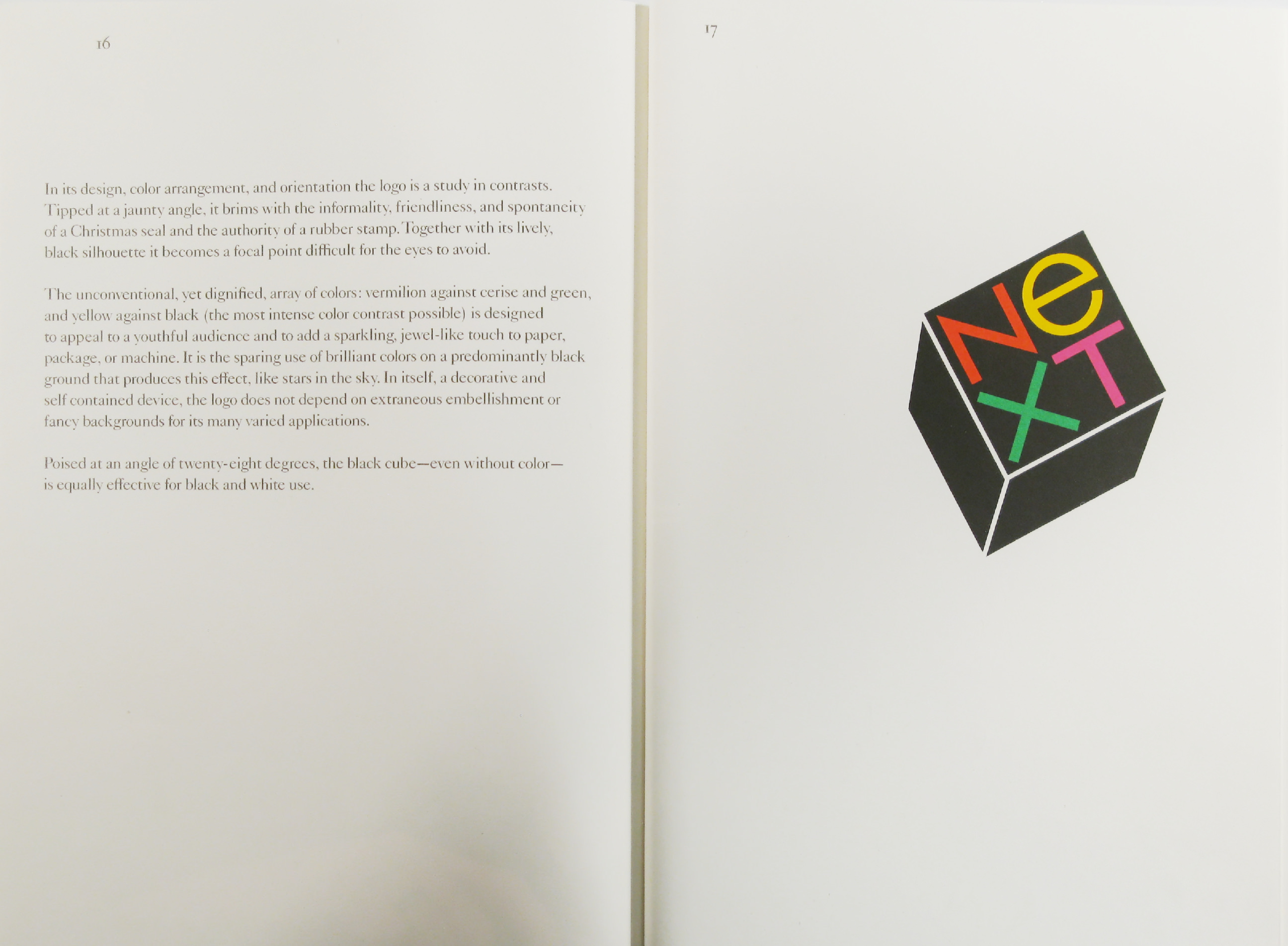
In its design, color arrangement, and orientation the logo is a study in contrasts. Kipped at a jaunty angle, it brims with the informality, friendliness, and spontaneity of a Christmas seal and the authority of a rubber stamp.Together with its lively, black silhouette it becomes a focal point difficult for the eyes to avoid.
The unconventional, yet dignified, array of colors: vermilion against cerise and green, and yellow against black (the most intense color contrast possible) is designed to appeal to a youthful audience and to add a sparkling, jew’el-like touch to paper, package, or machine. It is the sparing use of brilliant colors on a predominantly black ground that produces this effect, like stars in the sky. In itself, a decorative and self contained device, the logo does not depend on extraneous embellishment or fancy backgrounds for its many varied applications.
Poised at an angle of twenty-eight degrees, the black cube—even w ithout color— is equally effective for black and white use.
Here are some other choices.
Many different color combinations are possible.
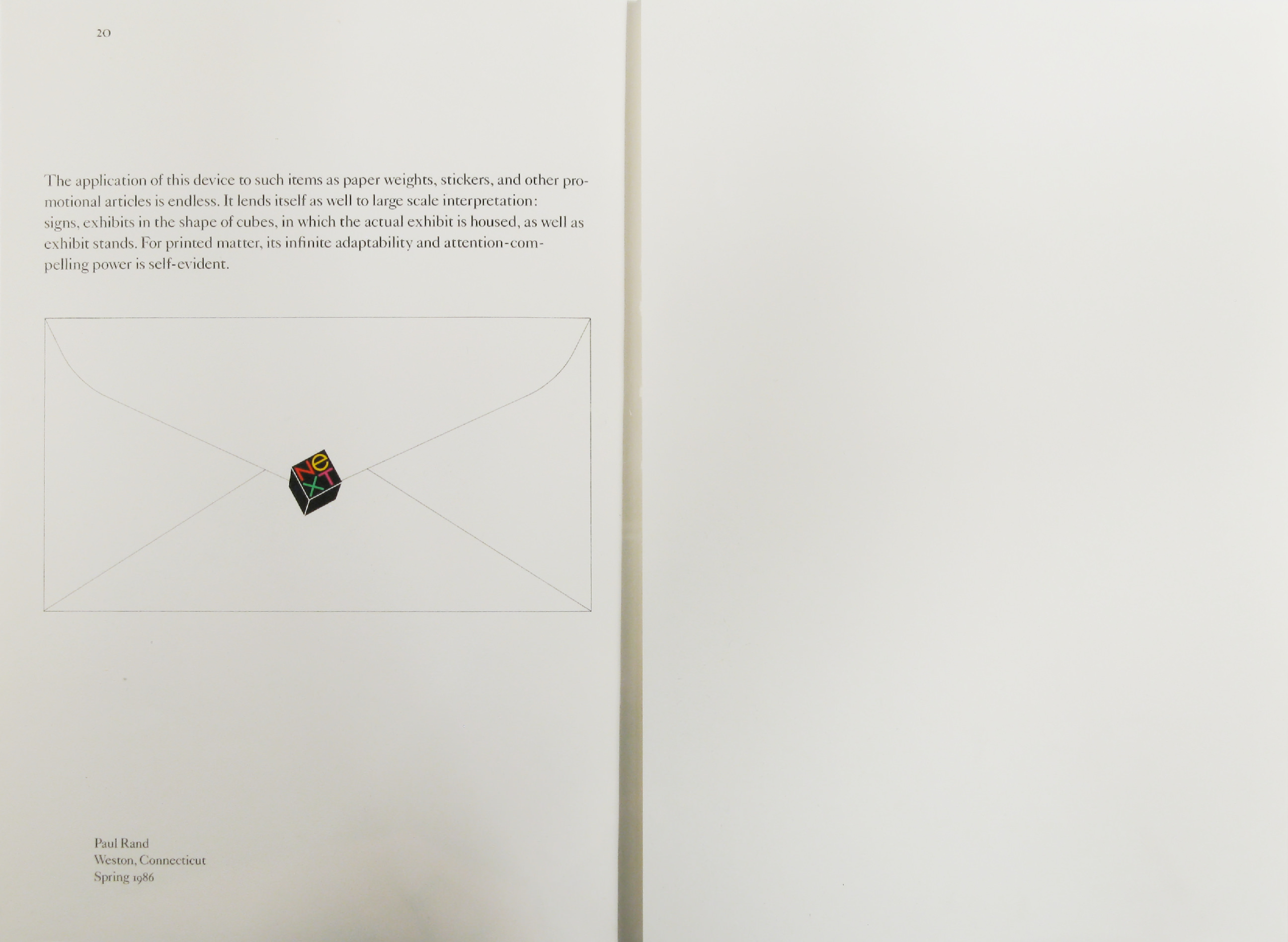
The application of this device to such items as paper weights, stickers, and other promotional articles is endless. It lends itself as well to large scale interpretation: signs, exhibits in the shape of cubes, in which the actual exhibit is housed, as well as exhibit stands. For printed matter, its infinite adaptability and attention-compelling power is self-evident.
Paul Rand
Weston, Connecticut Spring 1986
(Back cover)
Brochure

View More


(Use ← → keys to navigate. Click for larger view.)
Stationery


Poster

Miscellaneous