The Limited
1988
Logo

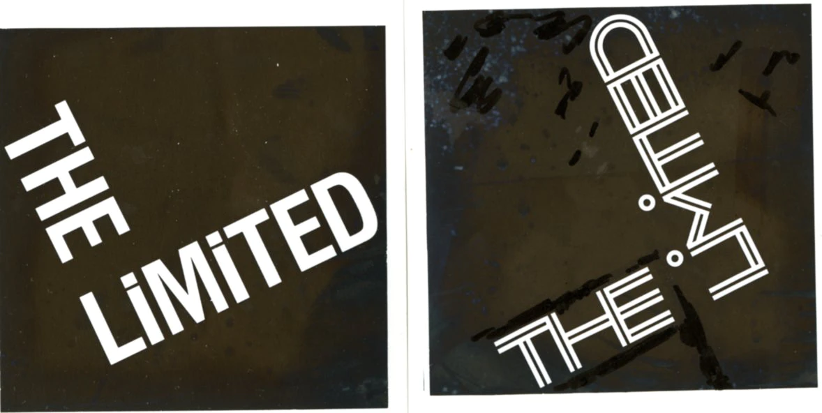
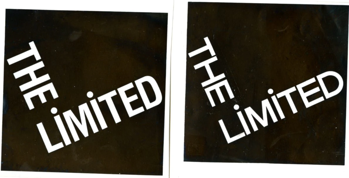
Logo Sketches
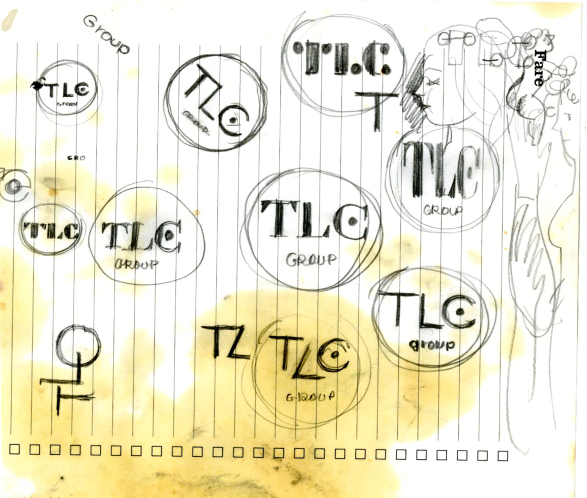
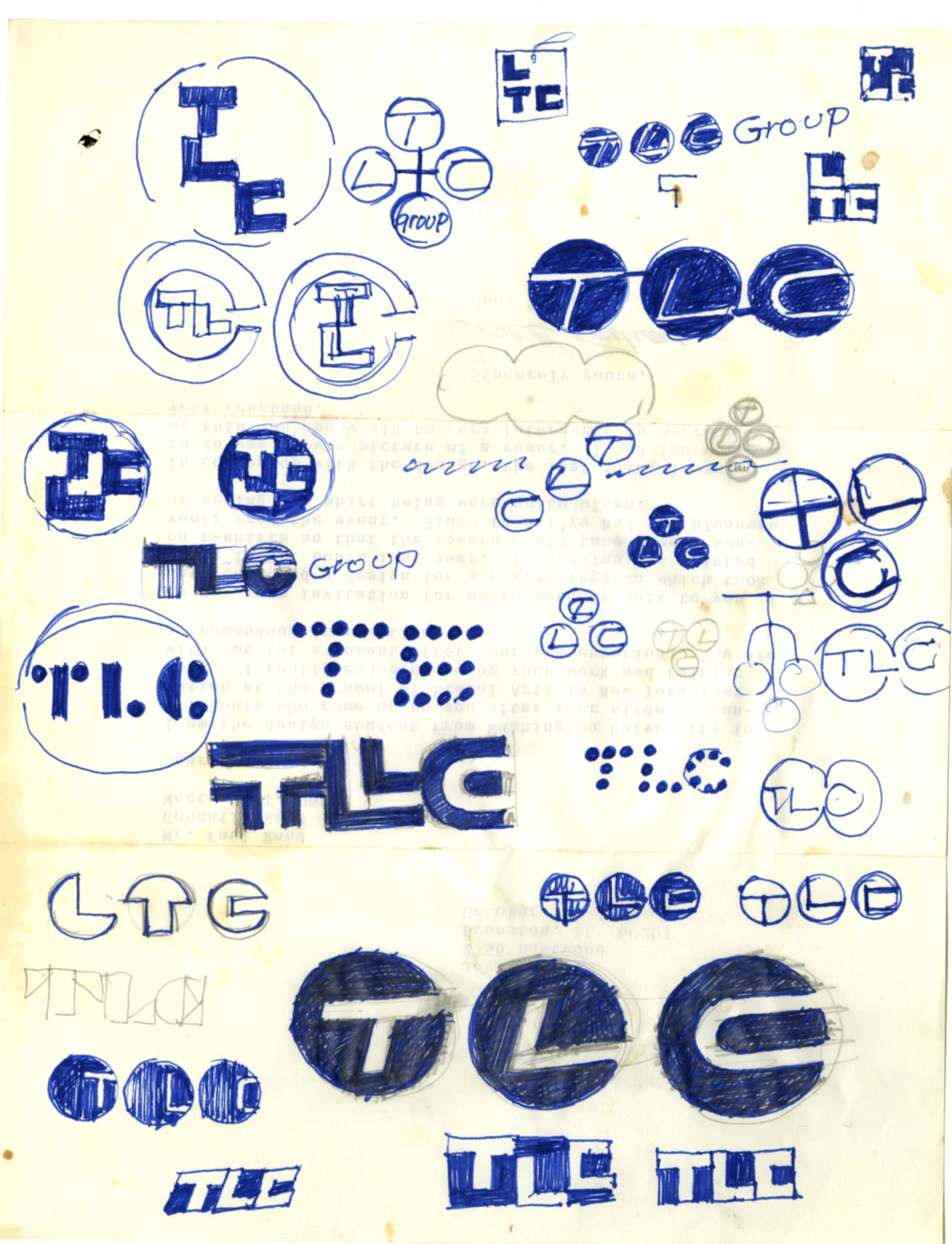
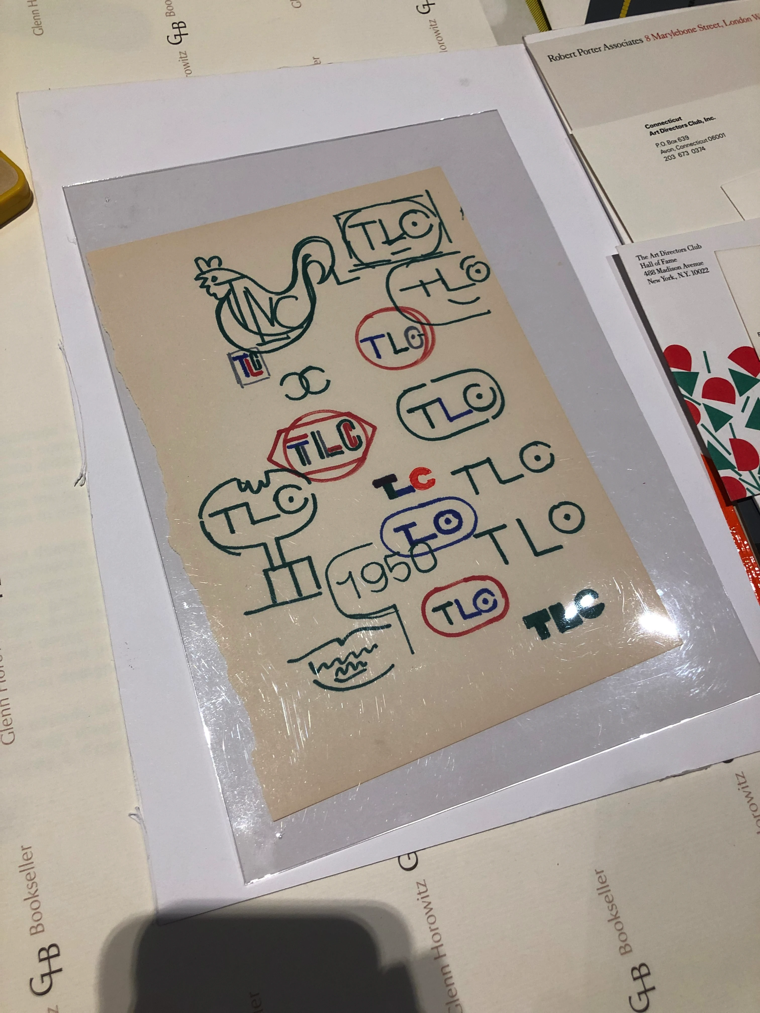
(Use ← → keys to navigate. Click for larger view.)
Logo Presentation Booklet

View More
(Use ← → keys to navigate. Click for larger view.)
A new logo design
for
The Limited
Columbus, Ohio 43216
A new logo design
for
The Limited
Columbus, Ohio 43216
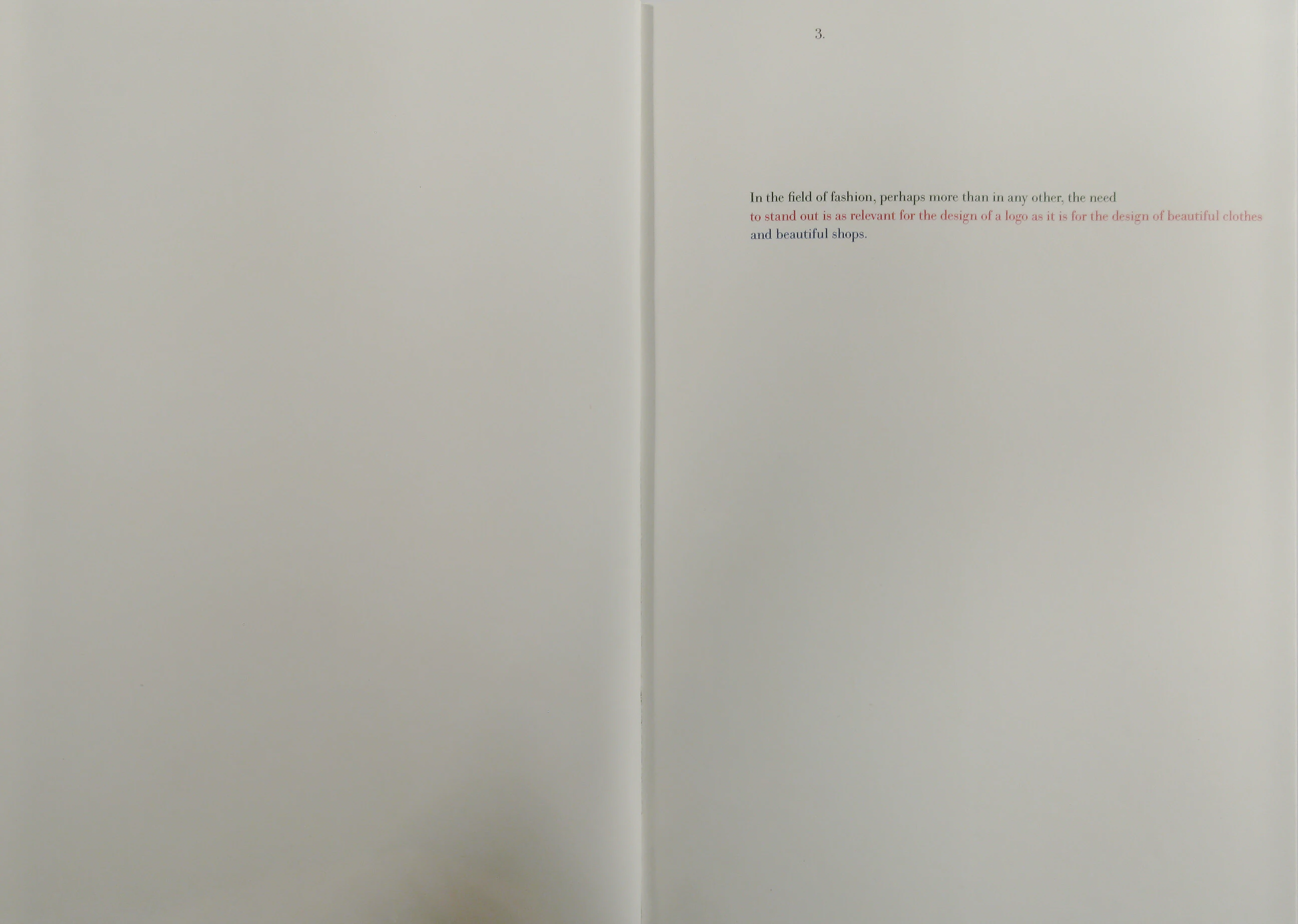
In the field of fashion, perhaps more than in any other, the need to stand out is as relevant for the design of a logo as it is for the design of beautiful clothes and beautiful shops.
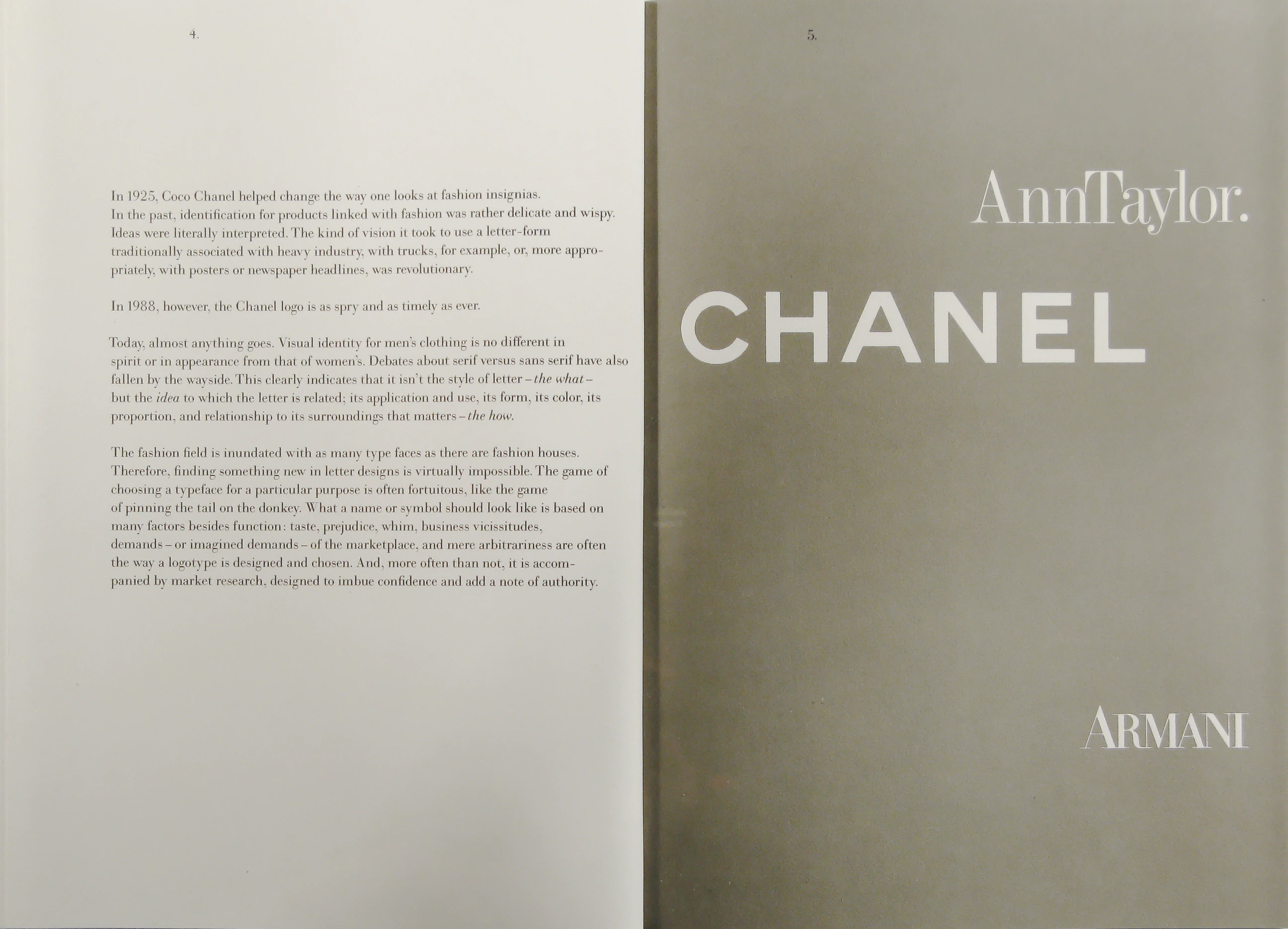
In 1925, Coco Chanel helped change the way one looks at fashion insignias. In the past, identification for products linked with fashion was rather delicate and wispy. Ideas were literally interpreted. The kind of vision it took to use a letter-form traditionally associated with heavy industry, with trucks, for example, or, more appropriately, with posters or newspaper headlines, was revolutionary.
In 1988, however, the Chanel logo is as spry and as timely as ever.
Today, almost anything goes. Visual identity for men’s clothing is no different in spirit or in appearance from that of women’s. Debates about serif versus sans serif have also fallen by the wayside. This clearly indicates that it isn’t the style of letter - the what - but the idea to which the letter is related; its application and use, its form, its color, its proportion, and relationship to its surroundings that matters - the how.
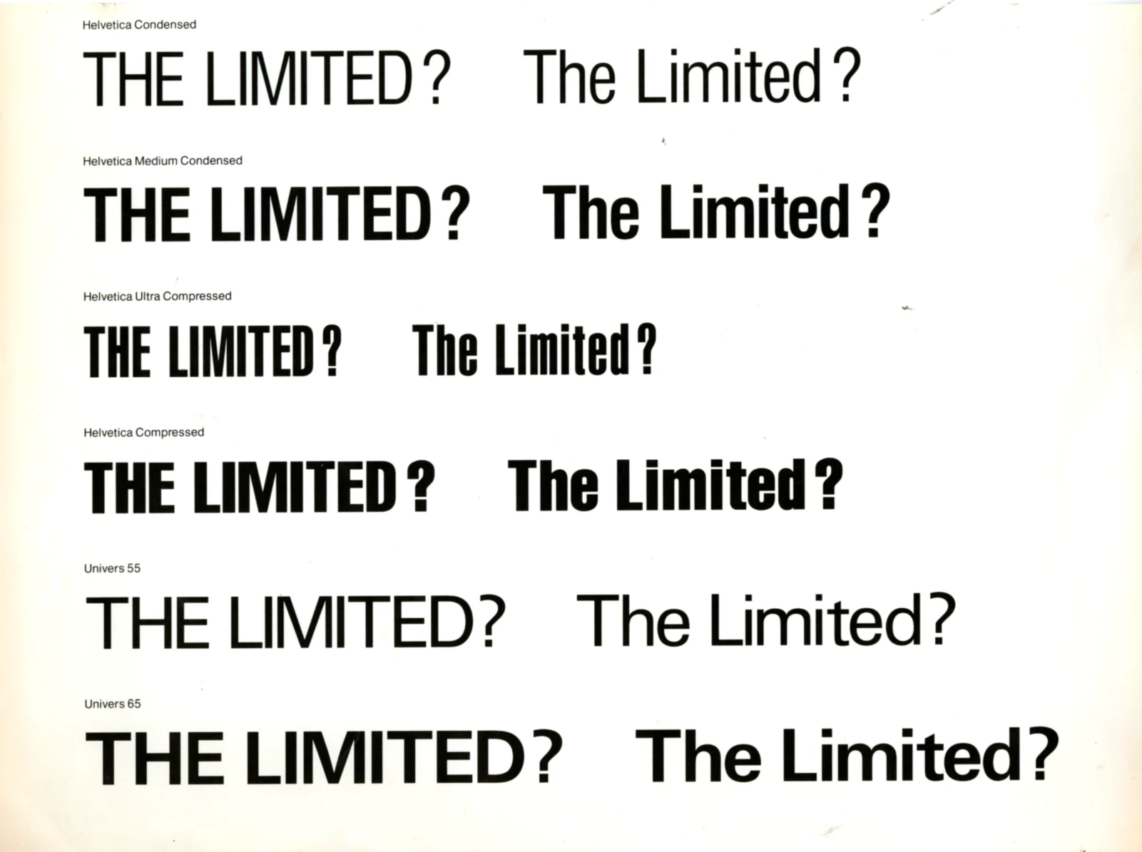
The fashion field is inundated with as many type faces as there are fashion houses. Therefore, finding something new in letter designs is virtually impossible. The game of choosing a typeface for a particular purpose is often fortuitous, like the game of pinning the tail on the donkey. What a name or symbol should look like is based on many factors besides function: taste, prejudice, whim, business vicissitudes, demands - or imagined demands - of the marketplace, and mere arbitrariness are often the way a logotype is designed and chosen. And, more often than not, it is accompanied by market research, designed to imbue confidence and add a note of authority.
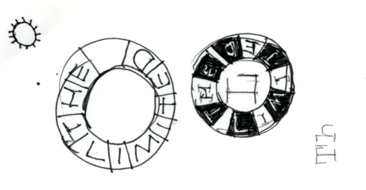
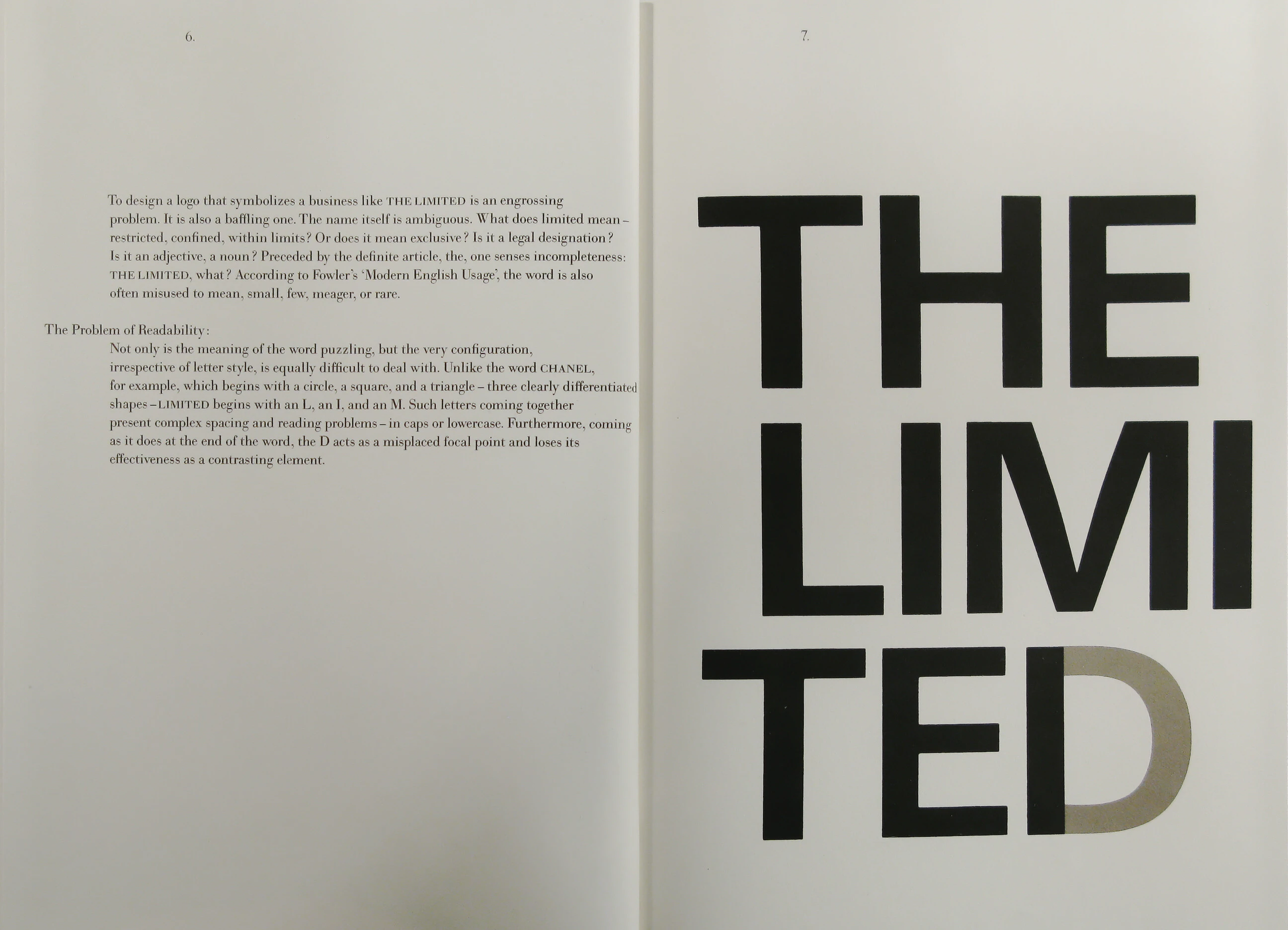
To design a logo that symbolizes a business like THE LIMITED is an engrossing problem. It is also a baffling one. The name itself is ambiguous. What does limited mean - restricted, confined, within limits? Or does it mean exclusive? Is it a legal designation? Is it an adjective, a noun? Preceded by the definite article, the, one senses incompleteness: THE LIMITED, what? According to Fowler’s ‘Modern English Usage’, the word is also often misused to mean, small, few, meager, or rare.
The Problem of Readability:
Not only is the meaning of the word puzzling, but the very configuration, irrespective of letter style, is equally difficult to deal with. Unlike the word CHANEL, for example, which begins with a circle, a square, and a triangle - three clearly differentiated shapes - LIMITED begins with an L, an I, and an M. Such letters coming together present complex spacing and reading problems - in caps or lowercase. Furthermore, coming as it does at the end of the word, the D acts as a misplaced focal point and loses its effectiveness as a contrasting element.
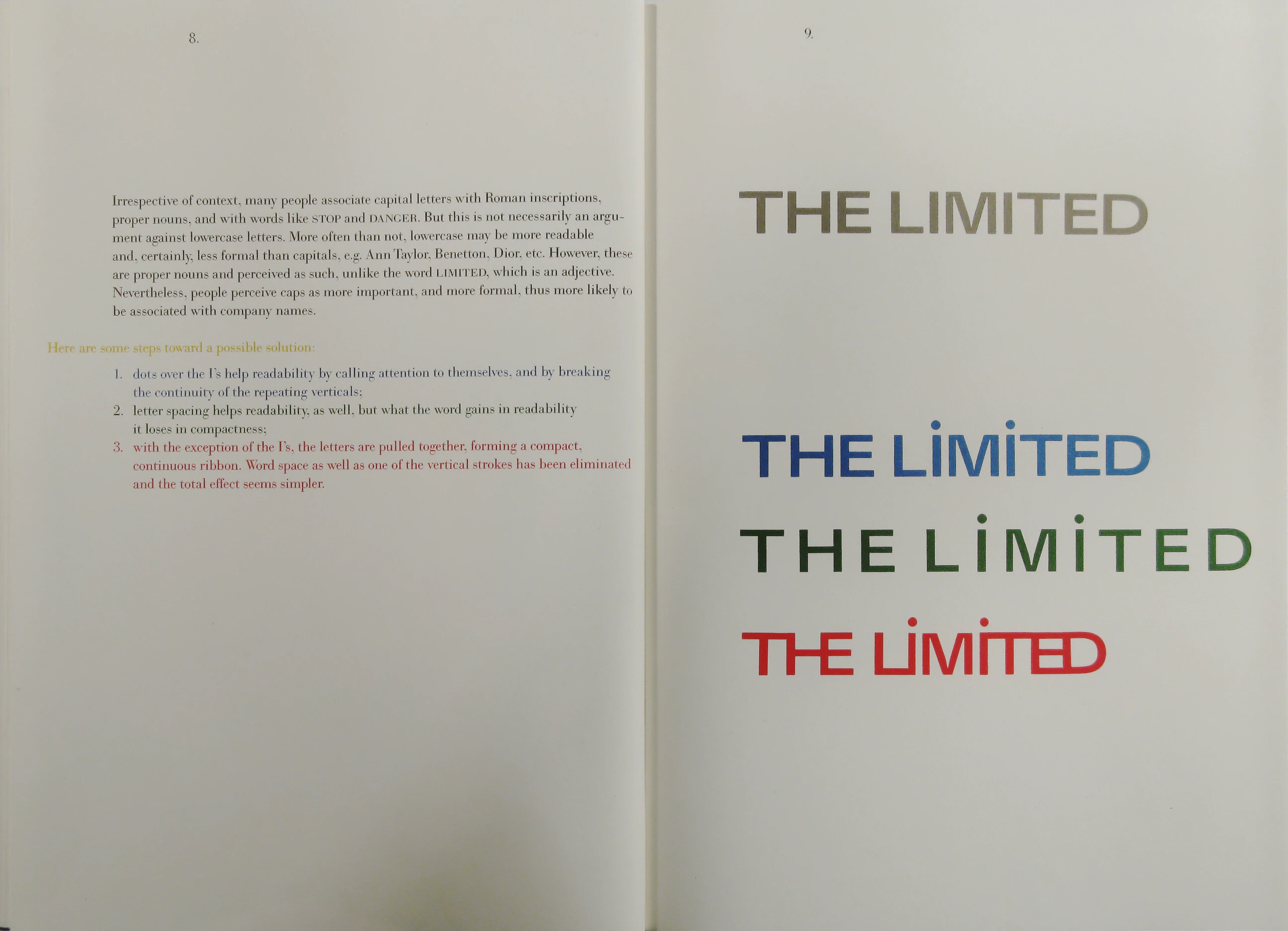
Irrespective of context, many people associate capital letters with Roman inscriptions, proper nouns, and with words like STOP and DANGER. But this is not necessarily an argument against lowercase letters. More often than not, lowercase may be more readable and, certainly, less formal than capitals, e.g. Ann Taylor, Benetton, Dior, etc. However, these are proper nouns and perceived as such, unlike the word LIMITED, which is an adjective. Nevertheless, people perceive caps as more important, and more formal, thus more likely to be associated with company names.
Here are some steps toward a possible solution:
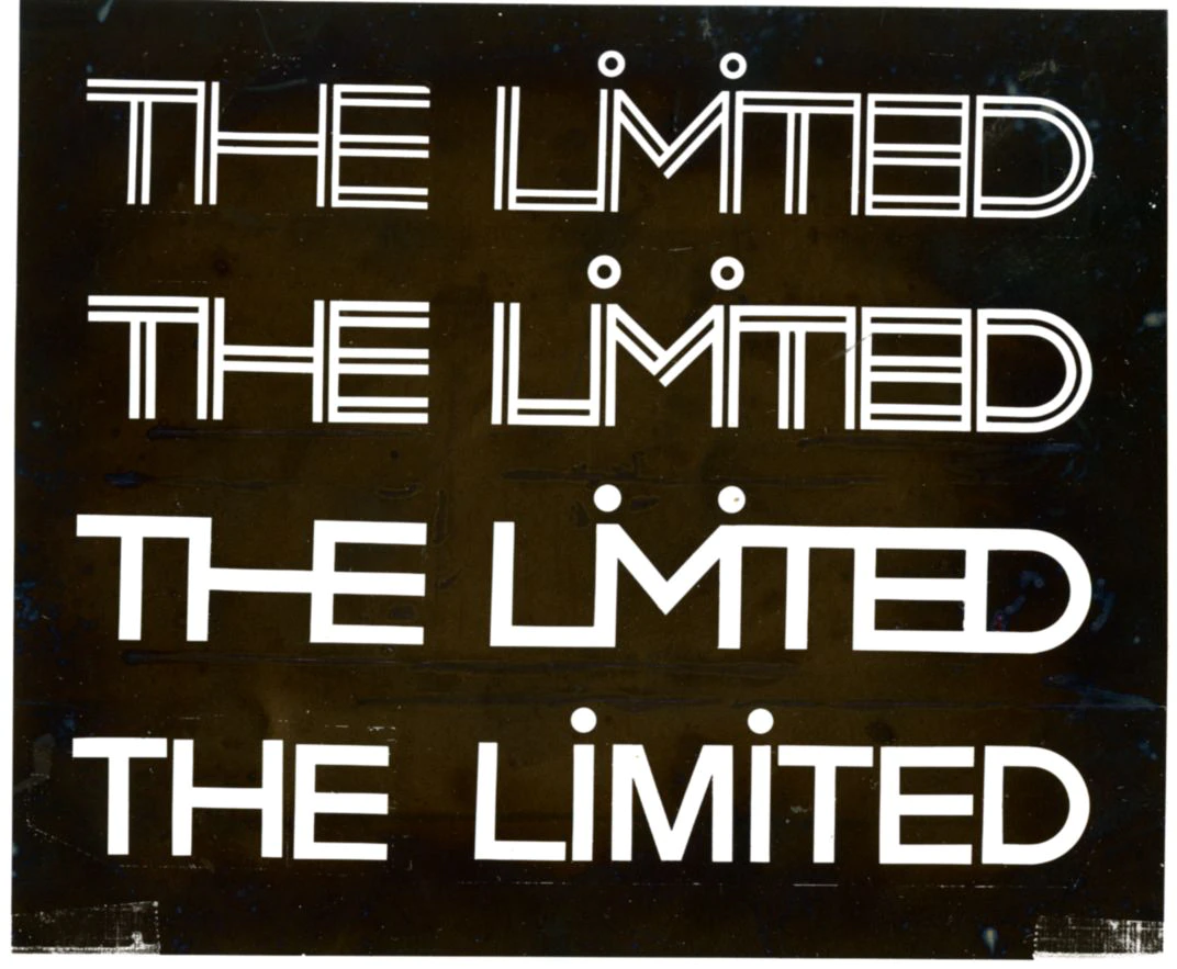
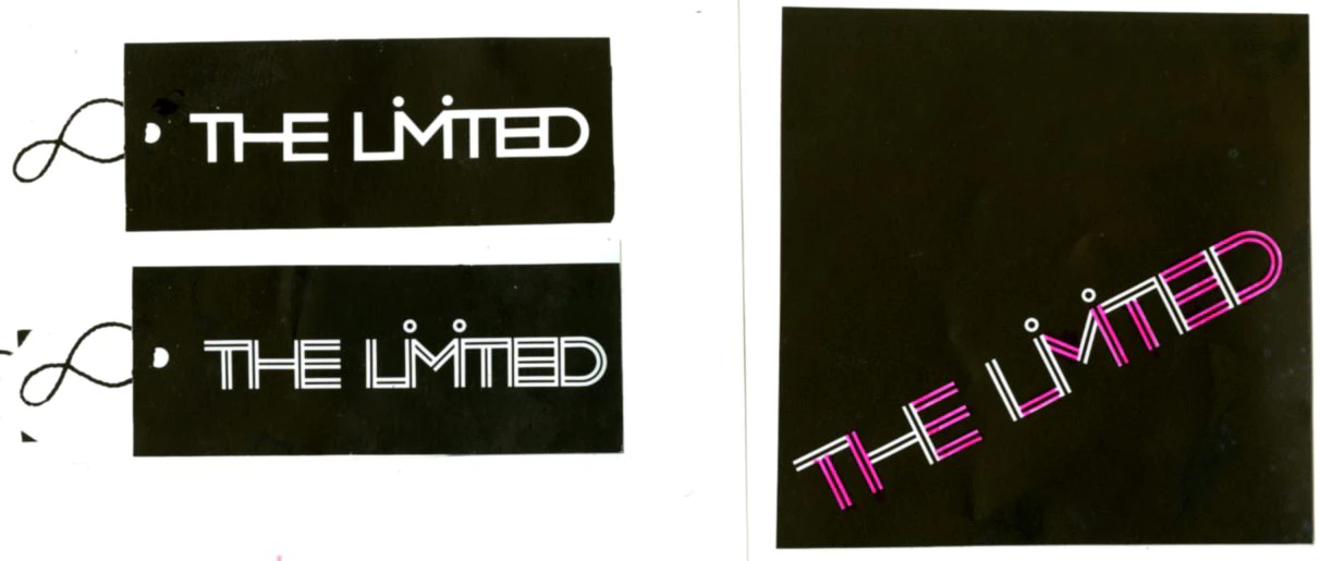
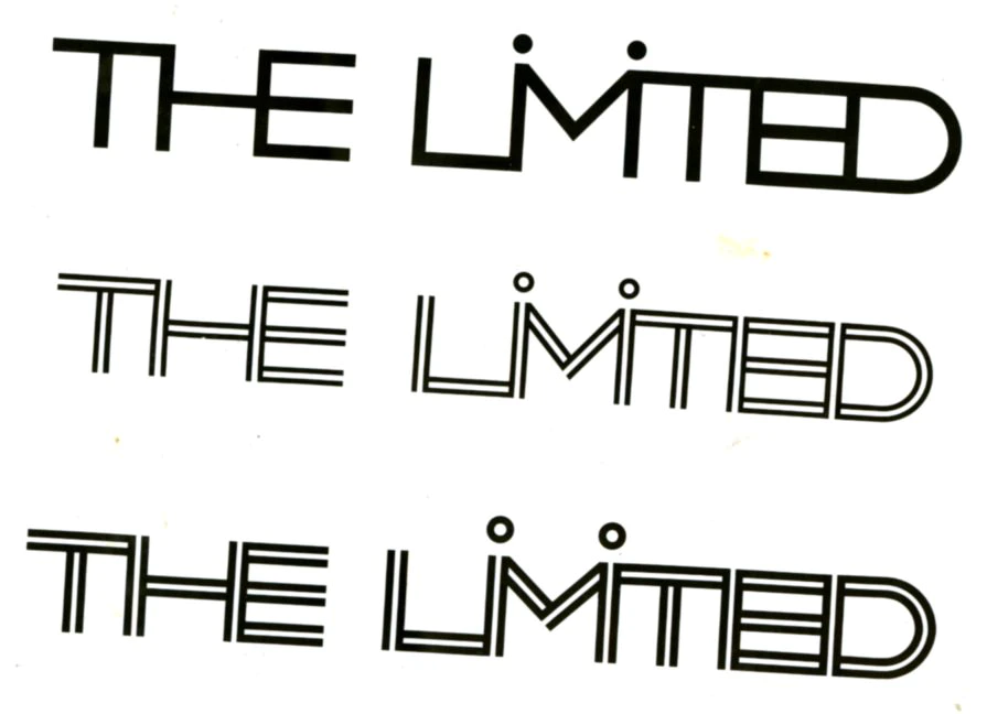
- dots over the I’s help readability by calling attention to themselves, and by breaking the continuity of the repeating verticals;
- letter spacing helps readability, as well, but what the word gains in readability it loses in compactness;
- with the exception of the I’s, the letters are pulled together, forming a compact, continuous ribbon. Word space as well as one of the vertical strokes has been eliminated and the total effect seems simpler.
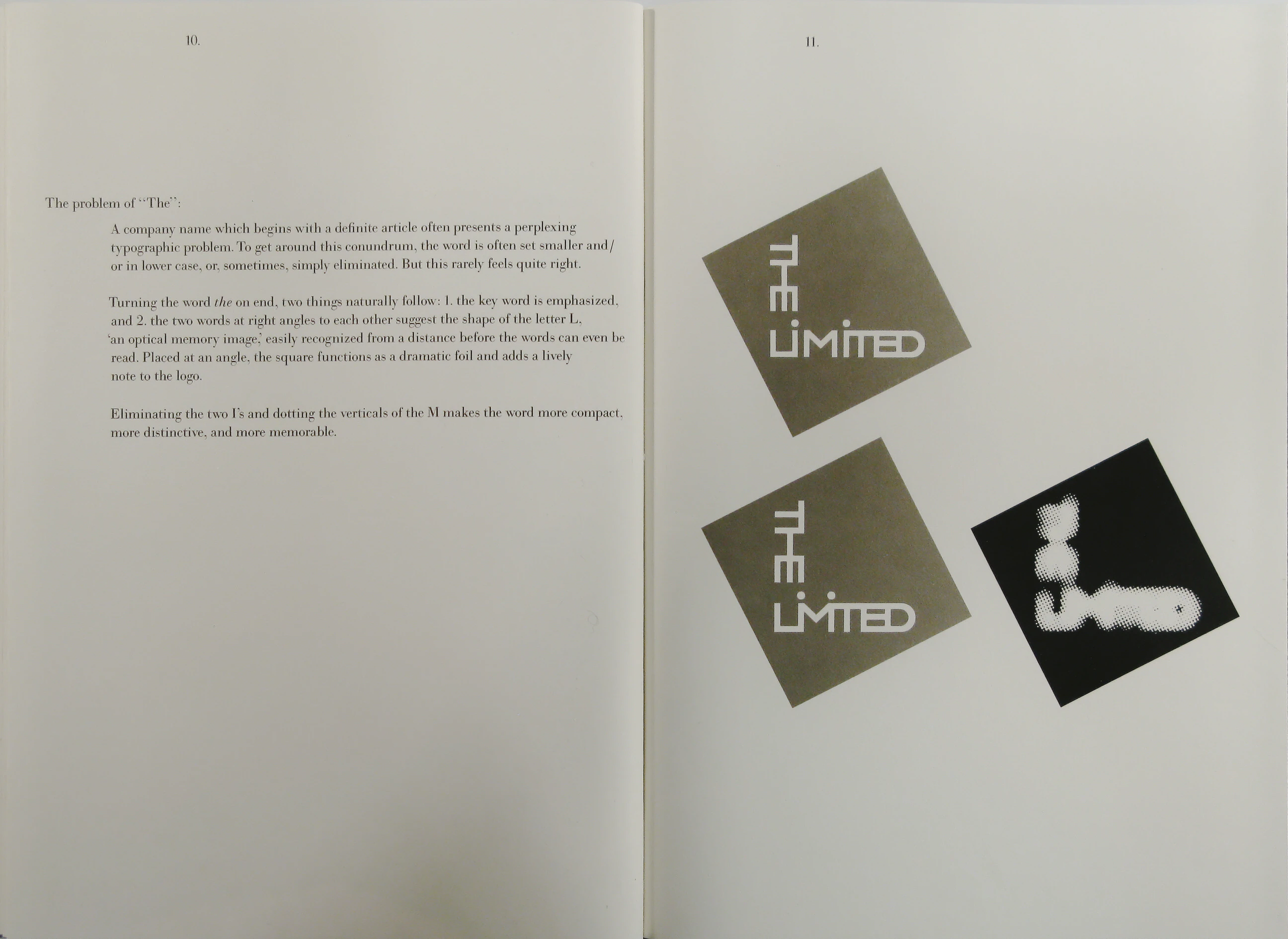
The problem of “The”:
A company name which begins with a definite article often presents a perplexing typographic problem. To get around this conundrum, the word is often set smaller and/or in lower case, or, sometimes, simply eliminated. But this rarely feels quite right.
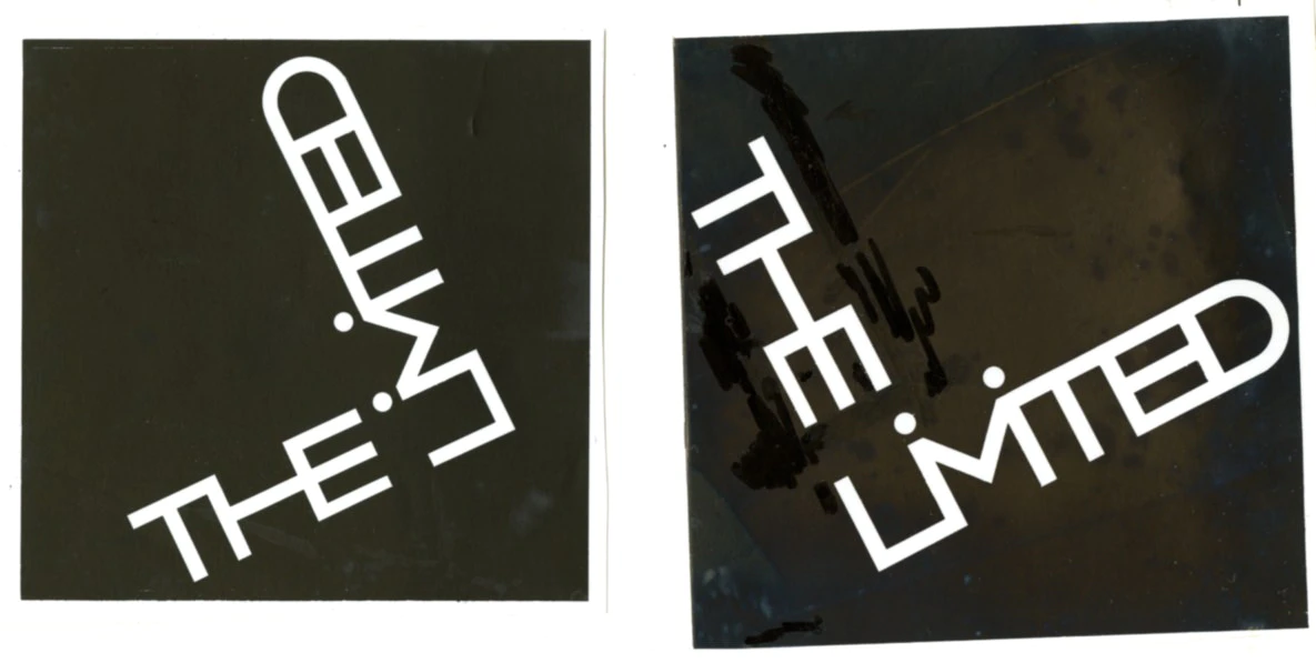
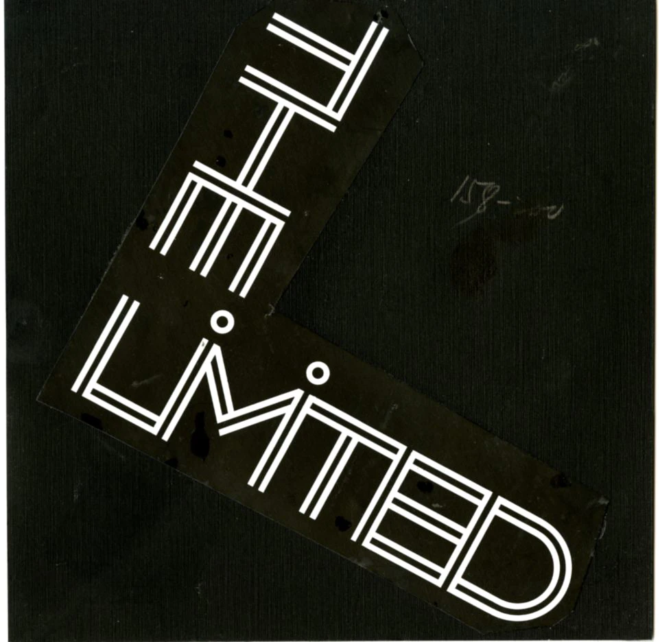
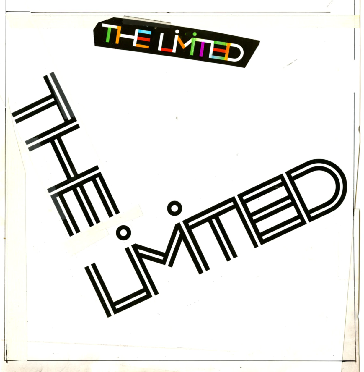
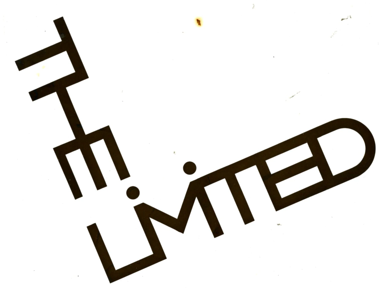
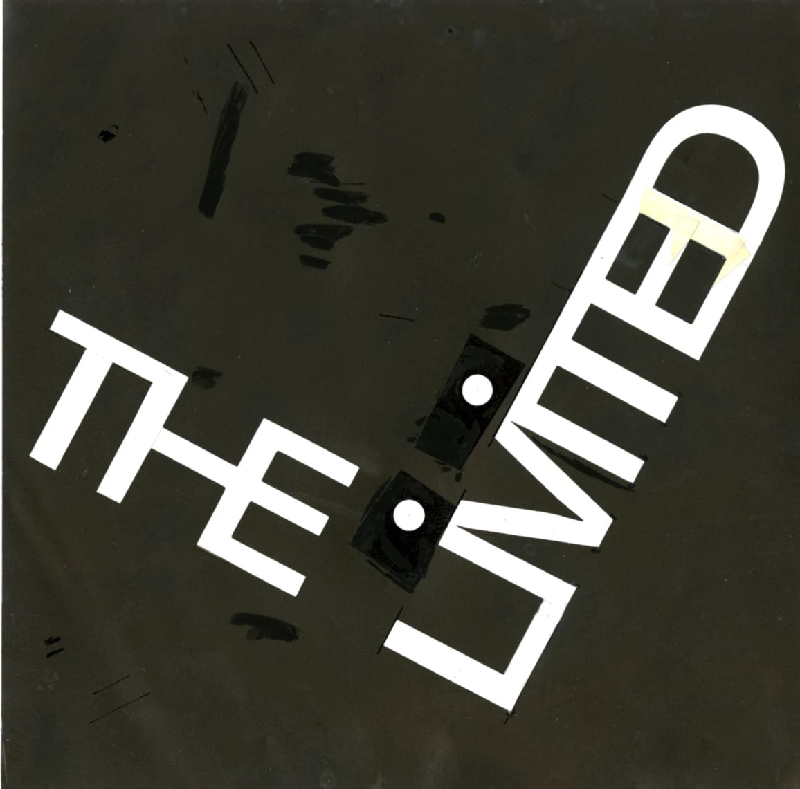
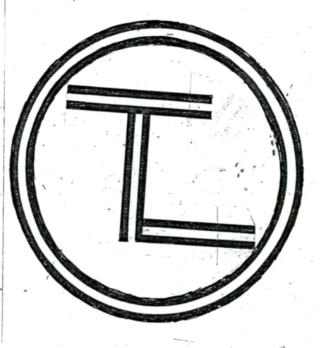
Turning the word the on end, two things naturally follow: 1. the key word is emphasized, and 2. the two words at right angles to each other suggest the shape of the letter L, ‘an optical memory image’ easily recognized from a distance before the words can even be read. Placed at an angle, the square functions as a dramatic foil and adds a lively note to the logo.
Eliminating the two I’s and dotting the verticals of the M makes the word more compact, more distinctive, and more memorable.
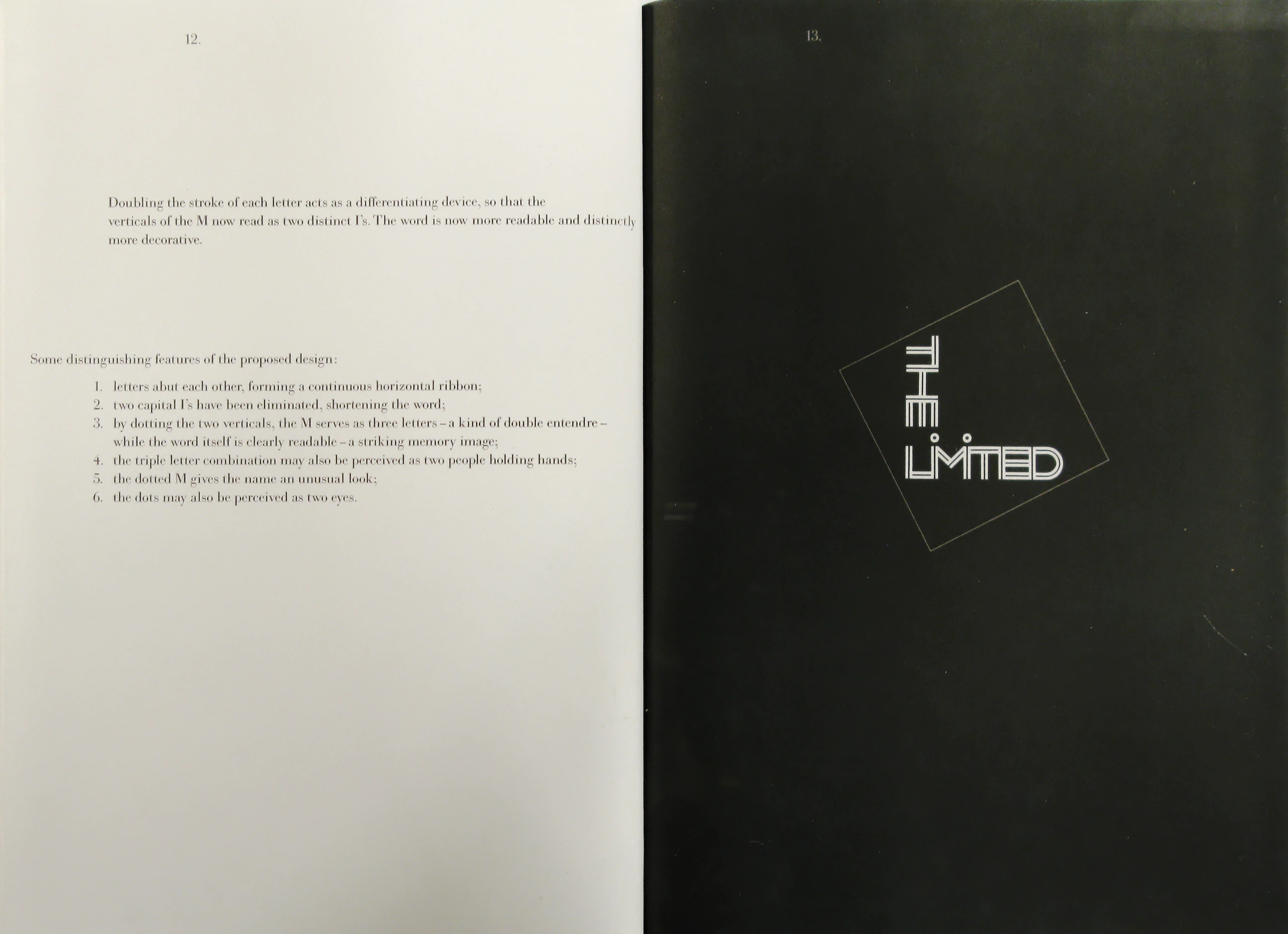
Doubling the stroke of each letter acts as a differentiating device, so that the verticals of the M now read as two distinct I’s. The word is now more readable and distinctly more decorative.
Some distinguishing features of the proposed design:
- letters abut each other, forming a continuous horizontal ribbon;
- two capital I’s have been eliminated, shortening the word;
- by dotting the two verticals, the M serves as three letters - a kind of double entendre - while the word itself is clearly readable - a striking memory image;
- the triple letter combination may also be perceived as two people holding hands;
- the dotted M gives the name an unusual look;
- the dots may also be perceived as two eyes.
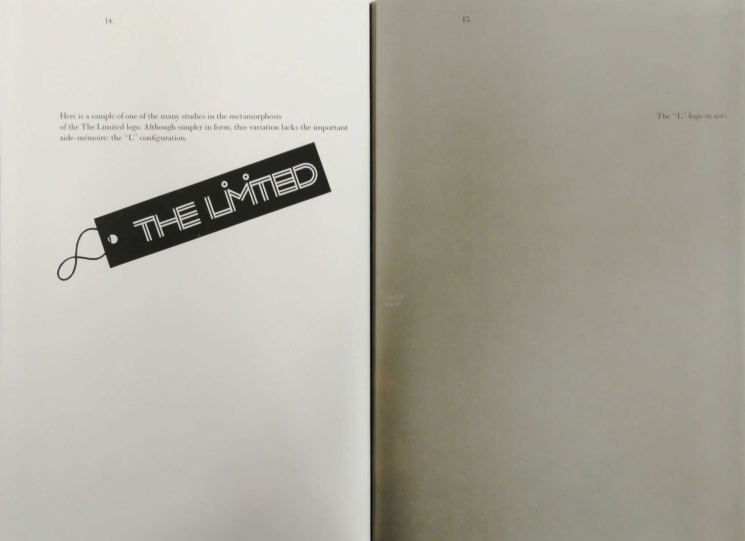
Here is a sample of one of the many studies in the metamorphosis of the The Limited logo. Although simpler in form, this variation lacks the important aide-mémoire: the “L” configuration.
The “L” logo in use:
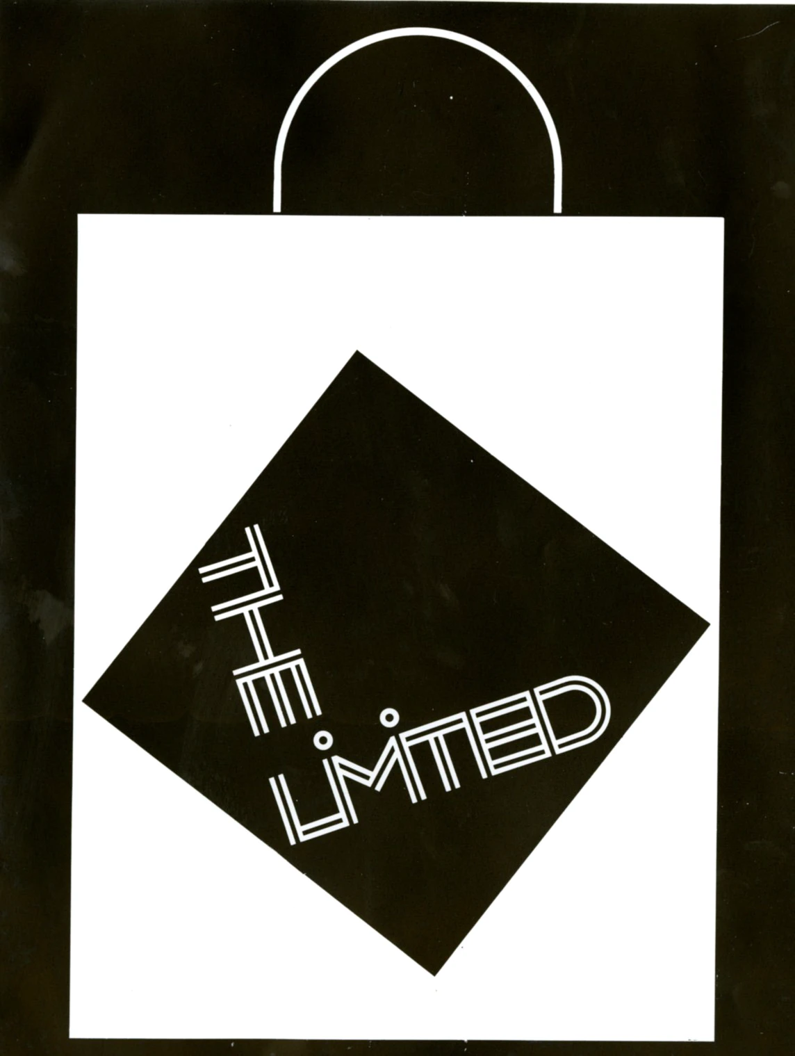
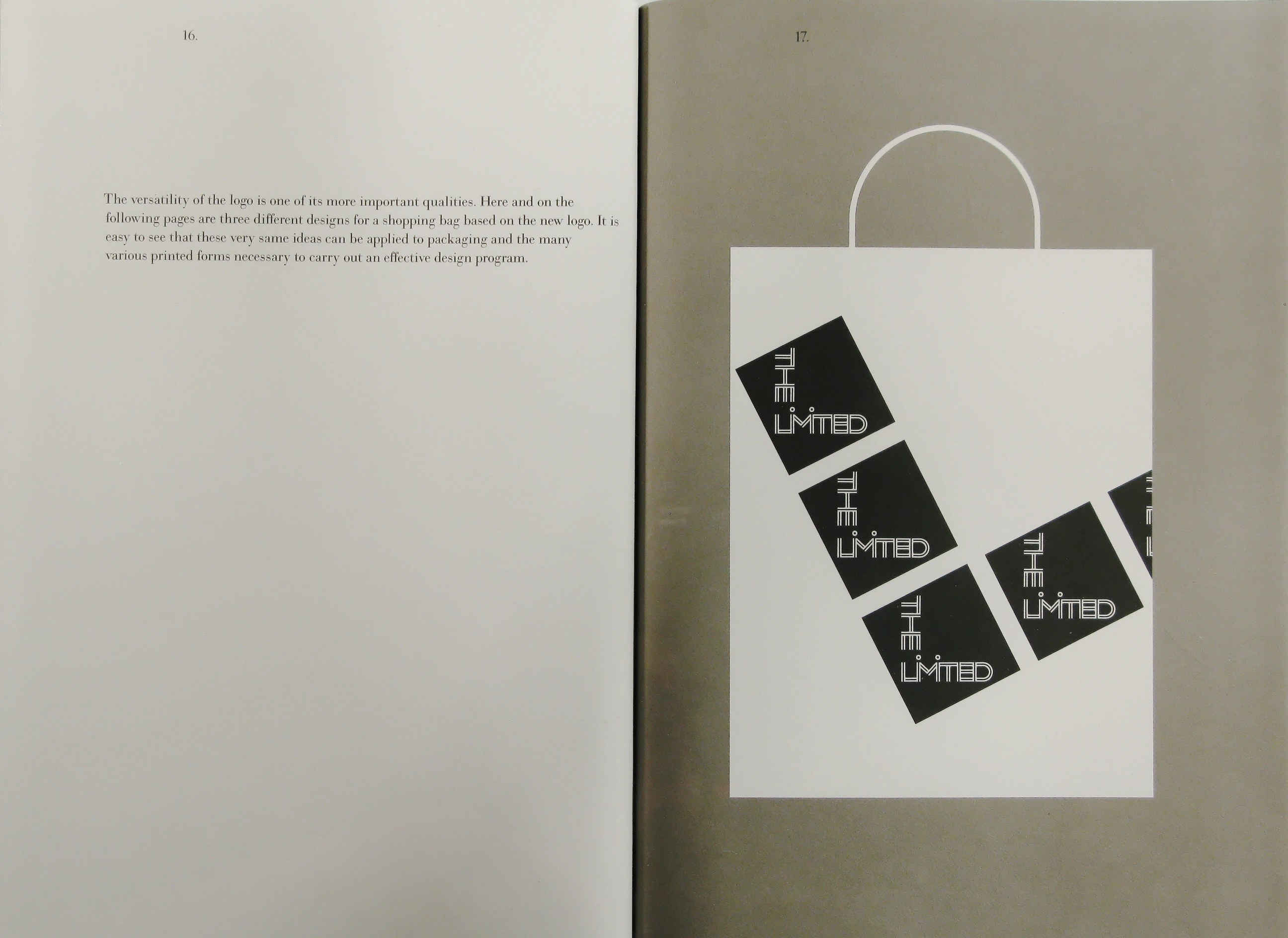
The versatility of the logo is one of its more important qualities. Here and on the following pages are three different designs for a shopping bag based on the new logo. It is easy to see that these very same ideas can be applied to packaging and the many various printed forms necessary to carry out an effective design program.
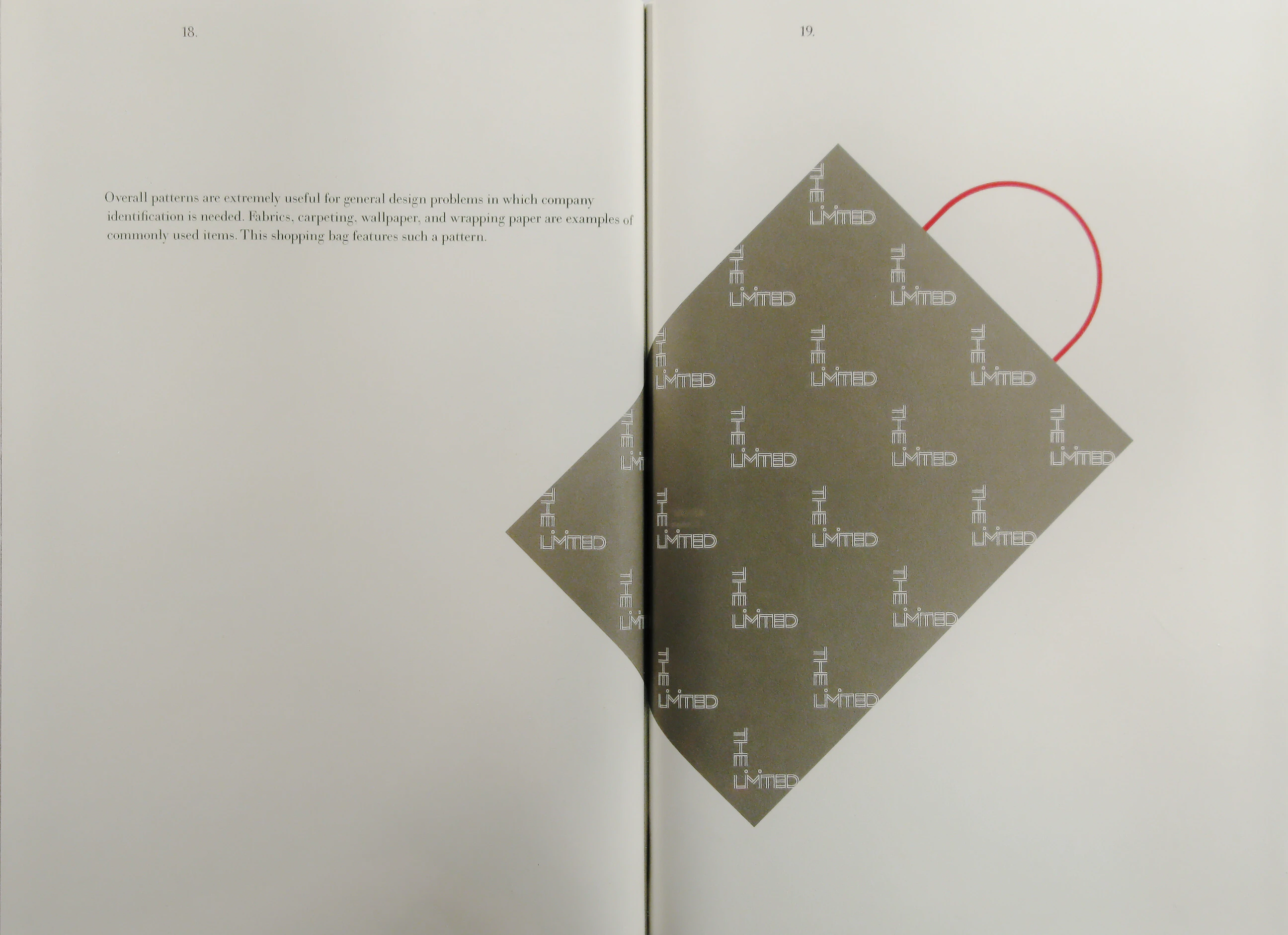
Overall patterns are extremely useful for general design problems in which company identification is needed. Fabrics, carpeting, wallpaper, and wrapping paper are examples of commonly used items. This shopping bag features such a pattern.
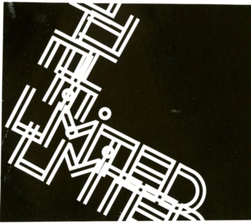
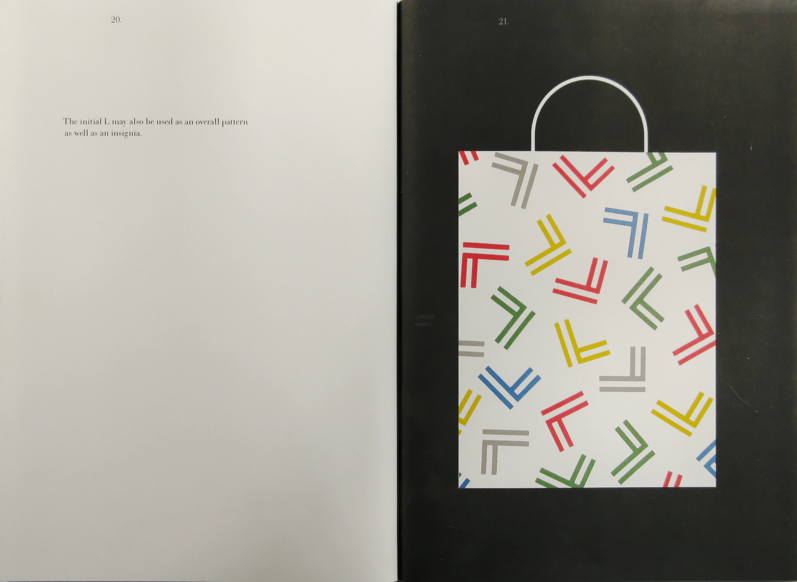
The initial L may also he used as an overall pattern as well as an insignia.
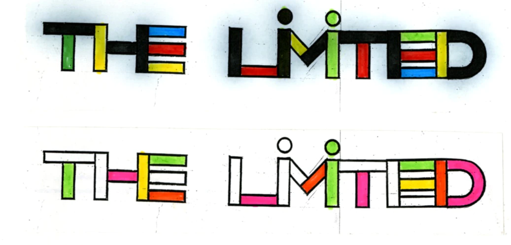
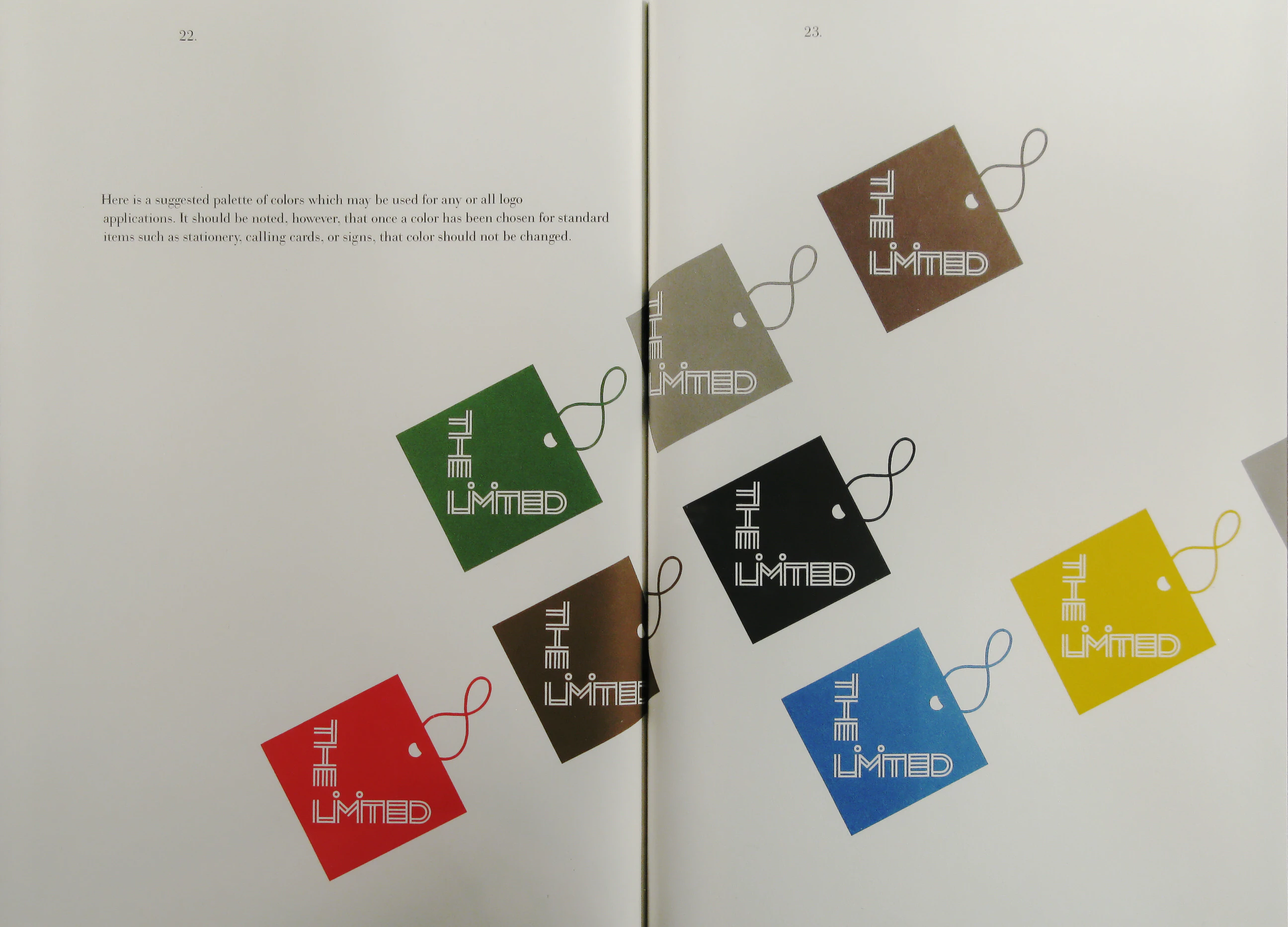
Here is a suggested palette of colors which may be used for any or all logo applications. It should be noted, however, that once a color has been chosen for standard items such as stationery, calling cards, or signs, that color should not be changed.
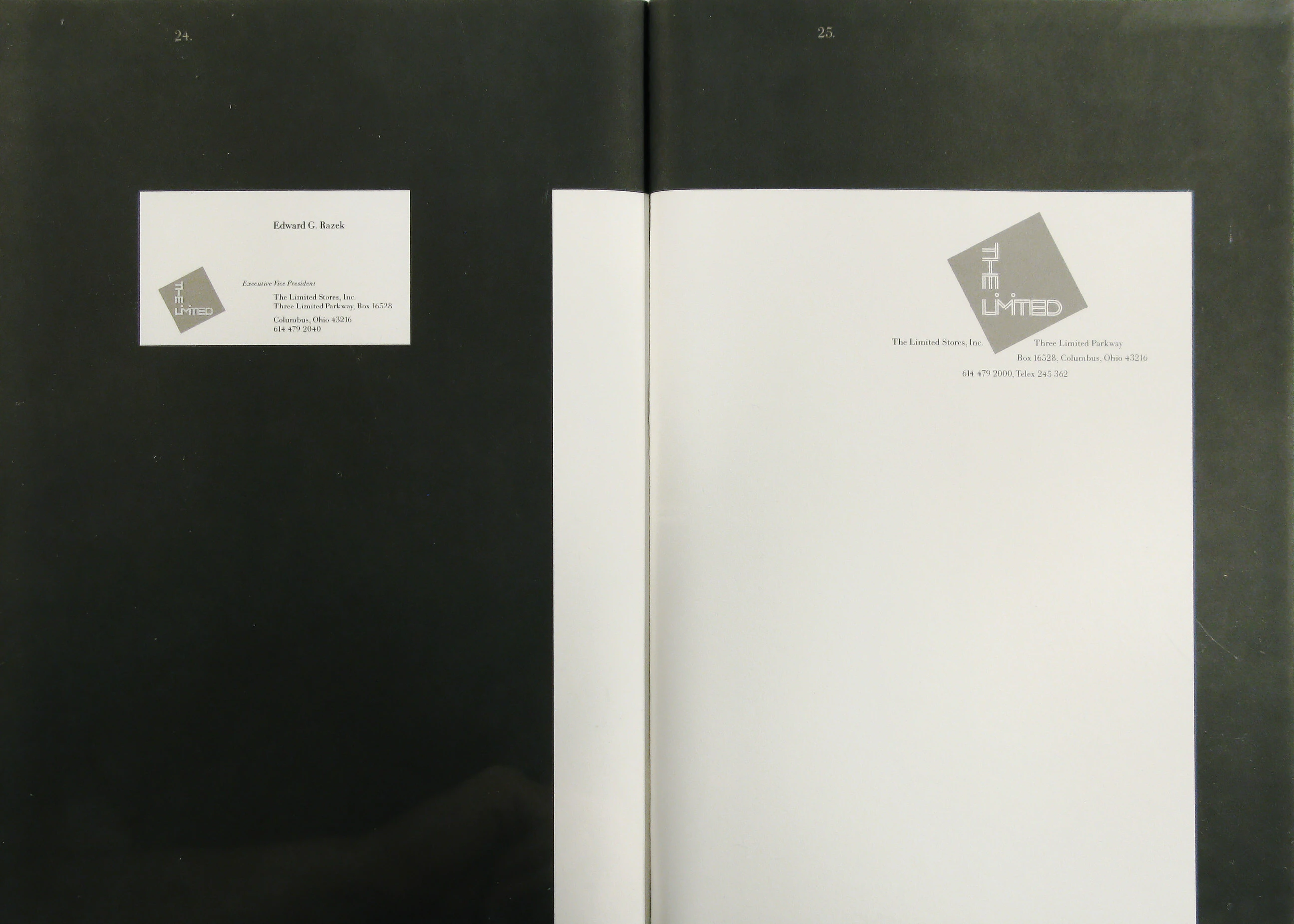
(Stationery)
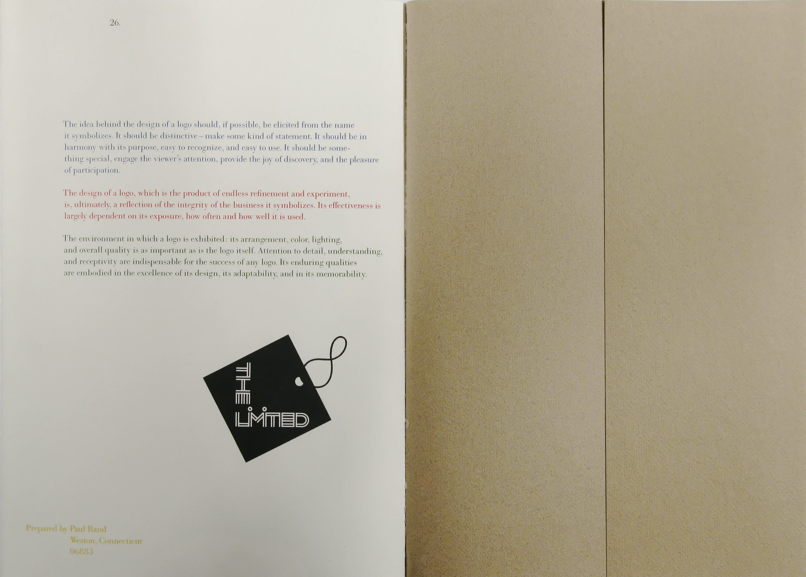
The idea behind the design of a logo should, if possible, be elicited from the name it symbolizes. It should be distinctive - make some kind of statement. It should be in harmony with its purpose, easy to recognize, and easy to use. It should be something special, engage the viewer’s attention, provide the joy of discovery, and the pleasure of participation.
The design of a logo, which is the product of endless refinement and experiment, is, ultimately, a reflection of the integrity of the business it symbolizes. Its effectiveness is largely dependent on its exposure, how often and how well it is used.
The environment in which a logo is exhibited: its arrangement, color, lighting, and overall quality is as important as is the logo itself. Attention to detail, understanding, and receptivity are indispensable for the success of any logo. Its enduring qualities are embodied in the excellence of its design, its adaptability, and in its memorability.
Prepared by Paul Rand
Weston, Connecticut
06883