
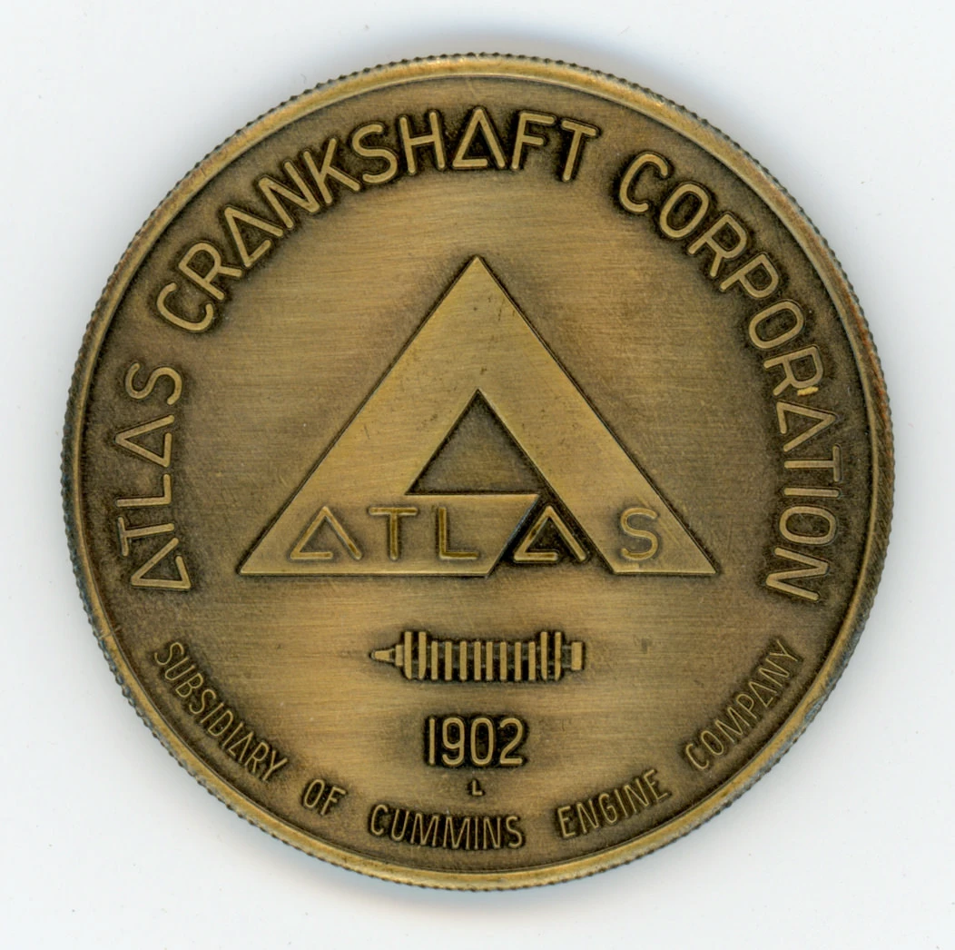
A Trademark for Atlas Crankshaft Corporation

A Trademark for Atlas Crankshaft Corporation
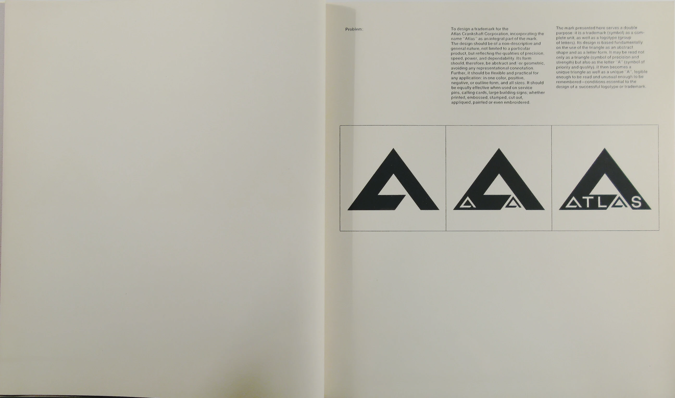
Problem:
To design a trademark for the Atlas Crankshaft Corporation, incorporating the name “Atlas” as an integral part of the mark. The design should be of a non-descriptive and general nature, not limited to a particular product, but reflecting the qualities of precision, speed, power, and dependability. Its form should, therefore, be abstract and/or geometric, avoiding any representational connotation. Further, it should be flexible and practical for any application: in one color, positive, negative, or outline form, and all sizes. It should be equally effective when used on service pins, calling cards, large building signs; whether printed, embossed, stamped, cut out, appliqued, painted or even embroidered.
The mark presented here serves a double purpose; it is a trademark (symbol) as a complete unit, as well as a logotype (group of letters). Its design is based fundamentally on the use of the triangle as an abstract shape and as a letter form. It may be read not only as a triangle (symbol of precision and strength) but also as the letter “A” (symbol of priority and quality). It then becomes a unique triangle as well as a unique “A”, legible enough to be read and unusual enough to be remembered — conditions essential to the design of a successful logotype or trademark.
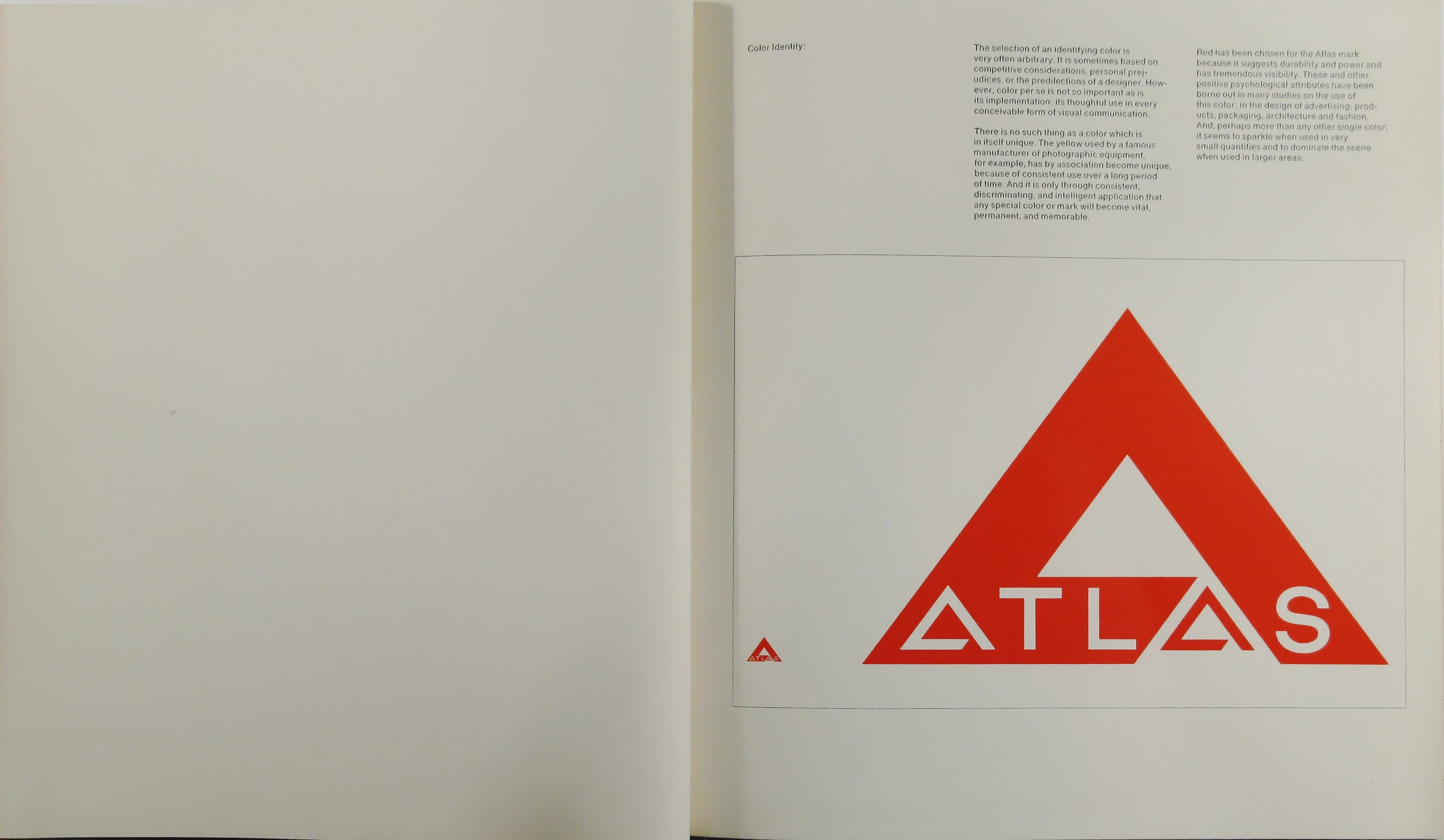
Color Identity:
The selection of an identifying color is very often arbitrary. It is sometimes based on competitive considerations, personal prejudices, or the predilections of a designer. However, color per se is not so important as is its implementation: its thoughtful use in every conceivable form of visual communication.
There is no such thing as a color which is in itself unique. The yellow used by a famous manufacturer of photographic equipment, for example, has by association become unique, because of consistent use over a long period of time. And it is only through consistent, discriminating, and intelligent application that any special color or mark will become vital, permanent, and memorable.
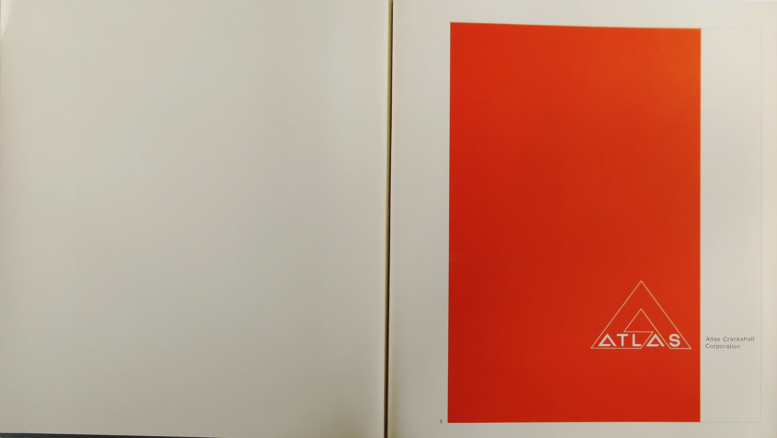
Red has been chosen for the Atlas mark because it suggests durability and power and has tremendous visibility. These and other positive psychological attributes have been borne out in many studies on the use of this color: in the design of advertising, products, packaging, architecture and fashion. And, perhaps more than any other single color. It seems to sparkle when used in very small quantities and to dominate the scene when used In larger areas.
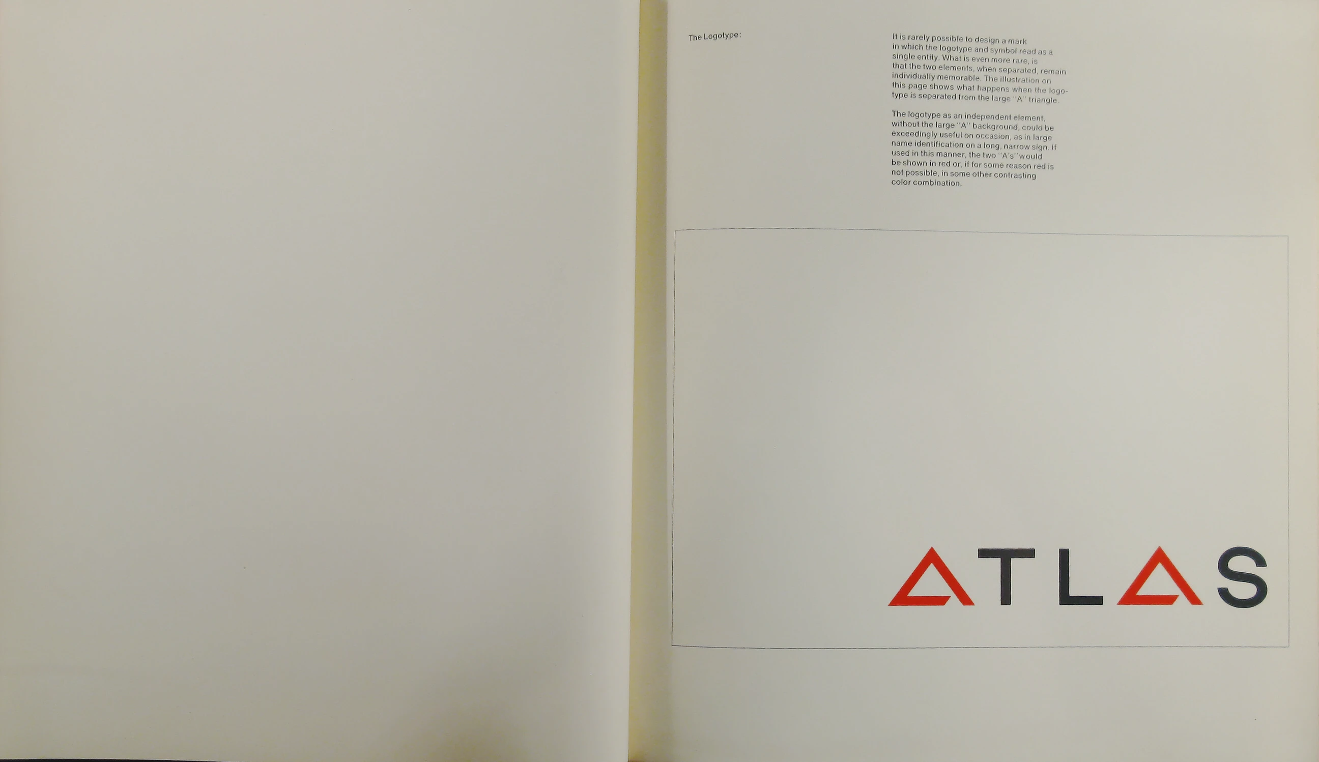
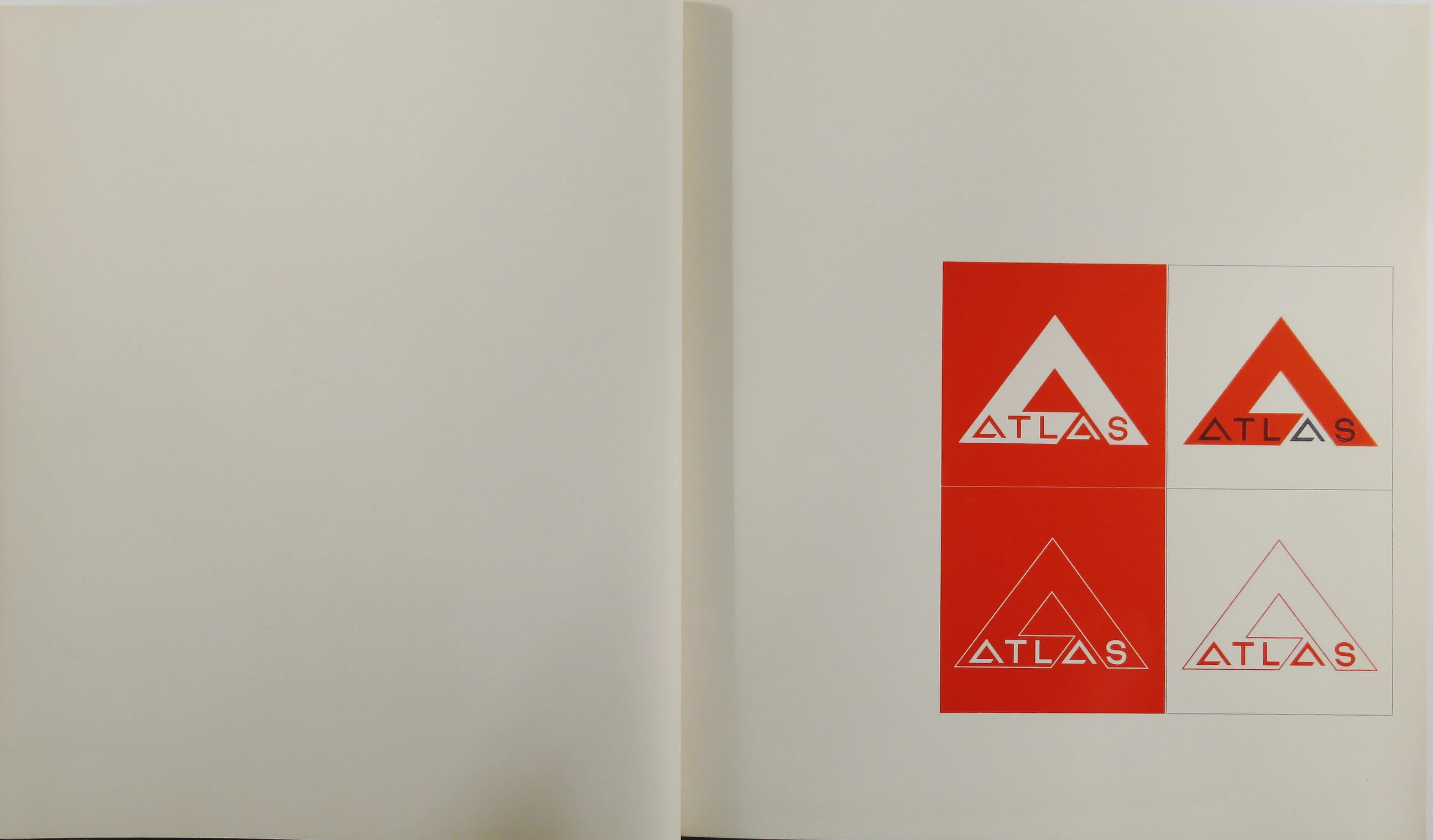
The Logotype:
It is rarely possible to design a mark In which the logotype and symbol read as a single entity. What Is even more rare, is that the two elements, when separated, remain individually memorable. The illustration on his page shows what happens when the logotype is separated from the large “A” triangle.
The logotype as an independent element, without the large “A” background, could be exceedingly useful on occasion, as in large name identification on a long, narrow sign. If used in this manner, the two “A’s” would be shown in red or, if for some reason red is not possible, in some other contrasting color combination.
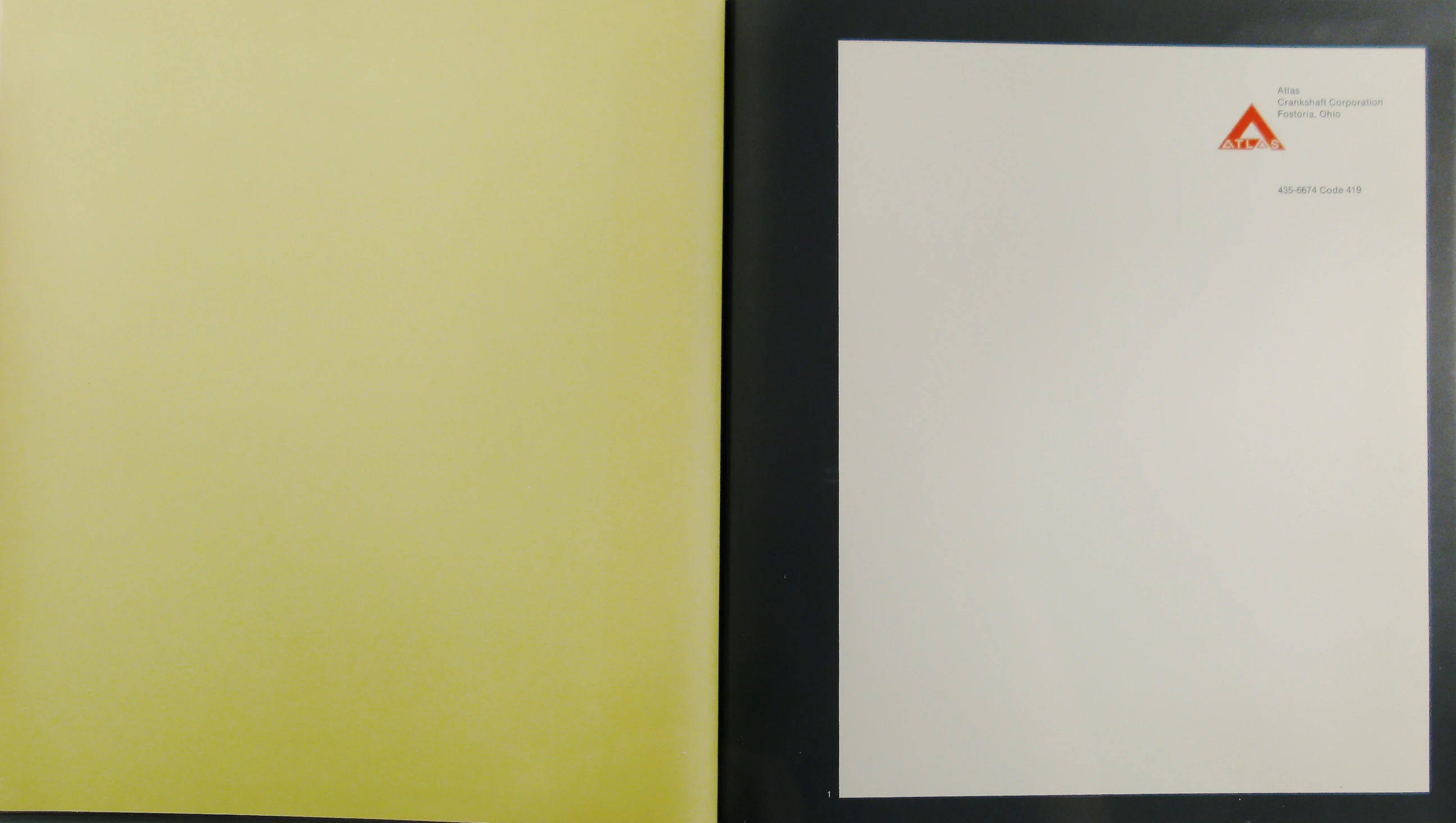
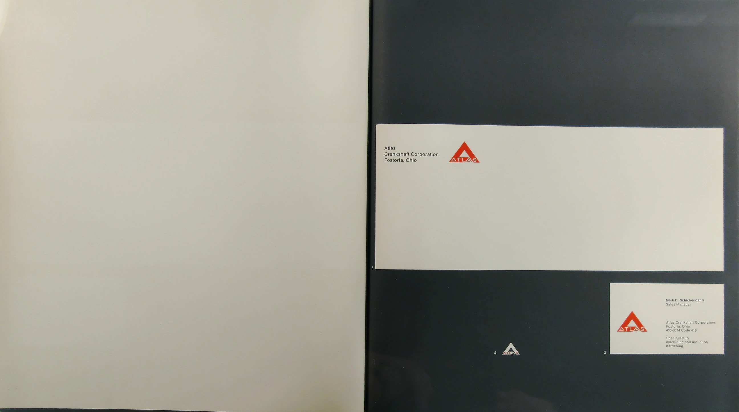
Following are examples of the trademark in use: 1 letterhead 2 envelope 3 calling card 4 service pin 5 folder
