American Express
Logos

Full name

Name Abbreviation
Presentation Booklet, v1
View More


(Use ← → keys to navigate. Click for larger view.)
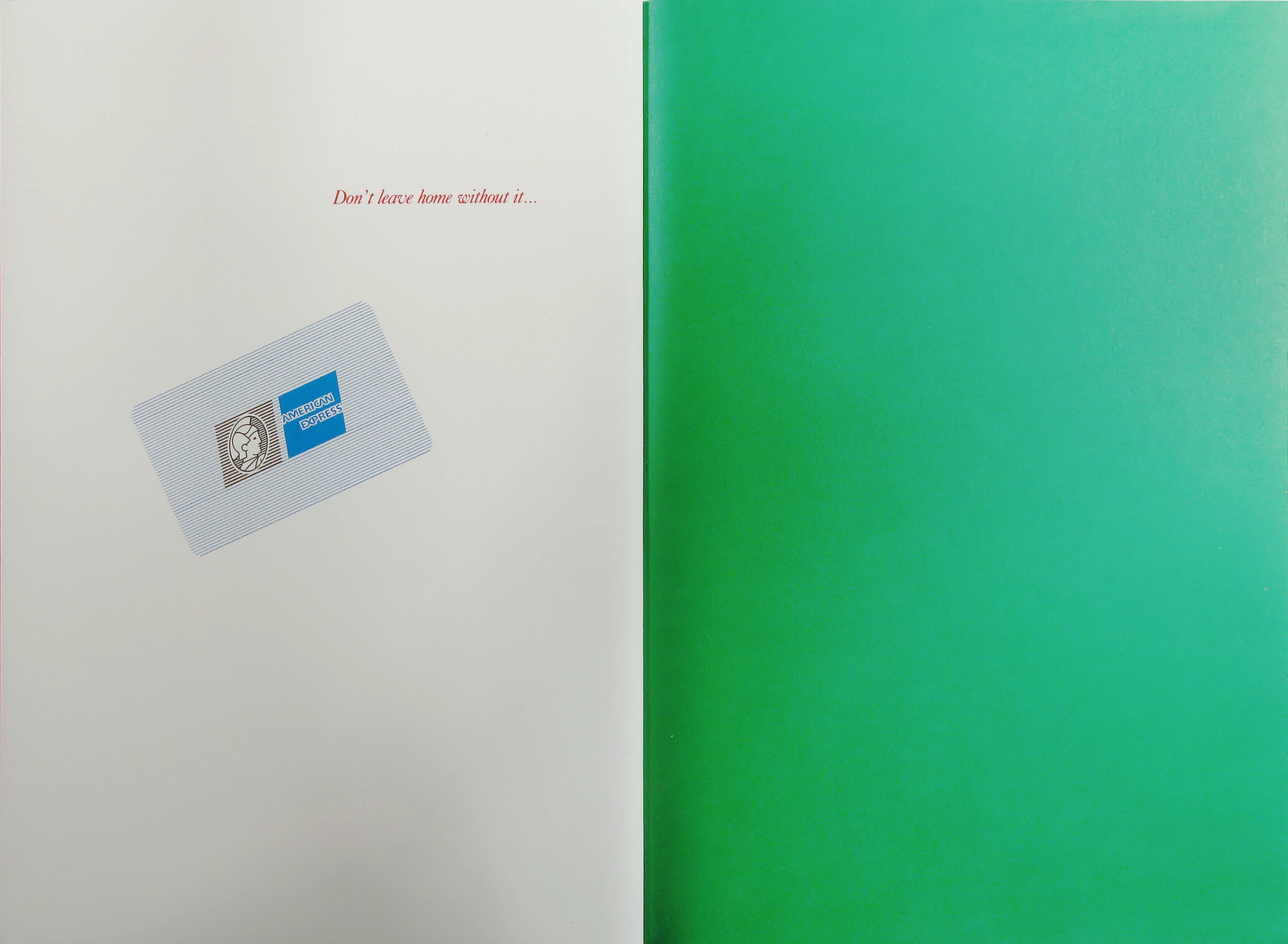
Don’t leave home without it…
Paul Rand
Weston, Connecticut February 1994
American Express is a great name…
but the American Express logo does not reflect this greatness…
Its fifteen letters are difficult to manipulate and reproduce…
Its off-centered placement complicates connection with other words…
Elaborate letter forms are interesting but difficult to handle…
A well designed logo has something spirited about it…
The blue square lacks this quality…
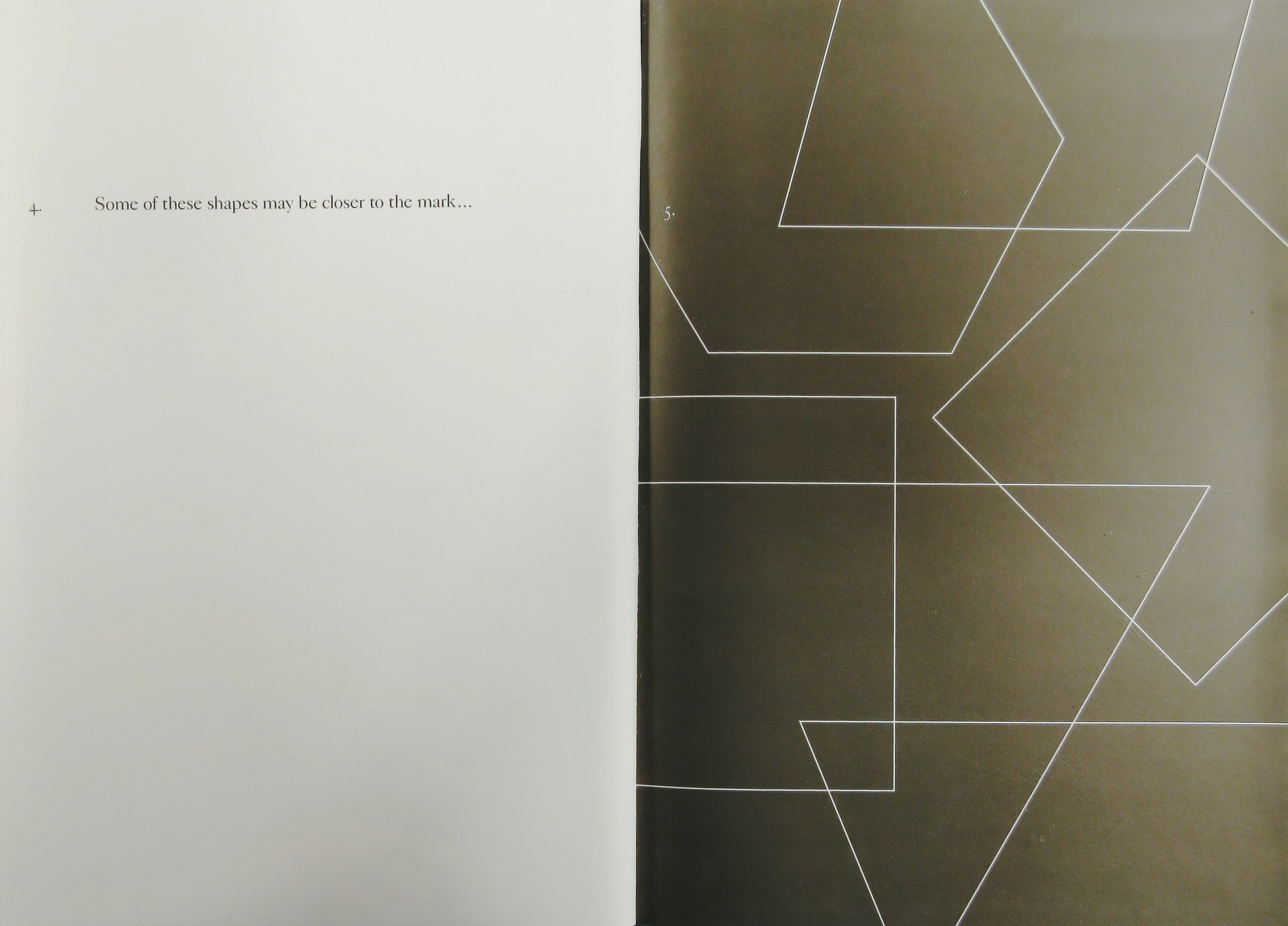
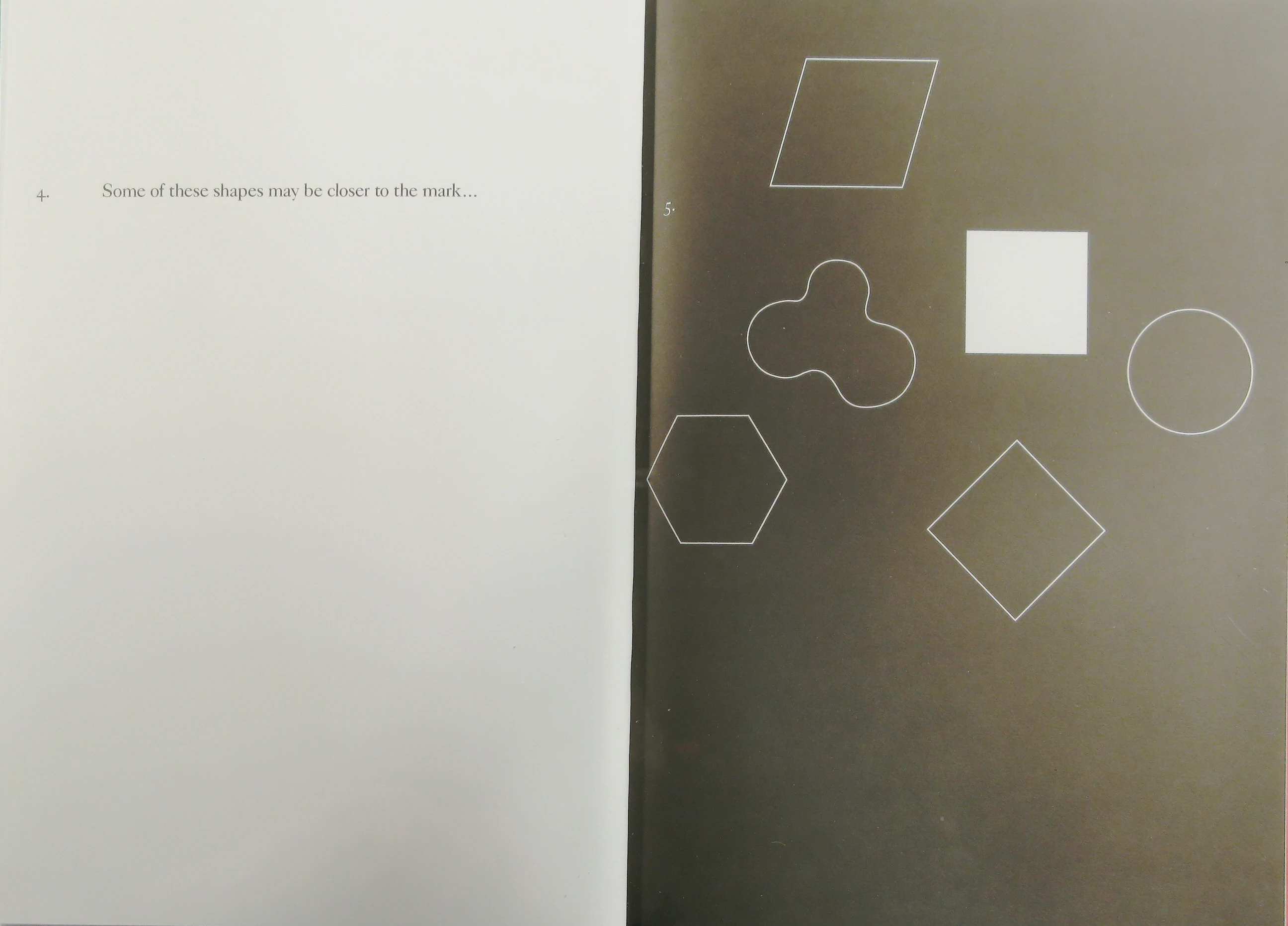
Some of these shapes may be closer to the mark…
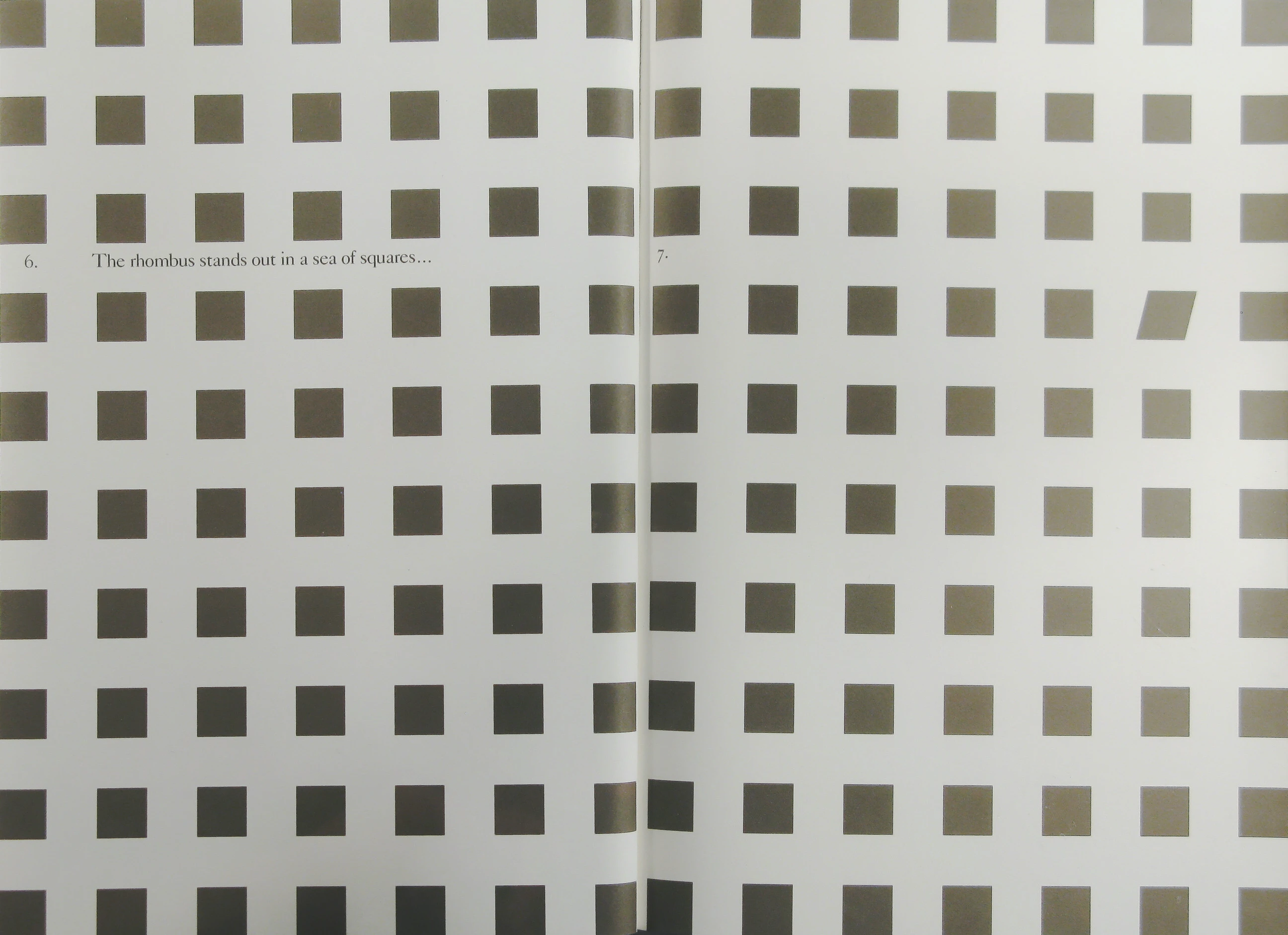
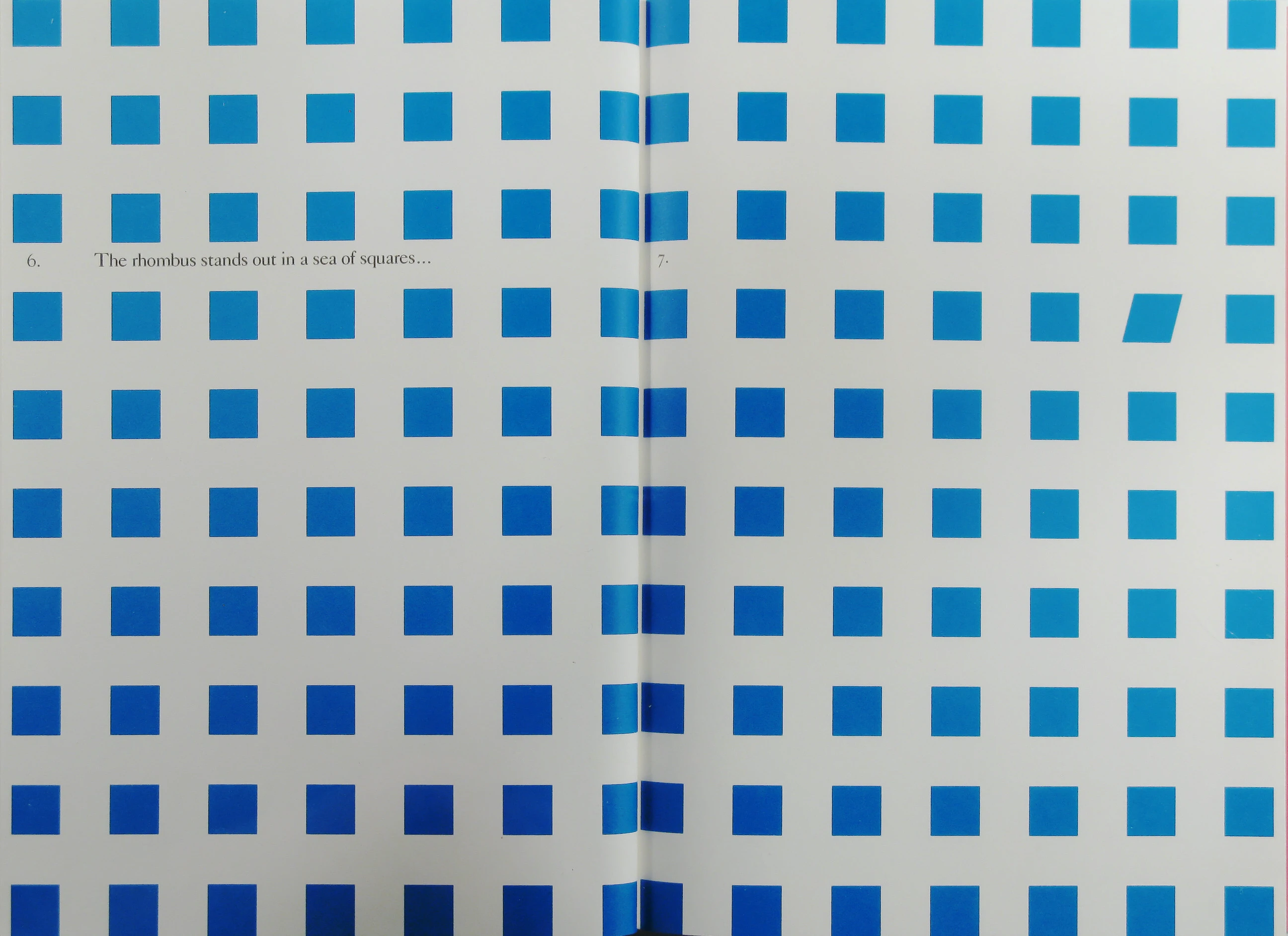
The rhombus stands out in a sea of squares…
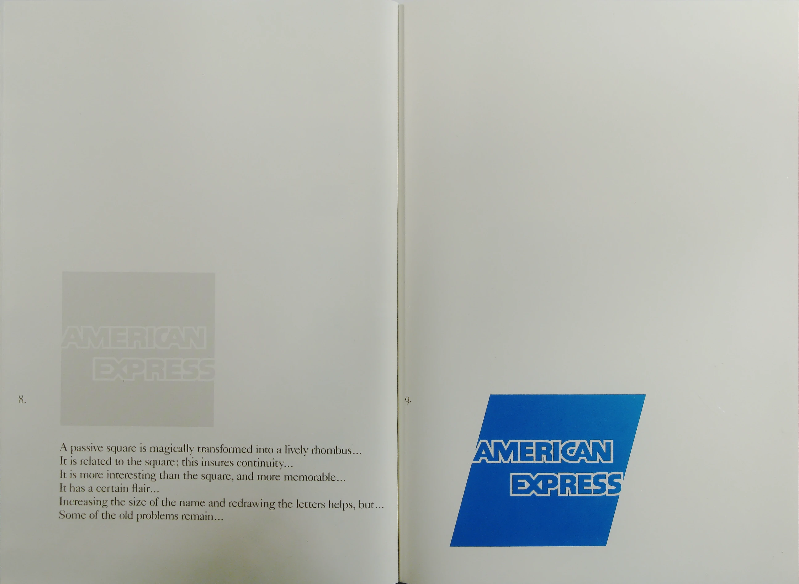
A passive square is magically transformed into a lively rhombus…
It is related to the square; this insures continuity…
It is more interesting than the square, and more memorable…
It has a certain flair…
Increasing the size of the name and redrawing the letters helps, but…
Some of the old problems remain…
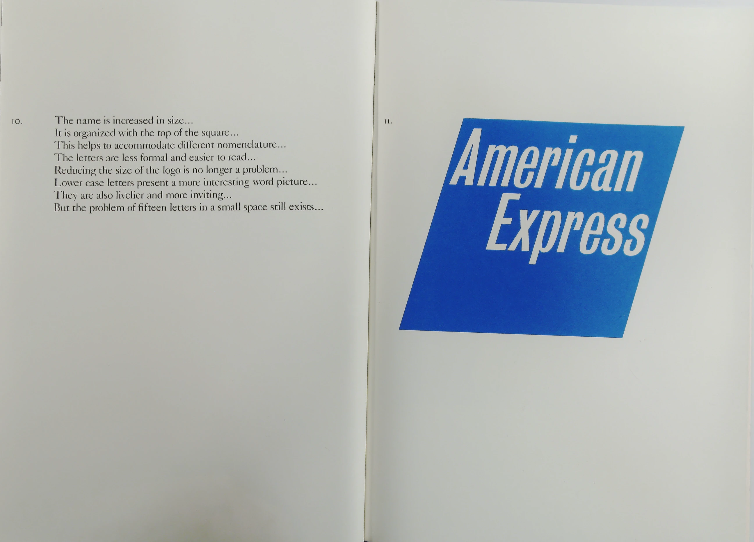
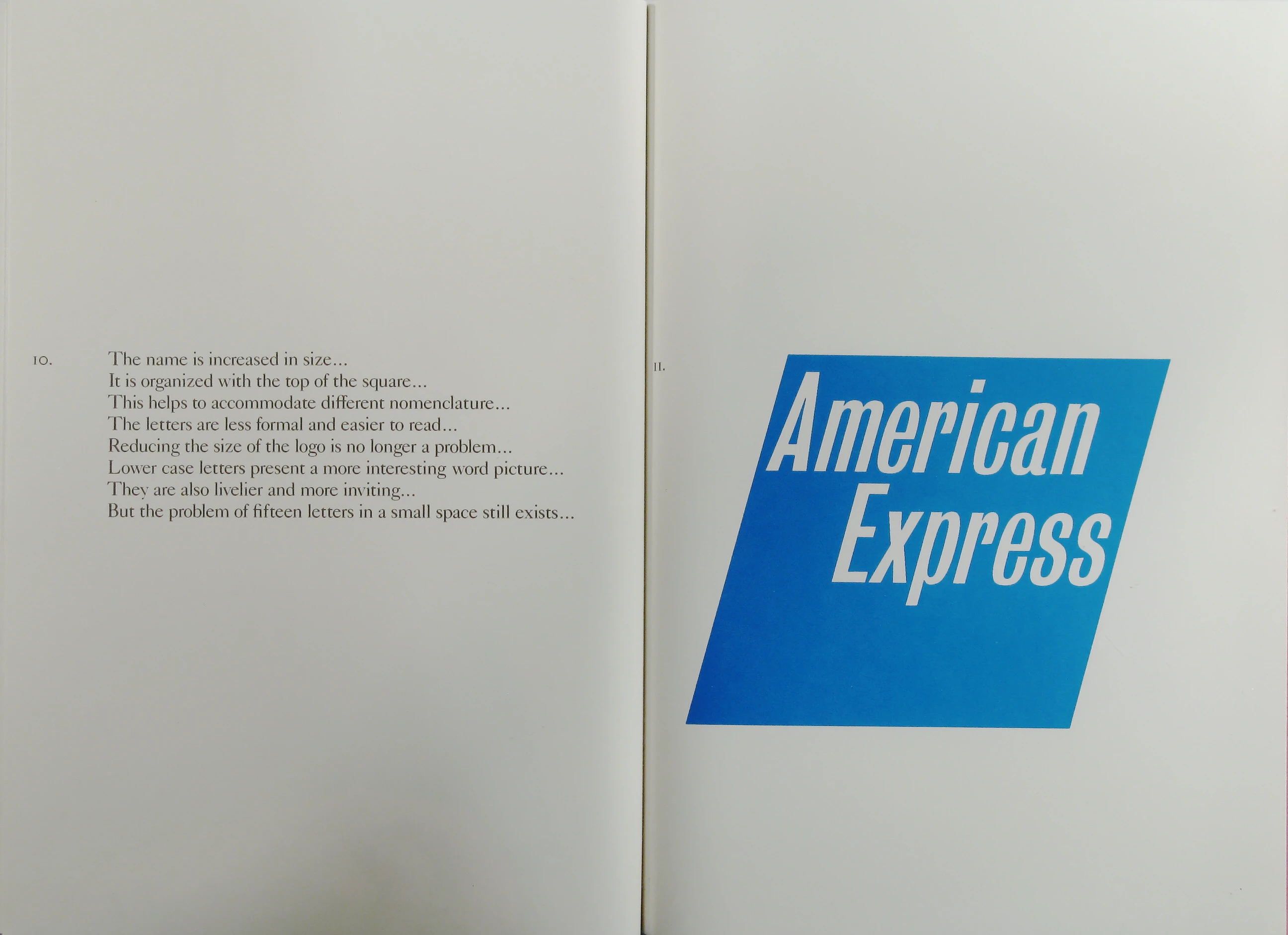
The name is increased in size…
It is organized with the top of the square…
This helps to accommodate different nomenclature…
The letters are less formal and easier to read…
Reducing the size of the logo is no longer a problem…
Lower case letters present a more interesting word picture…
They are also livelier and more inviting…
But the problem of fifteen letters in a small space still exists…
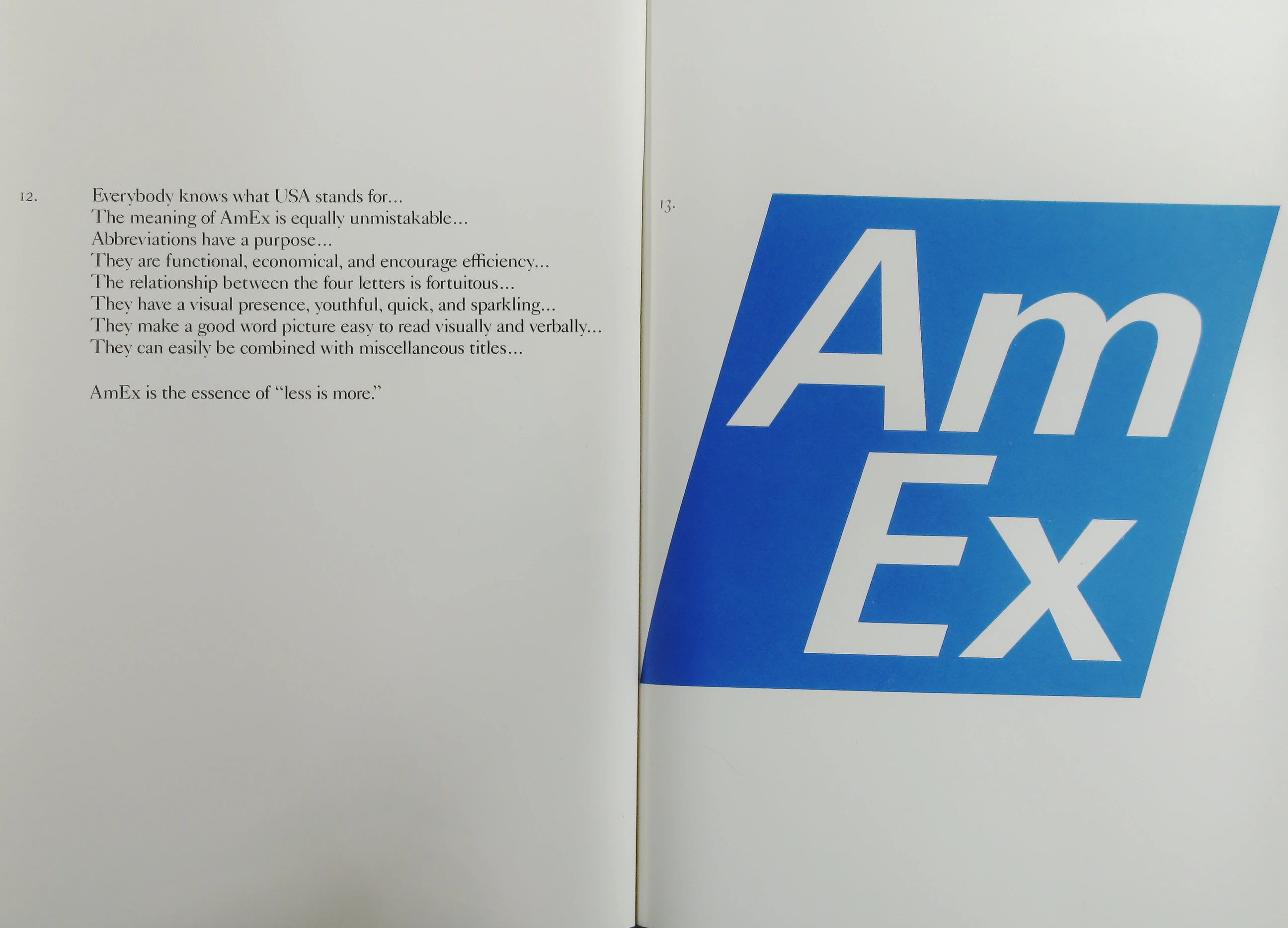
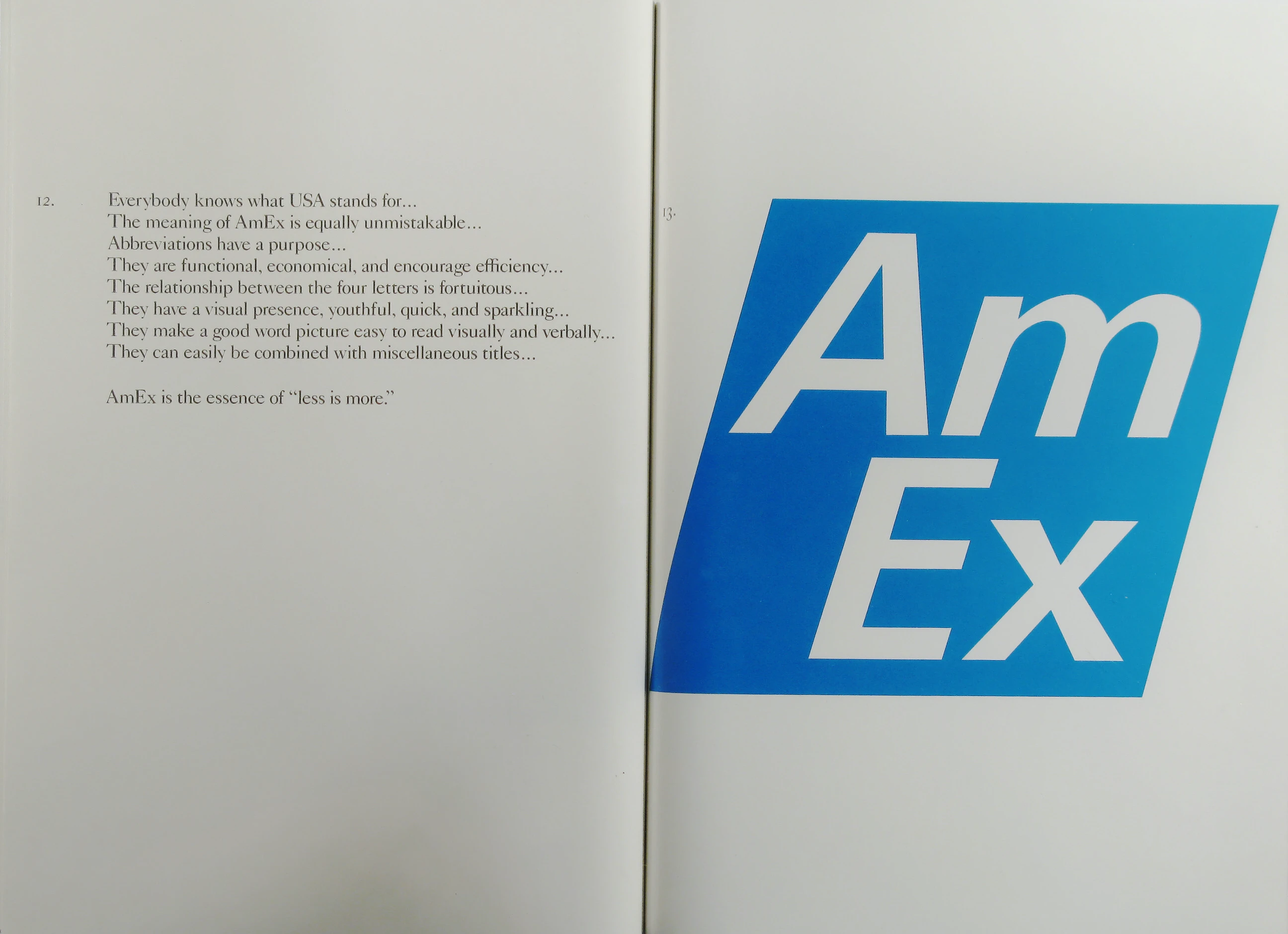
Everybody knows what USA stands for…
The meaning of AmEx is equally unmistakable…
Abbreviations have a purpose…
They are functional, economical, and encourage efficiency…
The relationship between the four letters is fortuitous…
They have a visual presence, youthful, quick, and sparkling…
They make a good word picture easy to read visually and verbally…
They can easily be combined with miscellaneous titles…
AmEx is the essence of “less is more.”
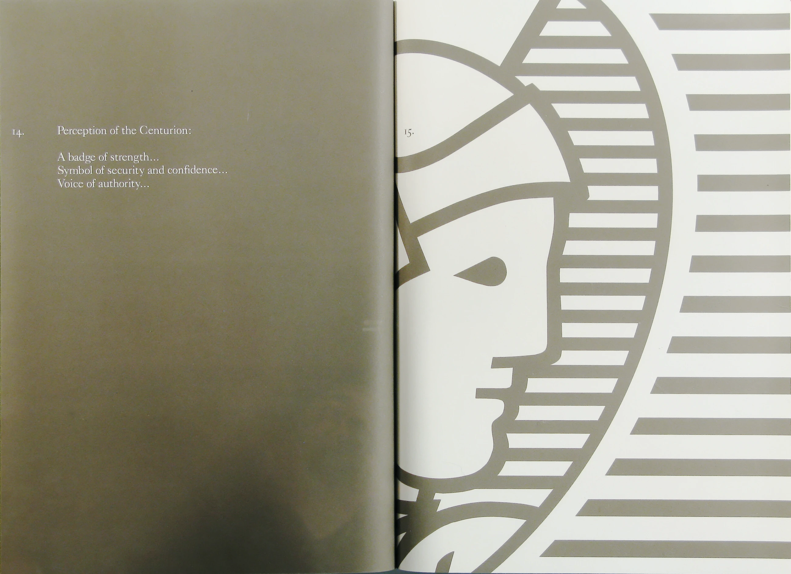
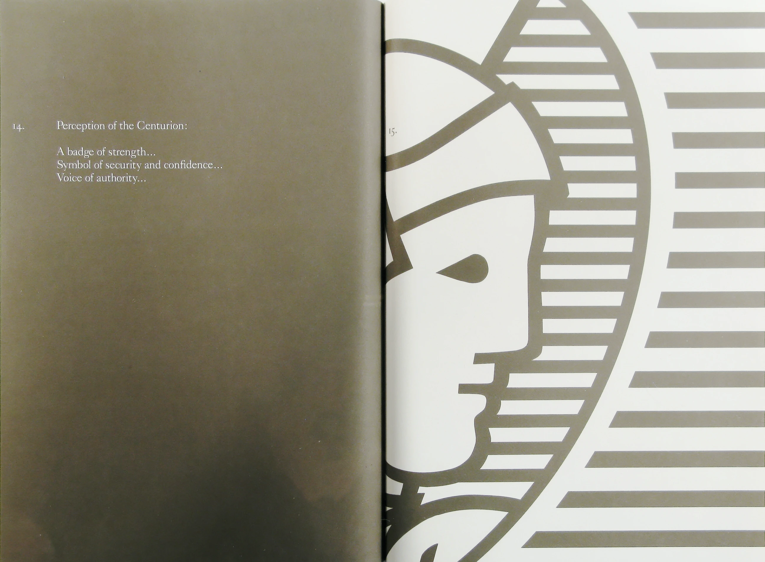
Perception of the Centurion:
A badge of strength…
Symbol of security and confidence…
Voice of authority…
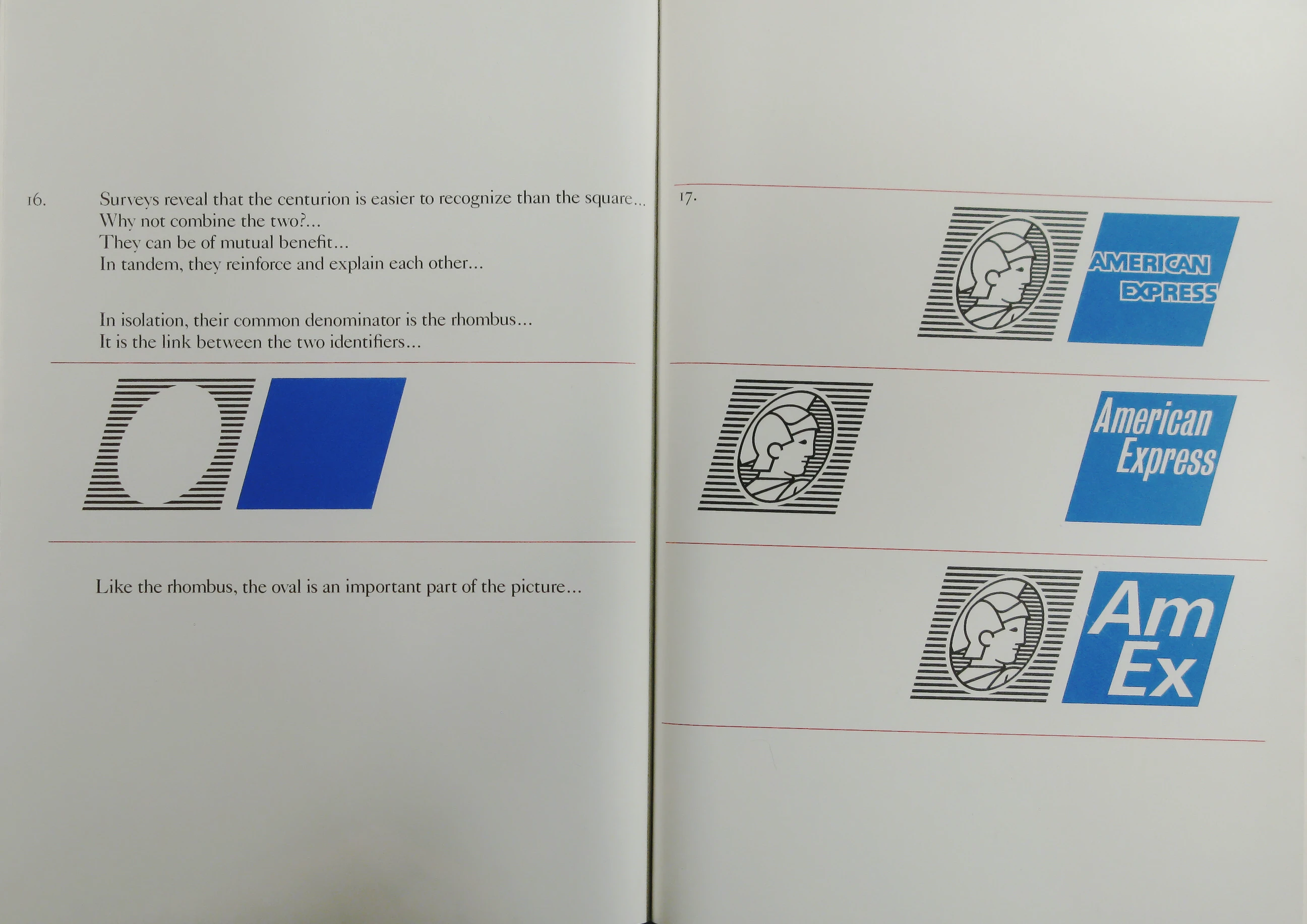
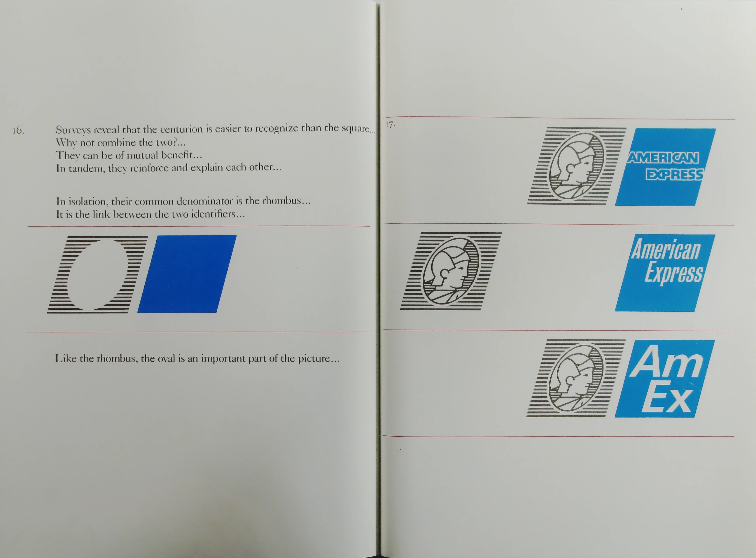
Surveys reveal that the centurion is easier to recognize than the square…
Why not combine the two?…
They can be of mutual benefit…
In tandem, they reinforce and explain each other…
In isolation, their common denominator is the rhombus…
It is the link between the two identifiers…
Like the rhombus, the oval is an important part of the picture…
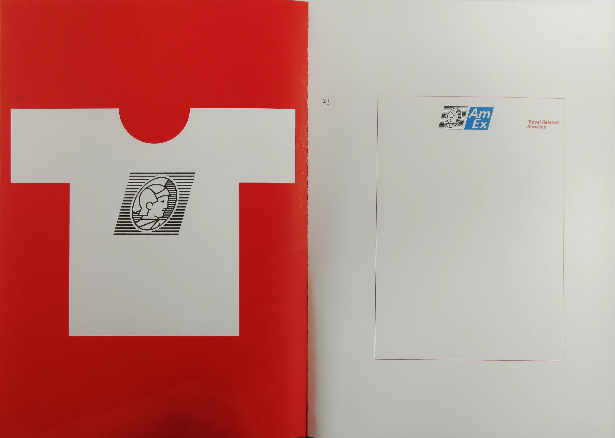
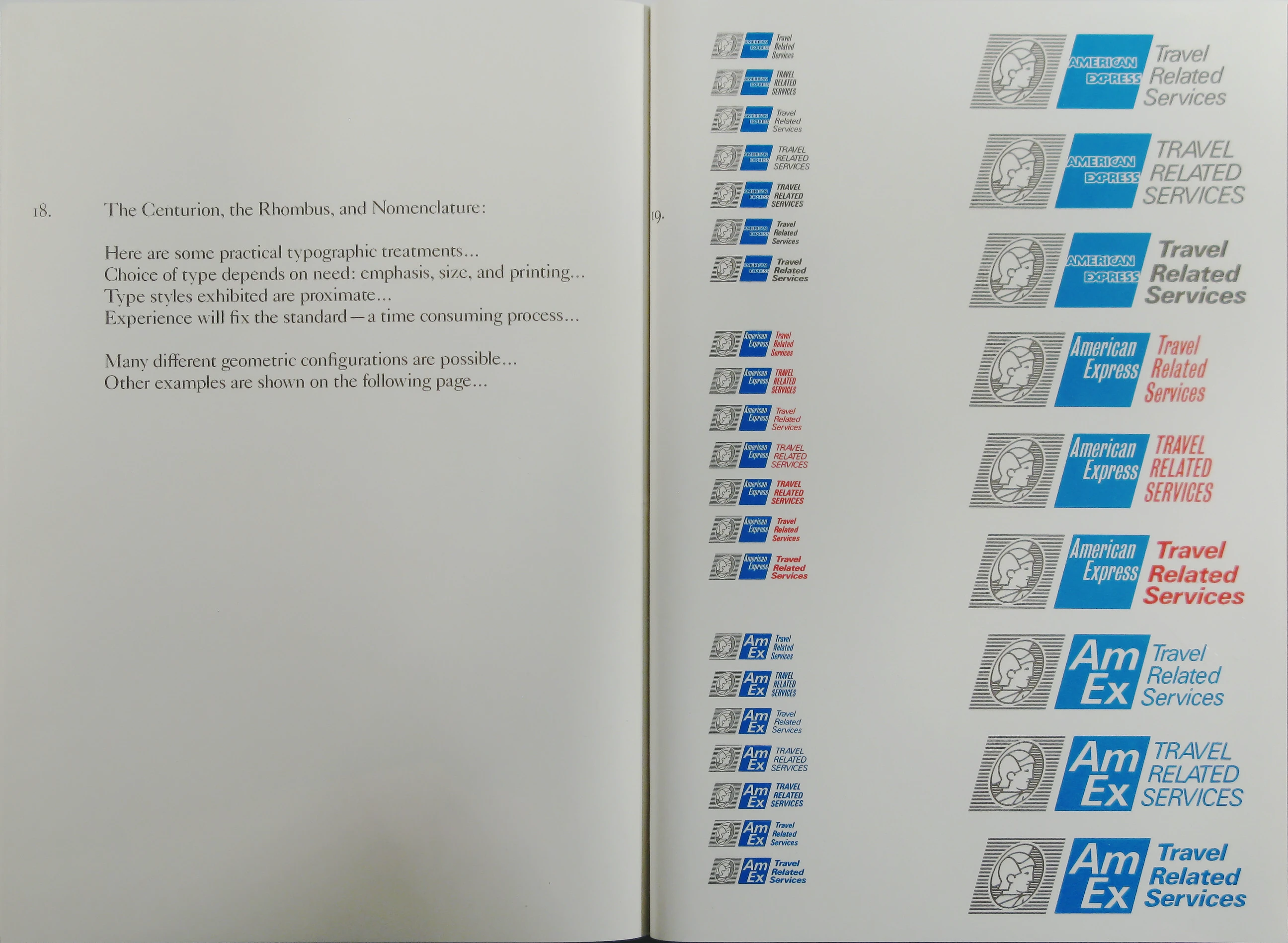
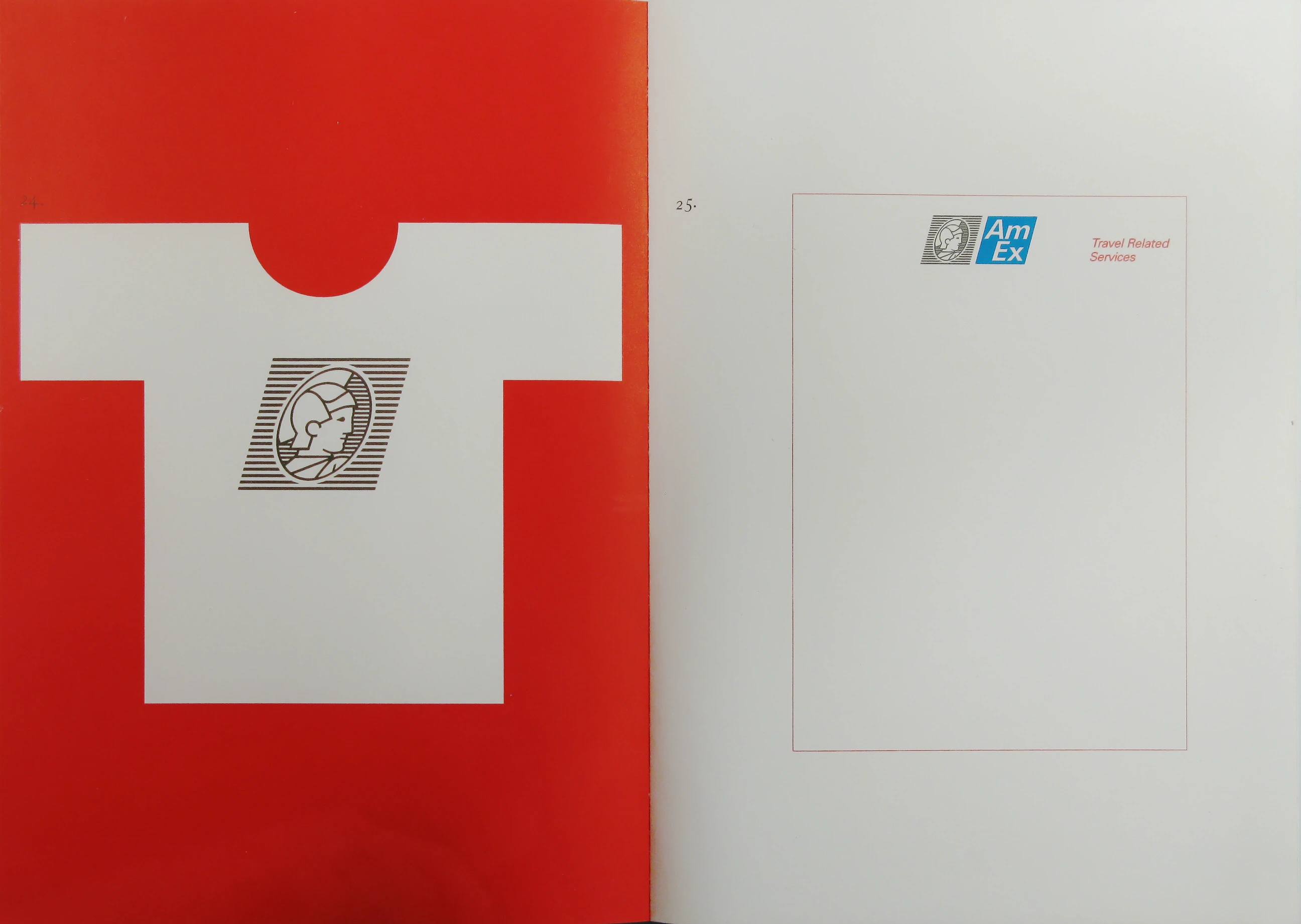
The Centurion, the Rhombus, and Nomenclature:
Here are some practical typographic treatments…
Choice of type depends on need: emphasis, size, and printing…
Type styles exhibited are proximate…
Experience will fix the standard — a time consuming process…
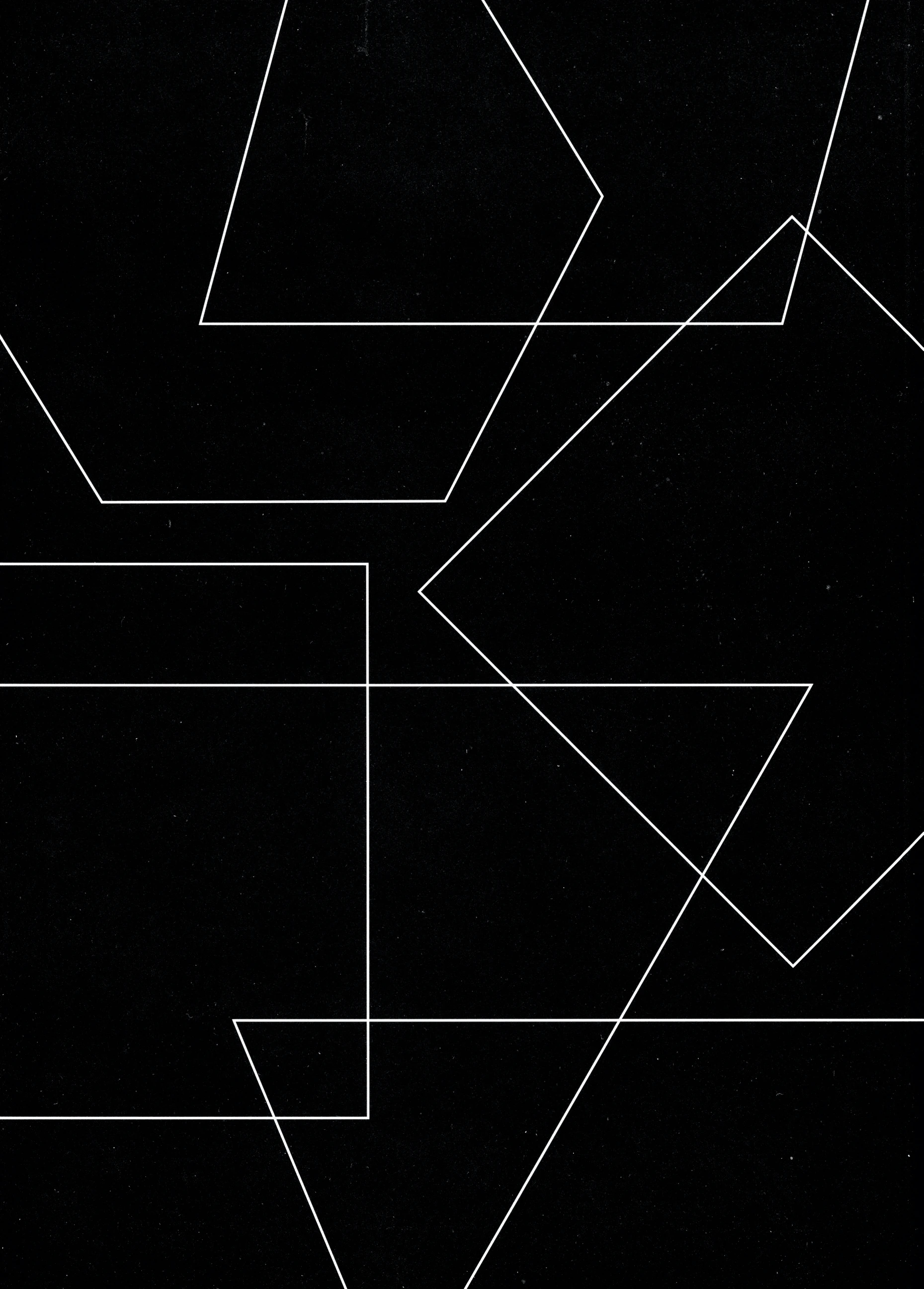
Many different geometric configurations are possible…
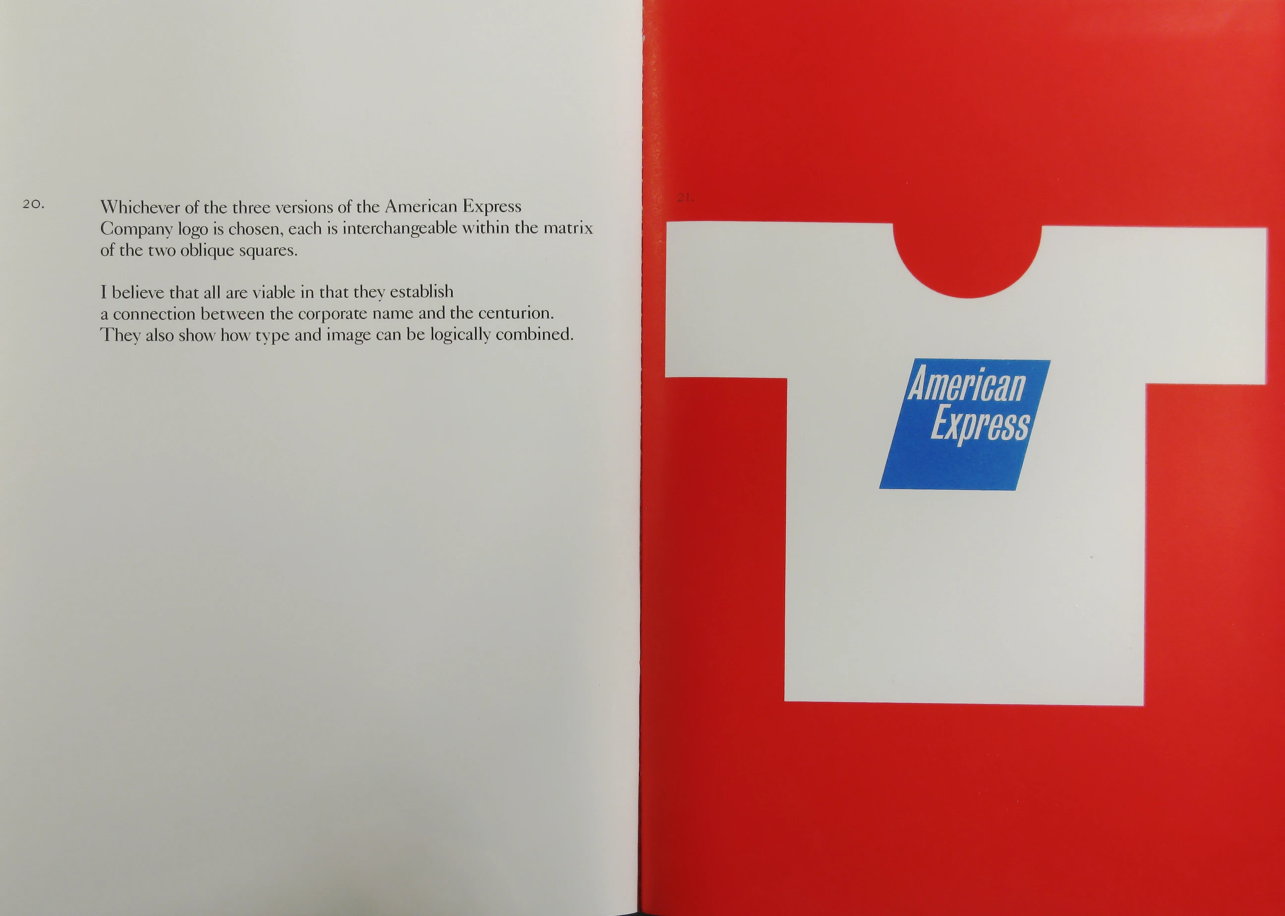
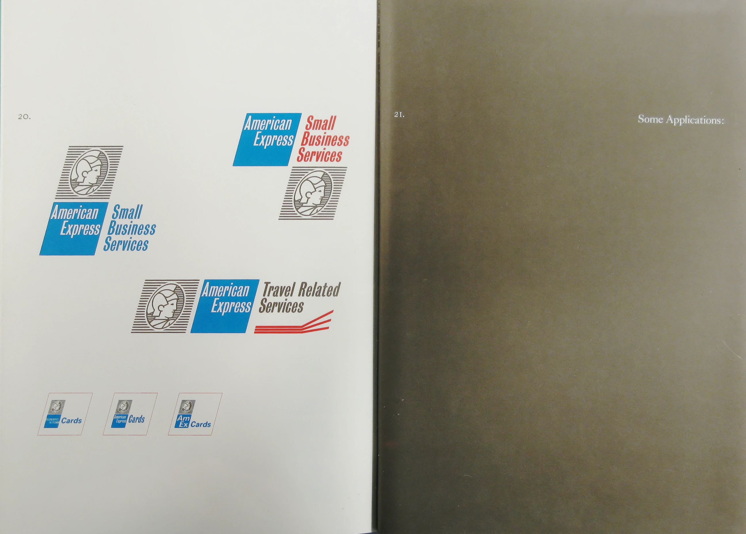
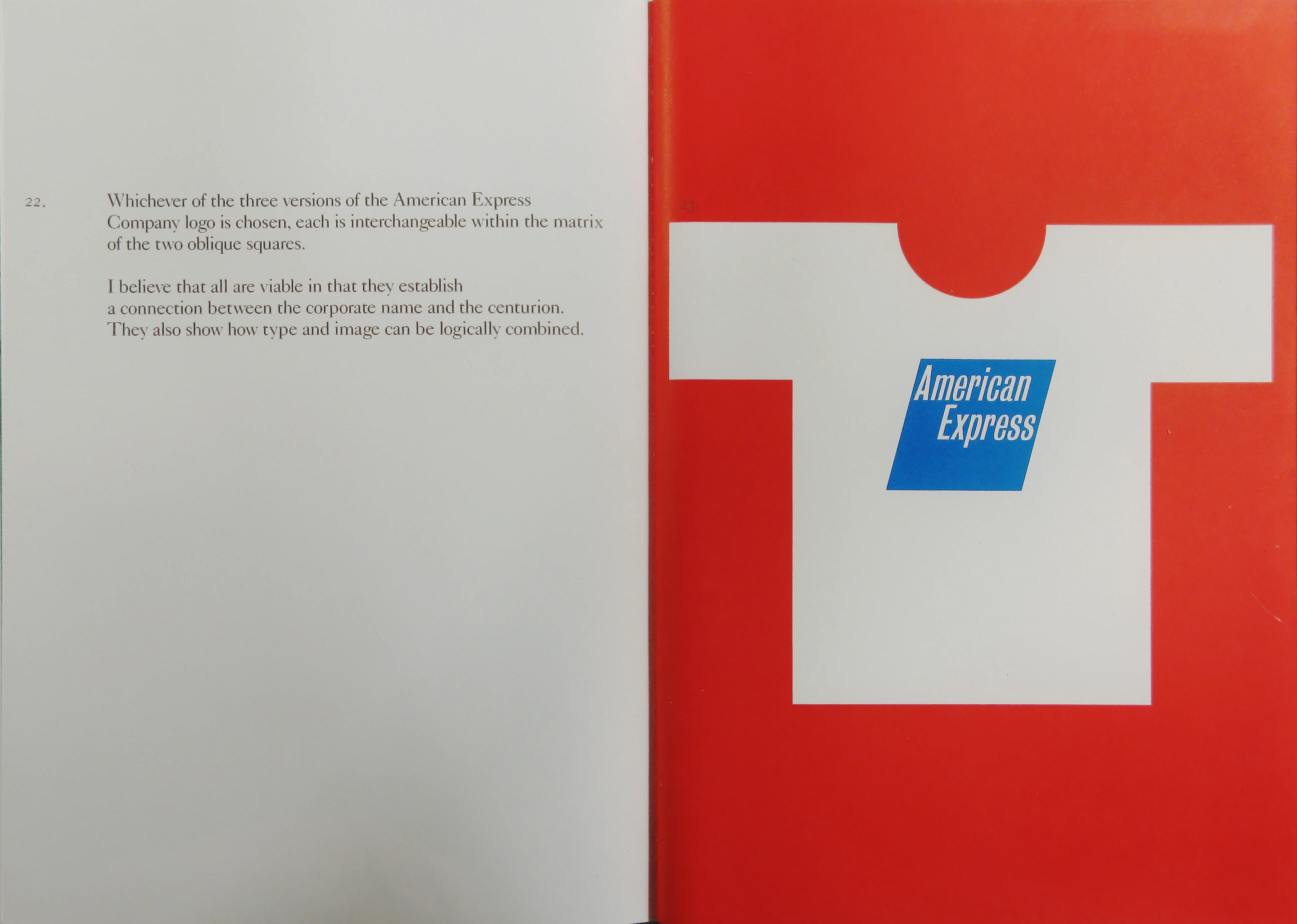
Whichever of the three versions of the American Express Company logo is chosen, each is interchangeable within the matrix of the two oblique squares.
I believe that all are viable in that they establish a connection between the corporate name and the centurion. They also show how type and image can be logically combined.
Don’t leave home without it…
Presentation Booklet, v2
View More

(Use ← → keys to navigate. Click for larger view.)
Paul Rand
Weston, Connecticut February 1994
American Express is a great name…
The present logo does not reflect the company’s greatness…
Its fifteen letters are difficult to manipulate and reproduce…
Its off-centered placement complicates connection with other words…
Elaborate letter forms are interesting but difficult to handle…
A well designed logo has something spirited about it…
The blue square lacks this quality…
Some of these shapes may be closer to the mark…
The rhombus stands out in a sea of squares…
A passive square is magically transformed into a lively rhombus…
It is related to the square; this insures continuity…
It is more interesting than the square, and more memorable…
It has a certain flair…
Increasing the size of the name and redrawing the letters helps, but…
Some of the old problems remain…
The name is increased in size…
It is organized with the top of the square…
This helps to accommodate different nomenclature…
The letters are less formal and easier to read…
Reducing the size of the logo is no longer a problem…
Lower case letters present a more interesting word picture…
They are also livelier and more inviting…
But the problem of fifteen letters in a small space still exists…
Everybody knows what USA stands for…
The meaning of AmEx is equally unmistakable…
Abbreviations have a purpose…
They are functional, economical, and encourage efficiency…
The relationship between the four letters is fortuitous…
They have a visual presence, youthful, quick, and sparkling…
They make a good word picture easy to read visually and verbally…
They can easily be combined with miscellaneous titles…
AmEx is the essence of “less is more.”
Perception of the Centurion:
A badge of strength…
Symbol of security and confidence…
Voice of authority…
Surveys reveal that the centurion is easier to recognize than the square… Why not combine the two?..
They can be of mutual benefit…
In tandem, they reinforce and explain each other…
In isolation, their common denominator is the rhombus…
It is the link between the two identifiers…
Like the rhombus, the oval is an important part of the picture…
The Centurion, the Rhombus, and Nomenclature:
Here are some practical typographic treatments…
Choice of type depends on need: emphasis, size, and printing…
Type styles exhibited are proximate…
Experience will fix the standard — a time consuming process…
Many different geometric configurations are possible…
Other examples are shown on the following page…
Some Applications:
Whichever of the three versions of the American Express Company logo is chosen, each is interchangeable within the matrix of the two oblique squares.
I believe that all are viable in that they establish a connection between the corporate name and the centurion. They also show how type and image can be logically combined.
Don’t leave home without it…