
The basic concept of casa BRUTUS is different from other japanese design magazines. casa BRUTUS takes a holistic approach, featuring not just design and architecture, but those lifestyle attributes that people who like design and architecture are also interested in such as fashion, automobiles, travel and much more.
The Original Text
ボール・ランドはみんなが知ってる、グラフィックデザインの巨人です。ポール・ランドの名前は聞いたことがなくても IBMやUPSのロゴは、誰もが目にしたことがあるはす。明るい色彩と豊かな造形力て、情報をシンプルに伝えるとともにアートとの境界線も突き破る。20世紀、彼がグラフィック界に与えた影響は計り知れない。
editor_Wakako Miyake special thanks_Marion Rand, Shinji Sugiyama (landscape Products), Koichi Yanagimoto, Ginza Graphic Gallery, The Niigata Pretectural Museum of Modern Art, Phaidon
左/昼夜場所を問わず、仕事をしたポール・ラド。自宅のアトリ工にて。
Paul Rand is a graphic design giant that everyone knows. Even though Paul Rand’s name has never been heard, the IBM and UPS logos have been seen by everyone. The bright colors and rich shaping ability convey information simply and break through the boundaries with art. The influence he had on the graphic world in the 20th century is immeasurable.
editor_Wakako Miyake special thanks_Marion Rand, Shinji Sugiyama (landscape Products), Koichi Yanag1moto, Ginza Graphic Gallery, The Niigata Architectural Museum of Modern Art, Phaidon
Paul Rand, who worked from the left / day / night place. Atelier at home.
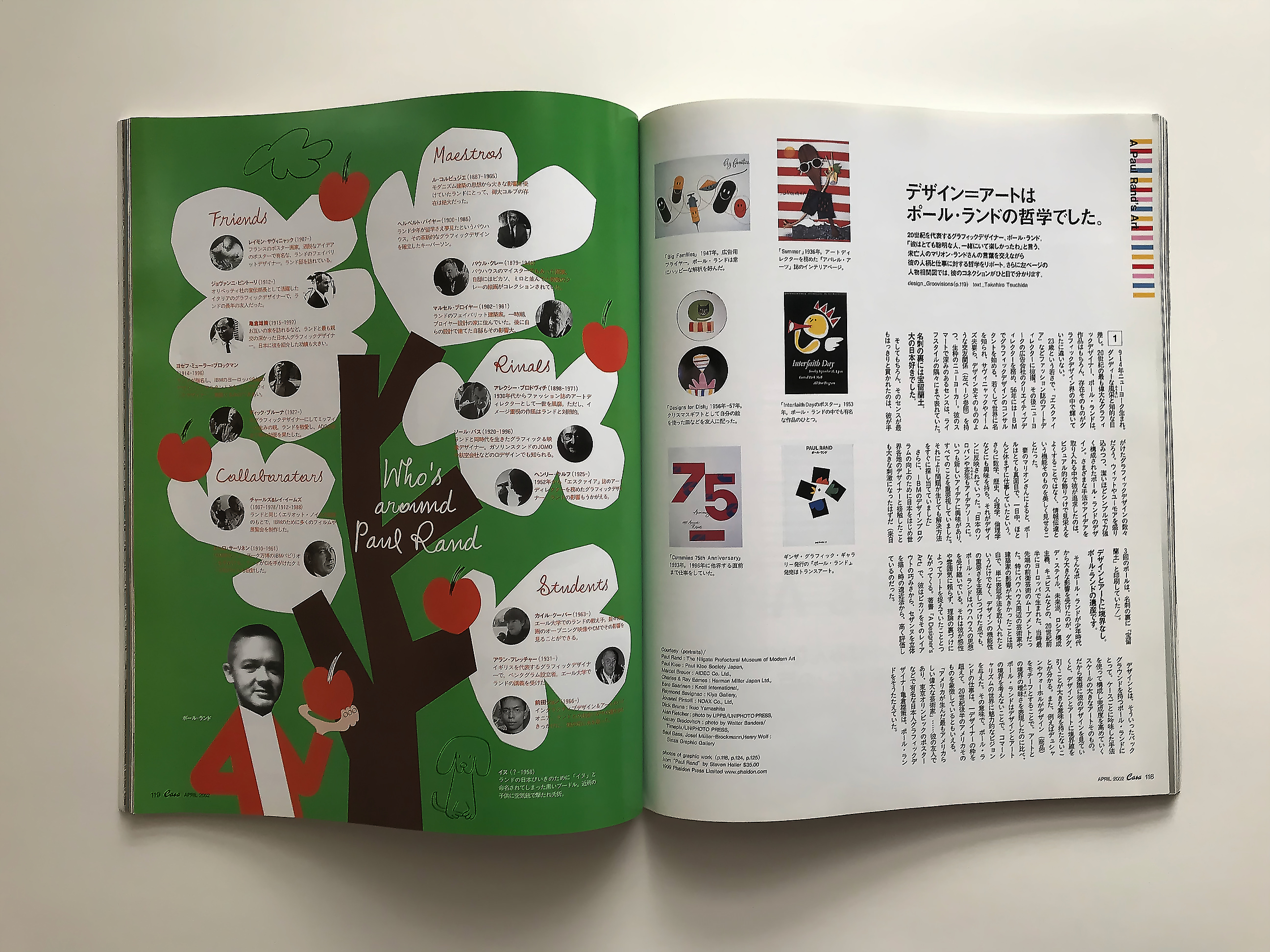
デザイン=アートは ボール・ランドの哲学でした。 20世紀を代表するグラフィックデザイナー、ボール・ランド。 「彼はとても聡明な人、一緒にいて楽しかったわ」と言う、 未亡人のマリオン・ランドさんの言葉を交えながら 彼の人柄と仕事に対する哲学をリポート。さらに左ページの 人物相関図では、彼のコネクションがひと目で分かります。 design_Groovis,ons(p.119) text_ Takahiro Tsuchida
Design = Art It was Ball Land’s philosophy. Ball land, a graphic designer representing the 20th century. “He was a very bright man, it was fun to be with him,” With words of widow Marion Rand Report his personality and philosophy for work. Further left page In the person correlation diagram, you can see his connection at a glance. design_Groovis, ons (p. 119) text_ Takahiro Tsuchida
1914年ニユーヨーク生まれ。
ダンディ—な風采と知的な目 差し。20世紀の最も偉大なグラフィ ックデザイナ—、ポール.ランドは、 作品はもちろん’ 1そのものがグ ラフィックデザイン界の中で輝いて ぃたに違ぃなぃ。
23歳といぅ若さで、『エスクァイ ア』などファッション誌のア—卜デ ィレク夕—に抜擢。その後ニユ—ヨ 丨クの広告会社のクリエイティブデ ィレク夕|を務め、56年には|日|\;| でグラフィックデザインのコンサル タン卜を始める。若くして世界に名 を知られ、サヴィニヤックや-1厶 ズ夫妻ら、デザイン史そのもののよ ぅな交友関係(左べ—ジ参照〉を持 つ、生粋のニユーョー力—。彼のス マー卜で深みのあるセンスは、ライ フスタイルの隅々にまで表れていた。
名刺の裏には宝留蘭土。
犬の日本好きでした。
そしてもちろん’ そのセンスが白取 もはつきりと貫かれたのは、彼が手
がけたグラフィックデザインの数々 だろ、っ。ウィットやユーモアを盛り 込みつつ’ 潔いほどシンプルで力強 く構成されたポールこフンドのデザ イン。さまざまな手法やアイデアを 取り入れる中で彼が追求したのは、 ビジュアル的な飾りつけで見栄えを よくすることではなく、情^達と いぅ機能そのものを美しく見せるこ とだつた。
妻のマリオンさんによると、ポー ルはとても真面目で、一日中’ ほと んど休まずに仕事していたとい、っ0 さらに数学’ 歴史’ 心理学、倫理学 などにも興味を持ち、それがデサイ ンに反映されていった。「日本のソ ロバンや茶宪もアイデアソ—スに。 いつも新しいアイデアに興味があり、 すべてのことを重要視していました。 それにより問題が生じても解決方法 をすぐに探し当てていました」
さらに’ 丨巳间のデザィンフログ ラムの向上のために日本をはじめ世 界各地のデザイナ—と^^したこと も大きな刺激になつたはずだ(来日
3回のポールは’ 名刺の裏に「宝留 蘭土」と印刷していた/)。
デザインとア—卜に境界なし。 ポール,ランドの遺産です。
そんなポール1フンドが少^'代 から大きな影響を受けたのが、ダダ、 デ.ステイル、未来派、ロシア1 主義、キユビス厶などの、20世紀前 半にョーロツバで生まれた、当時最 先端の前衛芸術の厶丨フメン卜だっ た。特にバウハウス周辺の芸術家や 建1の影響が大きかったことは明 白で、単に表現手法を取り入れたと いぅだけでなく、デザインの機能性 の重要さを主張しつづけた点でも、 ポ—ル.ランドはバウハウスの思想 を受け継いでいる。それは彼が感性 やI菌気に頼らず、理論の裏づけに よつてアー卜を捉えていたこととつ ながつてくる。著奎日『ン〇0519コ61-5 で、彼はピカソをそのレイア ウ卜の巧みさから、セザンヌを立体 を描く時の遠近法から、高く評価し ているのだった。
デザインとは、そぅいつたバック グラウンドを持つポ—ル.ランドに とつて、ケースごとに吟味した手法 を使って構成し^^成度を高めていく
スケールの大きなア そのもの。
だから実際に彼のデザインを見てい くと、デザインとアー卜に境霖を
引くことが大きな##を持たないこ とが分かる。また’ 例えばデュシャ ンやウォ—ホルがデザイン(商品) をモチ—フとすることで、アー卜と の境界の曖昧さを表現したのに比べ、 ポール.ランドはデザインとアー卜 の境界を考えないことで、コマ—シ ャリズムの世界に魅力的なビジョン を与えた。その意味で、ポール.ラ ンドの仕事は、一デザイナーの枠を 超えて、20世紀後半のァメリカその ものを^^しているともいえる。
「アメリカが生んだ〇一取もアメリカら しい偉大な芸術^:豕」……彼の友人で あり、1足才リンピックのポスタ— などで有名な日本人グラフィックデ ザイナ—#^策は、ポール.ラン ドをそぅたたえていた。
Born in New York in 1914.
A dandy look and an intelligent look. Paul Land, the greatest graphic designer of the twentieth century, is of course not only a piece of art.
At the age of 23 years old, she was selected as an advertising director for fashion magazines such as Esquire. Later he served as a creative director for New York-based advertising company, and started consulting graphic design at 56th in 56th. Young and well-known in the world, Savignac and his wife, his wife, his wife, and other members of the history of design itself have a nice relationship (see left page), a genuine new-year ability. The deep sense was evident in every corner of the life style.
The back of the business card is Bao Doran.
I loved dogs like Japan.
And, of course, that his sense was imprisoned by the white head, he was
It’s a lot of graphic design that I’ve got. Paul’s design is as simple and powerful as his wit and humor. What he pursued in introducing various methods and ideas was not to make the appearance look better with visual decoration, but to make the affection function itself look beautiful.
According to his wife Marion, Paul is very serious and he has been working almost all day without taking a rest, and he is also interested in mathematics, history, psychology, ethics, etc. Was reflected in the “Solobans and teacups in Japan also made ideas. I was always interested in new ideas and made all things important, so I was searching for a solution immediately if there was a problem.”
Furthermore, it is also a great stimulus to have ^^ with designers from around the world, including Japan, in order to improve the design of the design between 丨 巳
Paul three times’ printed on the back of the business card “Harodome Ransuto” /).
There is no boundary between the design and the atmosphere. Paul, it is a heritage of the land.
Such a pole 1 Fund was greatly influenced by the small ^ 's generations, such as Dada, De Steal, Futurism, Russia 1 principle, Chievist, etc., born in the first half of the twentieth century, the most advanced of those days It was a member of the avant-garde art. In particular, it was clear that the artists around the Bauhaus and the influence of Jen 1 were significant, and it was not only the habit of simply incorporating the expression method, but also the point of continuing the importance of design functionality. Rand inherits the Bauhaus philosophy. It is linked that he did not rely on sensitivities or mycelia, but that he had captured art by supporting the theory. By Ng 0519 ン 61-5, he valued Picasso for its cleverness of Reiah, and Cézanne for perspective when drawing a three-dimensional figure.
Design is to build a poll. Land with its background, using methods examined in each case to improve performance ^ ^
A large scale itself.
So when you look at his design, you are bound to design and art
It can be seen that the draw does not have a large ##. Also, for example, compared with the ambiguity of the border with Arhus by Dushan and Woorle’s design (product) motif, Paul Land thinks of the border between design and Arhus It gave an attractive vision to the world of socialism. In that sense, Paul Lund’s work goes beyond the frame of a single designer to say ^^ Americans in the late 20th century.
“The United States has created a great art that has been brought to life by the United States of America ^ ^: 豕” … A Japanese graphic designer who is famous for his friend, one-leg-acclaimed poster, and so on. I was honoring the land.
シンプルでユーモラス。 それがポール・ランドの仕事です。 ポール・ランドの仕事は実に多岐にわたる。その中から3つのカテゴリーに分けて、彼の仕事の傾向を探ってみましたシンプルでユーモラス、そしてハッピーなピジュアルは言葉がなくとも豊かなイメージとメッセージを伝えてくれます。 text_ Takahiro Tsuchida
Simple and humorous. That’s Paul Land’s job. Paul Land’s work is quite diverse. I divided into three categories from that, and tried to explore the tendency of his work Simple, humorous, and happy, and the colorful image conveys a rich image and message even without words. text_ Takahiro Tsuchida
Corporate Identity
日常で目にすることのできる、
ポール.ランド.デザイン
在:ホール.ランドの仕事の 中で最も広く知られているの が、CI デザインだろ、っ。企業イメ 丨ジを大きく左右する CI (コーポ レ—アイデンティティI)のデ ザインは、彼のよぅに豊富なキヤリ アと明確な理論を持つデザイナ—に とつて’ 特にやりがいのある仕事だ ったに違いない。
ポール.ランドが1956年に IBM のデザィンコンサル夕ン卜に就 任し’ 最初に手がけたのがロゴの刷 新だった。その後も IBM の多くの パッケージや販促品をデザイン。イ 夕リアの才リベッティ社のデザ イン(彼の友人でもあるジョヴァン ニ.ピン卜丨リが指揮を執った)と ともに、多様に発達していく20世紀 の〇丨デザイン手法のベースを作っ ていく。企業イメ—ジを明快に伝え るひとつのロゴマ—クに込められた アイデアの豊かさや斬新さ。また、 そのバリエ—ションをパッケージや 広告などに果てしなく展開させてい く手腕の見事さは、現代から見ても インパク卜を失っていない。
Corporate Identity You can see it everyday
Paul land design
Yes: The most widely known work of Hall Land is the CI design. The design of CI (Corporate Identity I), which greatly influences corporate imagery, was a particularly challenging task for a designer with a wealth of careers and a clear theory, much more than his own. Must.
Paul Rand was appointed to IBM’s Design Consultant in 1956, and it was the logo’s first work. Since then he has designed many IBM packages and promotional materials. Together with the design of Livetti’s talents (in the direction of his friend, Giovanni Pingli), I set up a base for a diversely developed 20th century design methodology. Go. The richness and novelty of ideas contained in one logo mark that clearly conveys corporate image. Also, the admirability of the technology that unfolds the variation endlessly in packaging and advertising has not lost its impact even from the present day.
Picture Book
可愛さ大爆発
娘のために作った絵本,
丨ル.ランドがグラフィック を手がけた絵本は4冊。その 文章はすべて前夫人のアン.ランド 〔ポールの2度目の妻)が書いてい る。最初の絵本『アィ.ノウ.ア. ロット.才ブ.シングス』が発表さ れた1956年当時は、ふたりの間 に最愛のひとり娘キヤサリンが生ま れて間もない頃。つまり’ 絵本制作 のきつかけは、キヤサリンに対する ポール&ァンの愛情表現だったのだ。 この共同作業は’ すでにふたりが離 婚して12年たった70蠢表のヴッ
スン/リッスン/』まで続いた。 4冊の絵本が好評だったためにポー ル.ランドへの絵本^:のオファー はほかにもあったが、それを引き受 けることはなかつたといぅ。
他のジャンルのグラフィックデザ インに比べて、ポ—ル.ランドの絵 本のグラフィックはあからさまに可 愛い。モチ—フのキユー卜さはもち ろんだが、色使いやユニークな構図 からも、広^!などのグラフィックに 比べて、アッ卜ホー厶な雰囲気が伝 わつてくる。
Picture Book Cuteness explosion
A picture book made for her daughter,
Four books have been written by RULELAND. All of the text is written by his former wife Anne Land (Paul’s second wife). In 1956, when the first picture book “A. Know. A. Lot. Bing Things” was released, it was almost time for the beloved one daughter, Kyasarin, to be born between the two. In other words, the picture book production kitsch was Paul & Pang’s love expression for Kyasarin. This joint work is’ already 70 years old, only 12 years since the two men broke up.
It continued to ‘Sung / listen /’. There were other offers of picture book ^: to Paul Rand because the four picture books were popular, but it has never been accepted.
The graphic of the picture book of Paul Land is more open-minded than the graphic design of other genres. The motif of the motif is not limited, but the color scheme and unique composition also convey an atmosphere that is more compelling than graphics such as ^ !.
Graphic Design
情報を明確に伝える グラフィックの手法を確立
^1、 Iル.ランドのグラフイツク につ」は’ ほとんどがシンプルで、 どことなくユ—モラスに見える。し かし’ 使われている色や形はひとつ ひとつが意味を持ち’ 1に構成さ れていた。マテイスを思わせる切り 絵も’ どことなく東洋風の手書きの 文字も’ インパク卜を増し、情報を 効率ょく伝えるために、頻繁に使わ れた。また、彼が好んだ色である赤 と緑が、印象的に使われていること も多い。
一方、ポ—ル.ランドには写真を
メインにしたデザインが少ない。こ れは「写真では明確な意味を伝達す ることができない」と、ポール.ラ ンドが考えていたから。
時代別に見ると、キヤリアの初期 に当たる1940羡にデザインし た雑誌の表紙には’ 当時の前衛アー 卜の影響がストレー卜に表れている。 その後に手がけることが増えた奎籍 の装丁やポスタ—では、用いられる テクニックがいつそ、つ多様になり’ 洗練されて、彼独特のスタイルを確 立していくことになる。
Graphic Design
Establish a graphic method to convey information clearly
The ‘1. I. Land’s graphics’ is’ mostly simple and looks somewhat humorous. Note that the colors and shapes used were made up of ‘1’, meaning one by one. Cutouts reminiscent of matisses and ‘simply hand-painted Oriental-style’ characters were also used frequently to increase impact and to convey information efficiently. Also, the colors he likes red and green are often used impressively.
On the other hand, a photograph is given to pole land
There are few main designs. This is because Paul Land thought that “the picture can not convey a clear meaning.”
Looking at the times, the cover of a magazine designed in 1940, the early stage of the carrier, shows the influence of the avant-garde of that time on the story. In the bindings and posters of the register, which have been dealt with since then, the techniques used will become diverse and sophisticated, and will establish his unique style.
あの作品は、 このアトリ工で生まれました。 ポール・ランドが他界して6年。夫人のマリオンさんが住む コネチカット州の自邸は、ほほ生前のまま残されている。 彼の発想を刺激したお気に入りの家具や物。 そこにはポール・ランドの世界が今なお息づいている。 photo_ Yuko Gon coordination_Yasuyo Hibino text_ Wakako Miyake
That work is I was born in this atelier. Paul Rand passed away for six years. His wife, Mr. Marion, lives in his home in Connecticut, where he remains in front of him. Favorite furniture and things that inspired his ideas. Paul Land’s world still lives there. photo_ Yuko Gon coordination_Yasuyo Hibino text_ Wakako Miyake
アトリ工。壁に貼ってある猿の写真が大好きで、いつも眺めて楽しんでいたそう。 ネチカット州ウェストンの田
喜を走ってい<と、緑の林の中に石壁の家が見えてくる。広大な敷地内に建つこの家が、ポ ル・ランドが前妻アンとともに設計し、l952年から亡くなる96年まで住んでいた自邸である。現在は未亡人のマリオンさんが住み、家の中はポールが生きていた頃と変わらぬ状態で保存。「ポールはどこでも仕事をした。家ではダイニングテープルを囲んで仕事のレビュをしたり、近所のレストランで作業をすることもありました」と、マリオンさん。アトリ工の壁には所狭しとタイポ見本やイラスト、仕事道具などが留められ、机や椅子なども彼がこだわって揃をたお気に入りばかり。また、ライプラリーには、膨大な数のア—トプックコレクションが並ぷ。彼の明る<洗練された作品の数々は、このアトリ工から生まれたのだ。
Atelier. I love the photos of the monkeys on the wall and I always enjoyed watching them. Rice field in Weston, Netikat
You’re happy and you can see the stone walled house in the green forest. The house, which is built on a large site, is a residence that Paul Land designed with his ex-wife and lived from l952 until 96, when he died. Currently, the widow, Mr. Marion, lives and the inside of the house is preserved as it was when Paul was alive. “Paul did work everywhere. At home, I used to have a job review around my dining table or work in a nearby restaurant,” said Marion. Atelier’s wall is filled with small figures and illustrations, illustrations, work tools, etc. The desks and chairs are all favorites that he cares about. In addition, a huge number of atopok collections line up in the library. His bright lights <a number of sophisticated works were born from this atelier.
グラフィック界の大物に聞きました。 あなたの好きなボール・ランドを 教えてください。 グラフィックに関わる人ならば、少なからずボール・ランドに 影響を受けているはず。そこで、国内外のグラフィック関係者に マイ・ベスト・ポール・ランドを聞いてみました。 text_ Takahiro Tsuchida, Wakako Miyake coordination_ Yasuyo Hibino
I asked a big man in the graphic world. Please tell me your favorite ball land. If you are involved in graphics, you should be influenced by the ball land not a little. So, I asked my best graphic lands around the world about My Best Paul Land. text_ Takahiro Tsuchida, Wakako Miyake coordination_ Yasuyo Hibino
Q1 一番好きなボール・ランド作品を教えてください。 Q2 その作品のどんなところに惹かれますか? Q3 ポール・ランドのどういうところに 魅力を感じますか? Q4 ポール・ランドから影響を受けている 部分はありますか?もしあるとすればそれはどういう部分ですか。
Q1 Please tell me your favorite ball land work. Q2 What part of the work are you attracted to? Q3 Where in Paul Land do you feel attractive? Q4 Is there a part affected by Paul Land? If so, what part is that?
仲條正義 Masayoshi Nakajo グラフィックデザイナ一 1936年生まれ,資生堂宣伝部を経て独立。 70年から資生堂P随志哨:椿」を手がけ、 松屋銀座のCl計画なども行う。
A1 「Westinghouse」(animatedsign) 1962年。最初は亀倉雄策さんのr世界のトレードマークJで見たと思います。
A2 電器会社のロゴで、丸の中に配線図のようなコンセントのような図で「W」と読めます。それだけで十分な作品に見えますが、その下にトラック楕円の横棒があって、地の色の量を加減,単なる丸から点が増殖し完成する成長の過程が知的で、デザインとはこういうものだと知らされました。
A3 過不足ない造形と色彩、いつまでも古ぴない豊かさ。
A4私たちの世代で影響を受けなかった人はいないでしょう。私の場合、形のポジネガのバランス、余白の取り方など、真似したつ もりはなくても、まともに反映しています。20t紀の巨人です。
Nakajima justice Masayoshi Nakajo Graphic designer Born in 1936, became independent after passing the Shiseido Advertising Department. He has been working on Shiseido’s “P Shi Shi Hui: Hagi” since 70, and also performs Cl plans for Matsuya Ginza.
A1 “Westinghouse” (animatedsign) 1962. At first I think that you saw with the world mark J of Yusaku Kamekura.
A2 This is the logo of the electronics company, and you can read “W” in a circle like a wiring diagram in a circle. It seems that it is enough work by itself, but there is a horizontal bar of track oval below it, and the amount of color of the ground is adjusted, the process of growth from the simple circle to the point to grow and perfection is intellectual, and the design is I was informed that this is something like this.
A3 Shape and color without excess and deficiency, richness never old.
A4 No one in our generation would have been unaffected. In my case, the balance of the positive and negative of the shape, how to set the margins, etc. are reflected properly even if there is no imitation. It is a giant of 20 tons.
伊藤高
Co Ito
プチグラパブリツシング代表
マニアックなグラフィックブックの出版や 映画の配給なども手がけるプチグラ。自身 の縦志でポール,ランドを^したことも。
A1 絵本「Sparkle and Spin」1957年。特にプロローグのアイス クリームが好きです。扉のデザインも素晴らしい。
A2 アン,ランドのウィットに富んだ言葉のセンスとポールのデ ザインが見事に共鳴し、この絵本の楽しさを2倍にも3倍にもして いる。何回読んでも楽しいと感じるってすごいことだと思います。
A3 彼のデザインをひと言でいうと、「清廉なモダン」という印象 でした。でもそれは僕にはあまりに厳格すぎて、隙がないのがちよ っとなあ…と最初は感じていました。しかし、絵本に目を向けてみ ると、彼の-資質には可愛さも多分にあることに気づきました。そこ で感じたことは、あらゆる仕事に対して彼は120%の力を発揮する、 まさにデザインの巨人なのだということでした。
A4 背筋を正す、といったところでしようか(苦笑)。実は今回初 めてプチグラのロゴマークを作ったのですが(デザインは後藤隆哉 氏)、彼の姿勢に対してリスぺク卜したモノ作りをしました。
Ito high Co Ito Representative of Petit Grab Pubricsing Puchigra also deals with publishing of maniac graphic books and distribution of movies. Paul also lands in his own vertical spirit.
A1 Picture book “Sparkle and Spin” 1957. I especially like prologue ice cream. The design of the door is also great.
A2 Anne, Land’s witty sense of words and Paul’s design resonate brilliantly, doubling or tripling the fun of this picture book. I think it’s great to feel fun reading many times.
A3 Speaking of his design, it was an impression of “clean modern”. But at first I felt that it was too strict for me and I could not afford it. However, when I turned my attention to the picture book, I realized that his qualities are also pretty. What I felt there was that he was just a giant in design, exerting 120% power for every job.
A4 I wonder if I can fix my spine (wry smile). In fact, for the first time this time I made the Puchigura logo (designed by Mr. Takatoshi Goto), but I made a rispek-like thing for his attitude.


